
Targeted Sprints
$6,000–25,000 · 2–4 weeks
You know the leak. We fix it. One sprint. One metric. Fixed scope. Fixed timeline. Fixed price.
How it works
Every sprint follows the same structure:
- Week 1: We audit the flow, confirm the leak, and design the fix.
- Week 2–4: We deliver redesigned screens, A/B-ready variants, implementation notes, and a Loom walkthrough. Scope and timeline depend on the sprint type.
You get production-ready Figma files your engineering team can implement directly. No back-and-forth. No “one more revision.” No scope creep.
Every sprint requires a completed FlowAudit or Human Design Audit before we start. We don’t guess. We fix what the data says is broken.
Activation Fix
$6,000–12,000 · 2–3 weeks
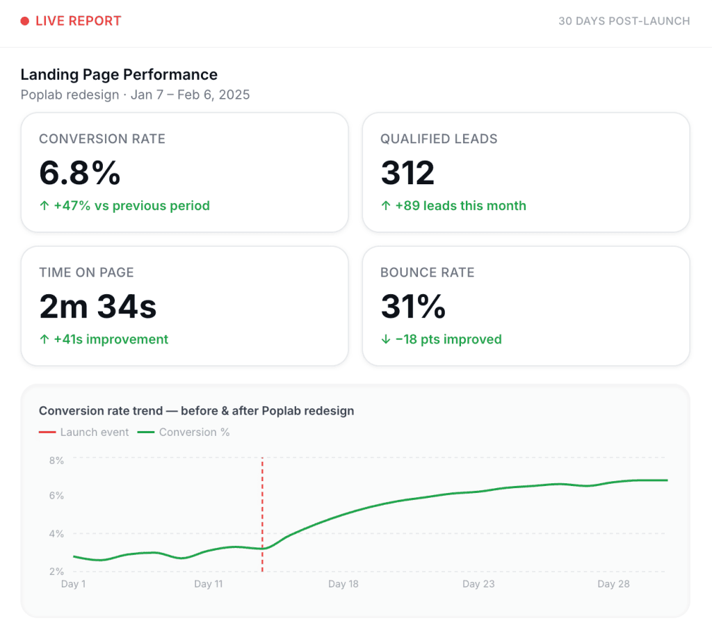
Users sign up and vanish. We find exactly where they drop and redesign the flow so they reach value — and stay.
What we fix: The specific screen or step where activation breaks. Usually it’s the gap between “account created” and “first meaningful action.” Sometimes it’s an onboarding sequence that teaches the wrong behavior. Sometimes it’s a permission wall that blocks users before they see anything useful.
What you get: Redesigned activation flow (up to 8 screens), A/B-ready variants, implementation notes, Loom walkthrough.
Best for: Products where signup-to-activation is below 25% and nobody can explain why.
Onboarding Sprint
$6,000–15,000 · 2–4 weeks
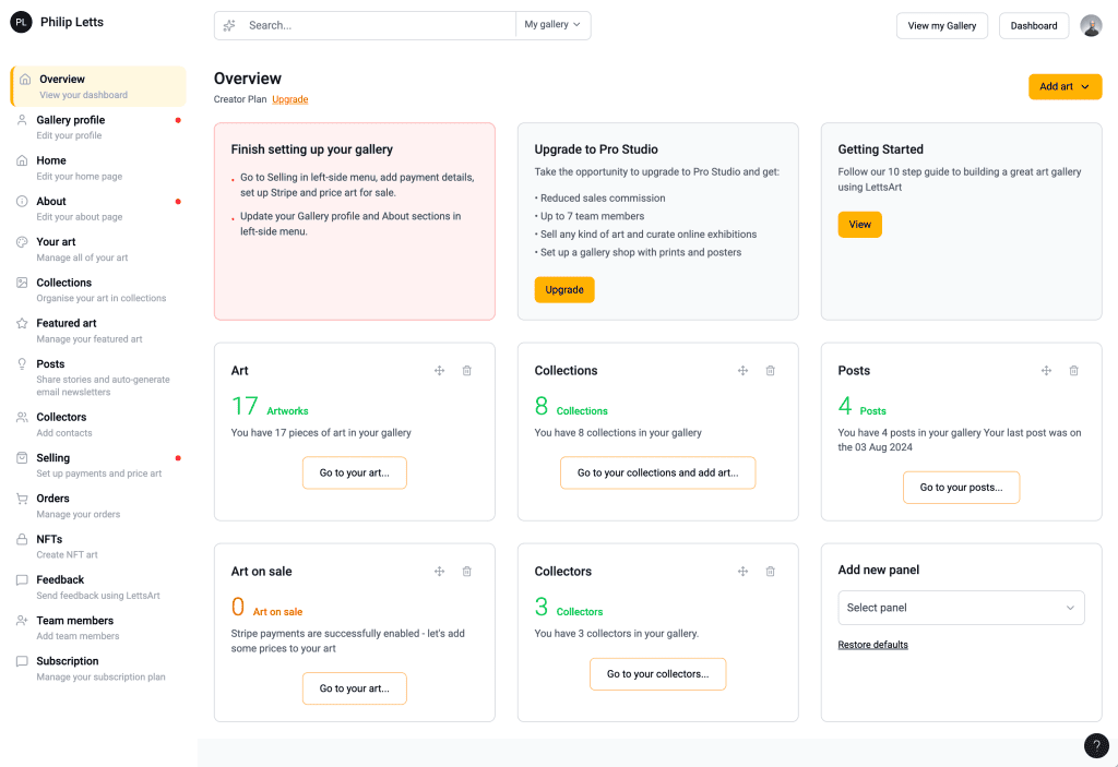
First-time user experience kills retention before users ever see what your product can do. We redesign it so their first session ends with a win — not a question mark.
What we fix: The entire first-run experience. Empty states. Error handling. Progressive disclosure of complexity. The moment where a user decides “I get it” instead of “this isn’t for me.”
What you get: Redesigned onboarding flow (up to 12 screens), empty state design, error handling patterns, implementation notes, Loom walkthrough.
Best for: Products where day-7 retention is flat or declining and “time to first value” is measured in days, not seconds.
Dashboard Redesign
$8,000–25,000 · 3–4 weeks
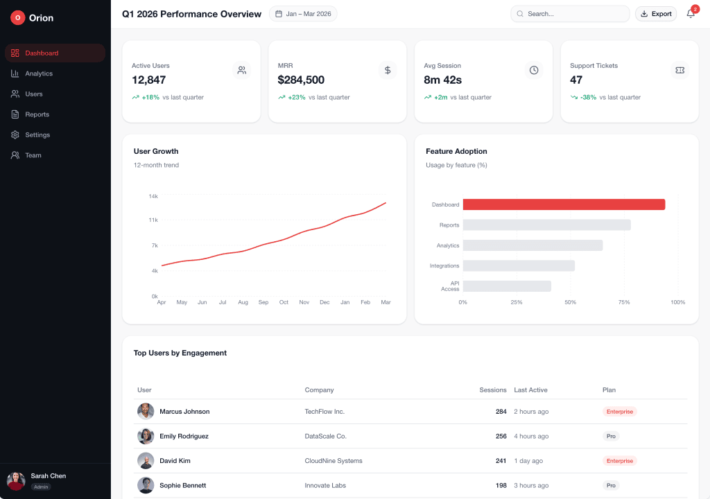
The dashboard is the product. It should work like it. Not like a spreadsheet. Not like a Christmas tree of metrics nobody asked for.
What we fix: Information architecture. Data density. Role-based views. Actionable insights vs. vanity metrics. The difference between “powerful” and “overwhelming.”
What you get: 3–5 fully designed core screens, role-mapped views, scalable component library, implementation notes, Loom walkthrough.
Best for: B2B SaaS companies where users live in the dashboard and churn correlates with “too hard to use.”
Conversion Sprint
$6,000–12,000 · 2–3 weeks
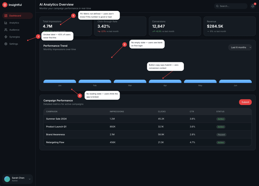
Your pricing page, checkout, or upgrade flow undersells what your product is worth. We fix it.
What we fix: The specific flow where revenue leaks — pricing pages that confuse, checkouts that ask for too much, upgrade flows that nobody finds. Copy and design working together. Every decision tied to a hypothesis about your buyer.
What you get: Redesigned conversion flow (up to 6 screens), A/B-ready variants, copy and design together (not separate), implementation notes, Loom walkthrough.
Best for: Products where conversion from free-to-paid or tier-to-tier is below industry benchmark and the current flow hasn’t been touched in 12+ months.
Requirements
- Completed FlowAudit or Human Design Audit (we fix what datasays is broken, not what you think is broken)
- Live product with real users
- Access to your product or a staging environment
- A single point of contact on your team for the duration of the sprint
Not sure which sprint fits?
Ready to fix the leak? Book a Fit Call →