
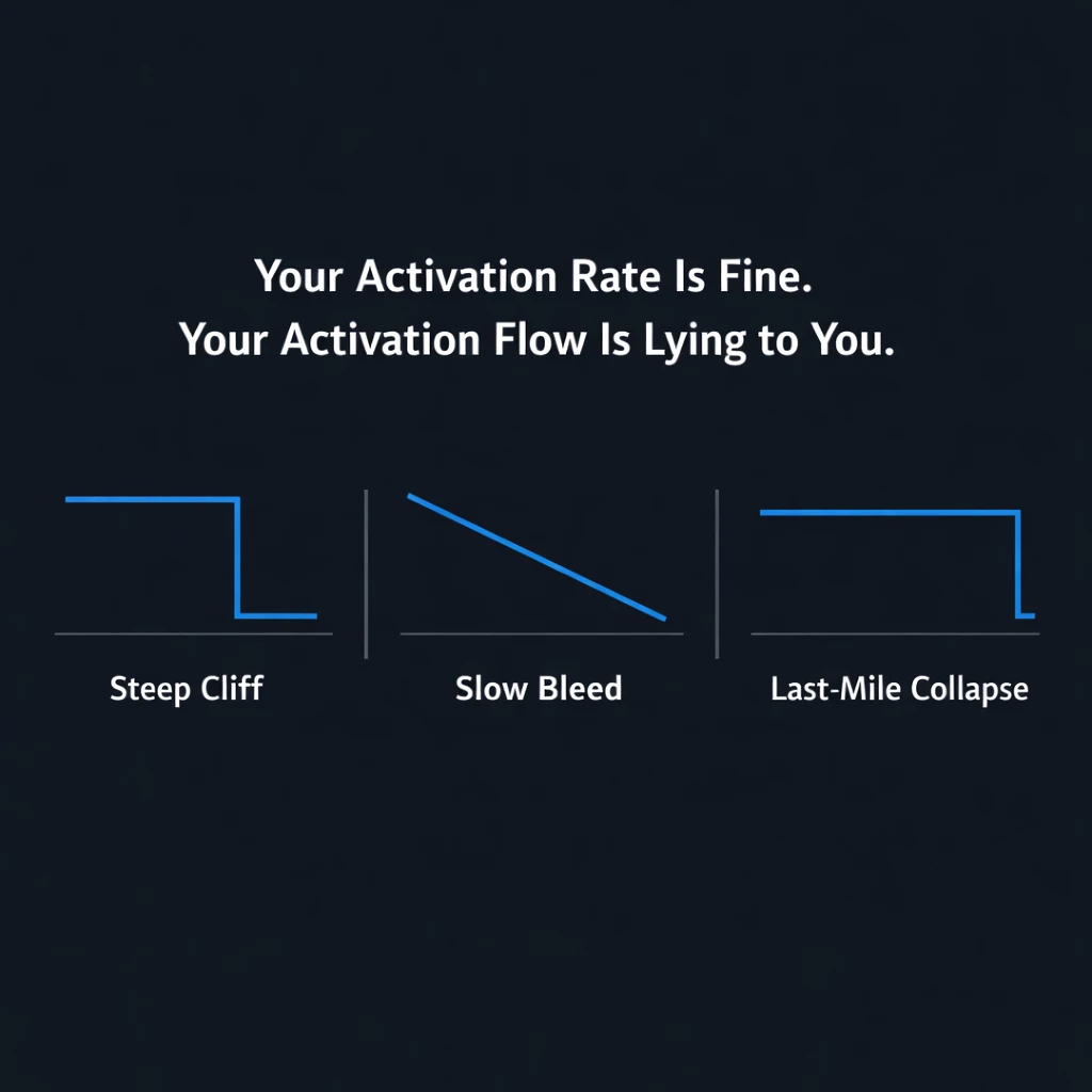


A product team I worked with last year had an activation rate of 22%.
They’d been optimizing it for six months. Copy changes. Button colors. A new onboarding wizard. They’d moved it from 18% to 22% and felt pretty good about it.
I asked them one question: “Where in the flow are the 78% actually leaving?”
Silence.
They had a number. They didn’t have a shape. And the shape is where the money is hiding.
The Single-Number Trap
Most teams measure activation as a percentage: “22% of signups reach the activation event.” That number tells you that you’re losing users. It doesn’t tell you where.
Activation isn’t a moment. It’s a chain.
Signup → Screen 1 → Screen 2 → Screen 3 → Screen 4 → Activation EventIf 100 users sign up and 22 activate, you’ve lost 78. But those 78 didn’t all leave at the same place. Some left on screen 1. Some on screen 3. Some never even finished signup.
The shape of the drop-off changes the fix entirely.
Losing users on the signup screen is a friction problem. Losing them on screen 3 is a value problem. Losing them between screen 4 and activation is an expectation gap. Same activation rate. Three different products to fix.
The Three Drop-Off Shapes
I’ve audited activation flows across dozens of B2B SaaS products. The drop-offs always fall into one of three patterns.
Pattern 1: The Cliff
Users
  ██
  ██
  ██
  ██
  █
  █
  █                 ← 40–60% drop between two specific screens
  █
  ████████████████
Screen  1    2    3    4    5
What it looks like: A massive, sudden drop between two specific screens. Everything before the cliff is fine. Everything after is fine. The cliff itself is the problem.
What it means: There’s a single decision point where users bail. Usually it’s a permission request, a pricing reveal, a “connect your data” step, or a form that asks for too much too early.
The fix: One screen. Redesign it. Don’t touch anything else.
I saw this with a SaaS product that asked users to invite three teammates on screen 2 of onboarding. 47% of users dropped right there. They weren’t ready to bring their team in. They hadn’t seen the product work yet. Moving that step to screen 5 — after users had created their first project — dropped the cliff from 47% to 12%. No other changes.
Pattern 2: The Slow Bleed
Users
  ██
  ███
  ████
  █████
  ██████
  ███████
  ████████         ← 5–10% drop per screen, steady erosion
  █████████
  ██████████
Screen  1    2    3    4    5    6    7    8
What it looks like: A steady, consistent drop at every screen. No single cliff. Just erosion.
What it means: The entire flow is too long, too complex, or asking for incremental commitment without delivering incremental value. Users aren’t rejecting a specific thing — they’re running out of patience.
The fix: You don’t redesign a screen. You delete screens. Or you restructure the flow so value arrives earlier.
A team I worked with had an 8-step onboarding flow. Each step asked for one more piece of setup. By step 8, they’d lost 40% of users — not at any single point, but across the whole chain. We collapsed it to 4 steps, moved the value reveal to step 2, and let users skip setup until they’d seen the product work. Activation went from 18% to 31%.
Pattern 3: The Last-Mile Collapse
Users
  ██
  ██
  ██
  ██
  ██
  ██
  ██               ← Everything looks healthy until the final step
  ██
  █                ← Then a cliff right before activation
Screen  1    2    3    4    5    6    7    8
What it looks like: Retention is solid through the entire flow — until the very last step, where users suddenly drop.
What it means: The activation event itself is the problem. It’s too high a bar, too unclear, or asks for something users aren’t ready to do. They’ve seen the value. They’re interested. But the final ask is wrong.
The fix: Redefine the activation event itself — or redesign the final step.
A B2B analytics tool defined activation as “created your first dashboard.” Users flowed through data connection, schema mapping, and exploration smoothly — then hit “create dashboard” and froze. The problem wasn’t the flow. It was that “create dashboard” felt like a commitment before they’d learned what a good dashboard looked like. We changed the activation event to “viewed a pre-built template dashboard” and let users customize from there. Activation jumped 26%.
How to Find Your Shape
You don’t need a data team. You need three things.
1. A flow map.
Write down every screen, step, and decision point between signup and your activation event. Not the ideal path — the actual path. Every modal. Every tooltip. Every “skip for now” link. Map what users actually encounter.
2. Drop-off data at each step.
Most analytics tools can do this. You want: “Of the 100 users who reached screen 2, how many reached screen 3?” Not total activation. Transition rates between each step.
3. The shape.
Plot it. Cliff, slow bleed, or last-mile collapse? The shape tells you what to fix.
What Happens When You Actually Fix the Right Thing
The team I mentioned at the start — 22% activation, six months of optimization — had a slow bleed. Eight steps. Each step lost 7–12%. They’d been optimizing step 3 because it had the highest absolute drop. But the problem wasn’t step 3. The problem was that step 3 existed at all — users had already answered seven questions before they saw anything useful.
We collapsed the flow to four steps. Moved the value reveal from step 8 to step 2. Let users skip anything they didn’t want to configure yet.
Activation went from 22% to 38% in three weeks. Six months of optimization got them +4%. Three weeks of fixing the right thing got them +16%.
Run This on Your Product Today
Open your analytics. Find your signup-to-activation flow. Map every step. Get the transition rate between each one. Plot the shape.
If you see a cliff, you have one broken screen. Fix it.
If you see a slow bleed, your flow is too long. Delete screens.
If you see a last-mile collapse, your activation event is wrong. Redefine it.
Most product teams know their activation rate. Very few know the shape of their drop-off. The ones who know the shape fix the right thing. The ones who don’t spend six months changing button colors and wondering why nothing moves.
Your product leaks users where nobody’s looking.
Run a free FlowAudit on your activation flow. 90 seconds. See the shape before you spend another sprint guessing.

Leave a Reply