Background
LettsNews began as a design problem, not a feature list. Independent journalists and small teams were doing professional work inside amateur workflows—too many tools, too much friction, not enough time. As a LettsGroup venture, the mandate was clear: design a newsroom platform that feels effortless under pressure, puts creators first, and makes AI feel like craftsmanship, not spectacle. From the outset, the goal was to give independent professionals the same polish and power that enterprise newsrooms take for granted—then ship it fast enough to support LettsGroup’s growth with a confident public beta.

Challenge
The challenge was to compress complexity into clarity without losing capability. That meant designing a system where:
- Capture is instant and reliable on mobile, because stories don’t wait.
- Structure emerges naturally from content, not the other way around.
- AI enhances judgment without flattening voice.
- Publishing across web, blogs, and social feels like one coherent act.
- Teams collaborate without stepping on each other, with presence and roles designed-in, not bolted on.
- Pricing feels human and navigable, guiding users to the right plan without cognitive overhead.
Layered on top were platform realities (app store policies), AI constraints (cost and latency), and the need to protect margins while serving solo creators and teams. Every one of these was treated as a design constraint—shaping flows, systems, and the interface language.
Process
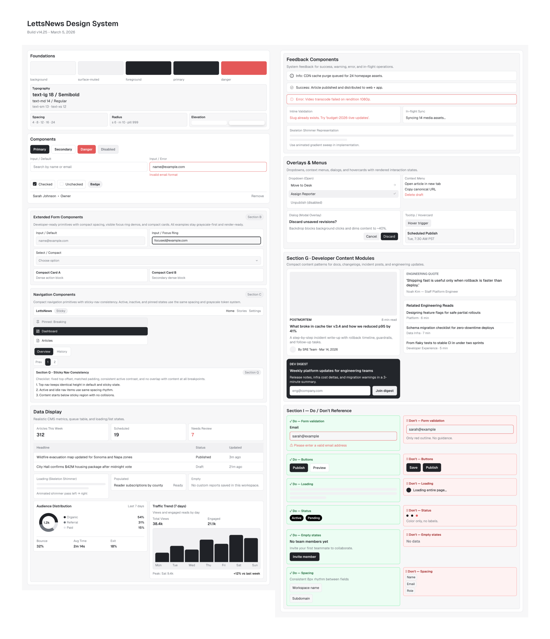
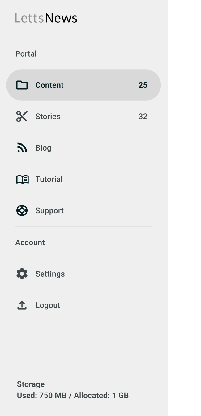
We built LettsNews the Poplab way: design-led, systems-forward, and prototype-heavy. We started with architecture and language. “Content Items” and “Stories” weren’t just labels—they were the mental model that stabilized the product. A digital newsroom emerged: visual, organized, and reassuringly simple, where every action has a clear affordance and a predictable outcome. We iterated through low-friction prototypes, validating flows in context before any polish. Mobile-first wasn’t a slogan; it determined layout, tap targets, gesture patterns, and how interruptions are handled in the field.
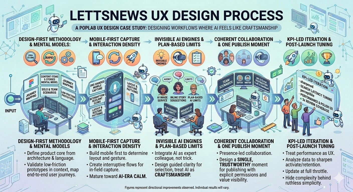
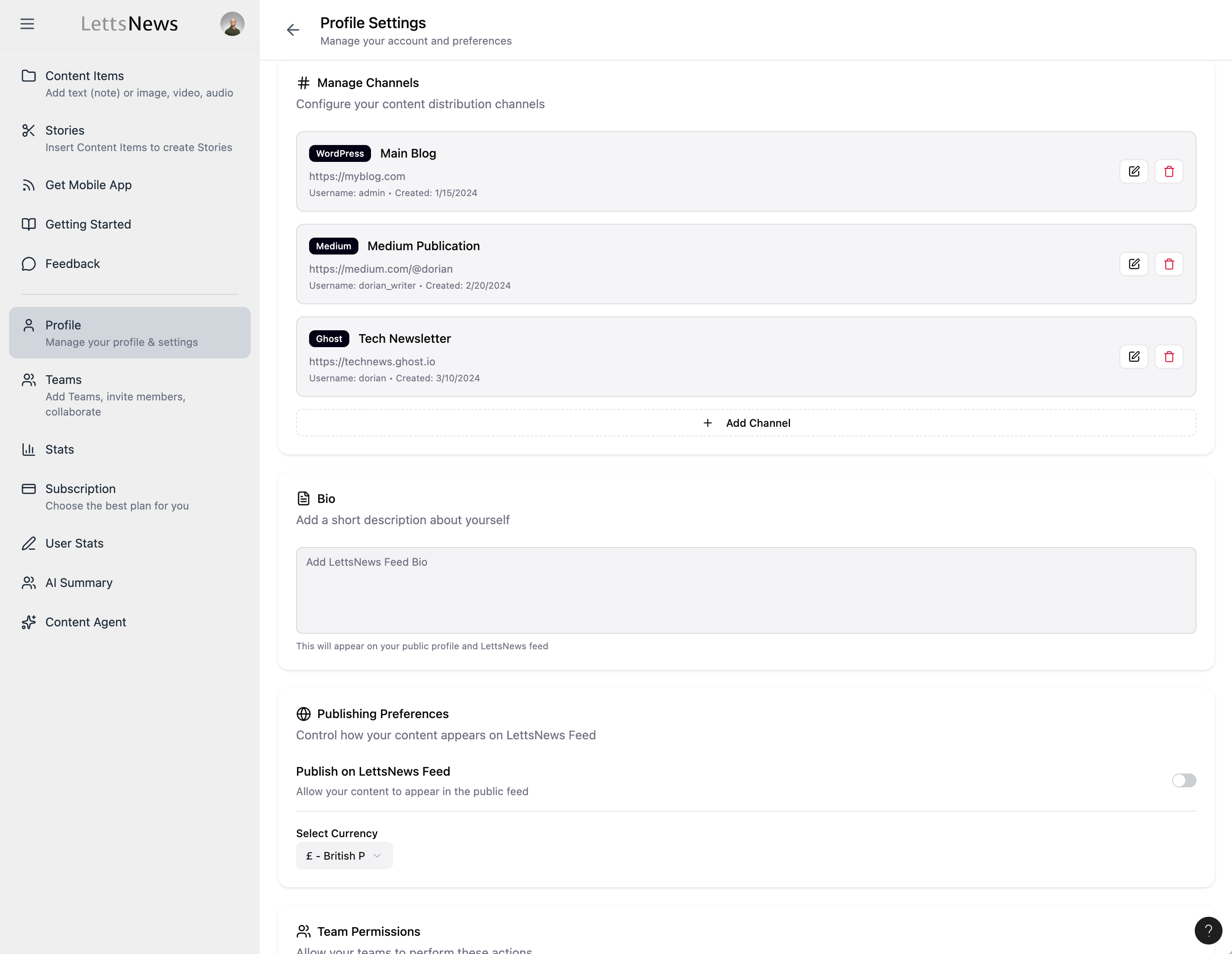
The UI matured toward an AI-era calm: typography doing the heavy lifting, restrained color, purposeful spacing, and interaction density tuned to scenario—light for capture, rich for assembly, focused for publish. We redesigned login and signup to set tone and trust early. Teams and profiles became structured hubs with obvious hierarchies and decluttered choices. AI-assisted design tools accelerated fidelity without sacrificing intent, letting us translate journeys into responsive systems rapidly and consistently.
When core mechanics were stable, we embedded the “invisible engines”: an AI image service; plan-based AI limits surfaced transparently at the moment of need; subscription and pricing UX that treats selection as guided clarity, not a maze. Distribution to WordPress and social was designed around truth in feedback—the UI shows exactly what will happen, then confirms it did. In parallel, we designed the marketing activation tracks so the story told outside the product matched the experience inside it. We pulled the beta forward because the system’s design integrity held under pressure.
Post-launch, we treated performance and polish as UX work. We tuned search latency perceptibly. We removed weight from video and audio paths. We refined microcopy, empty states, and error recovery so the product stays calm when things get noisy. Design reviews remained cross-functional, keeping feasibility, scale, and narrative aligned.
Solution
LettsNews is a design system for modern newsgathering, with AI as an integrated capability—not an overlay.
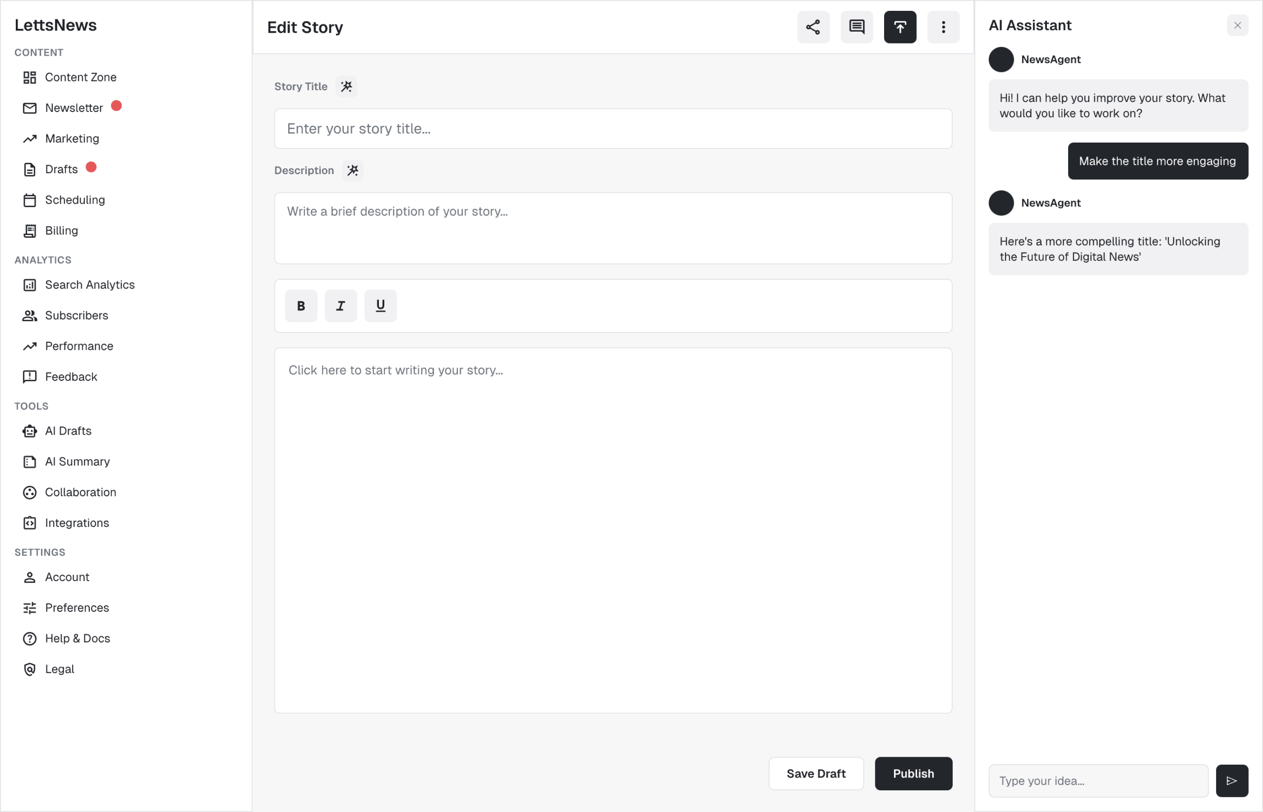
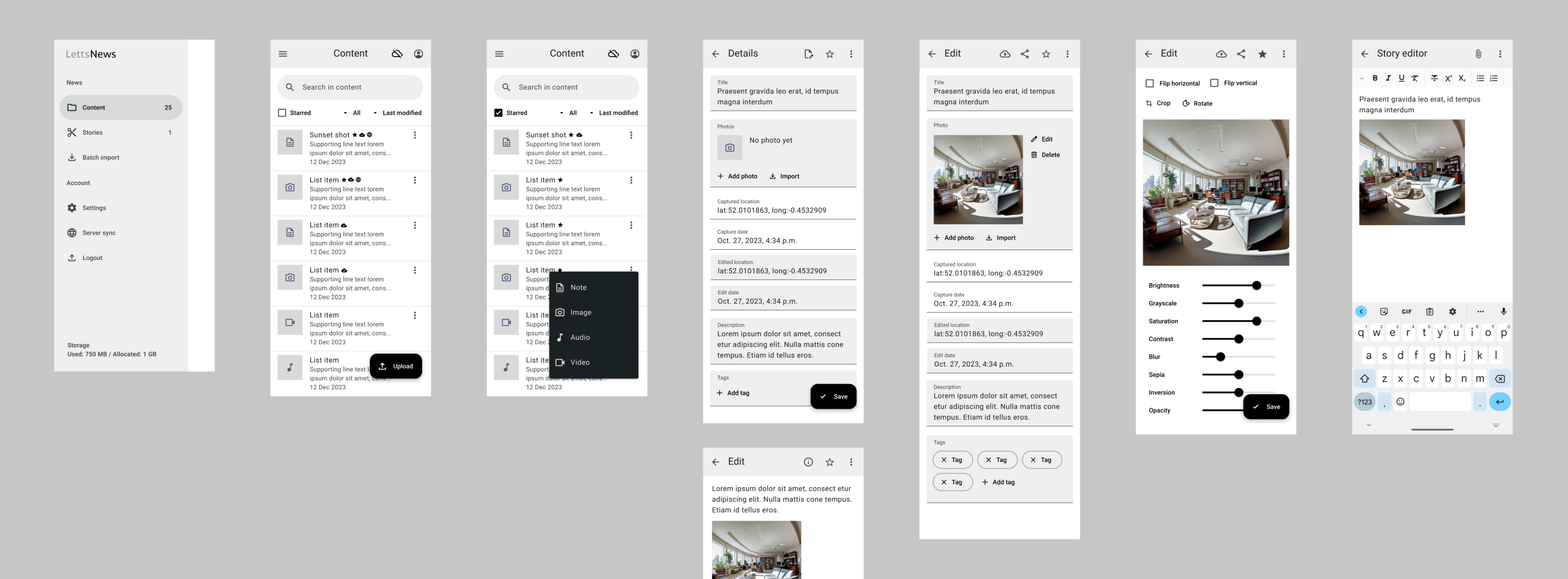
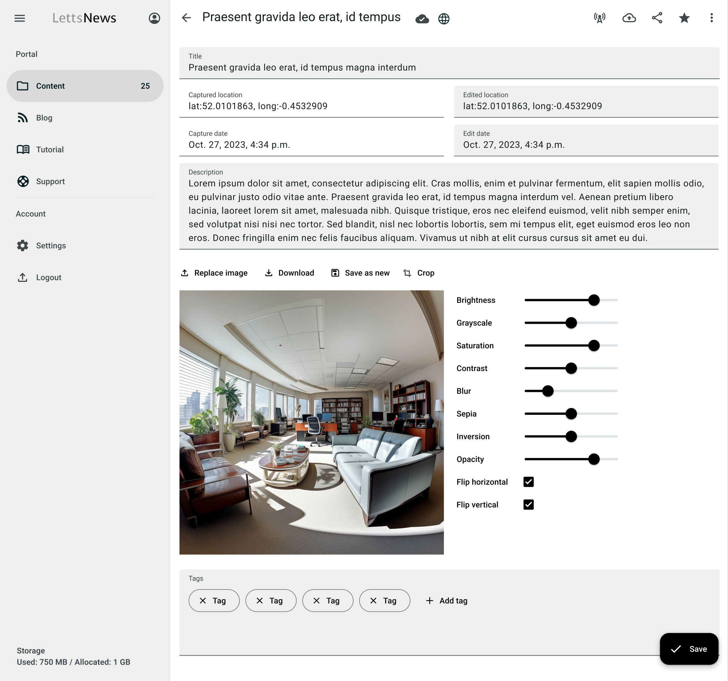
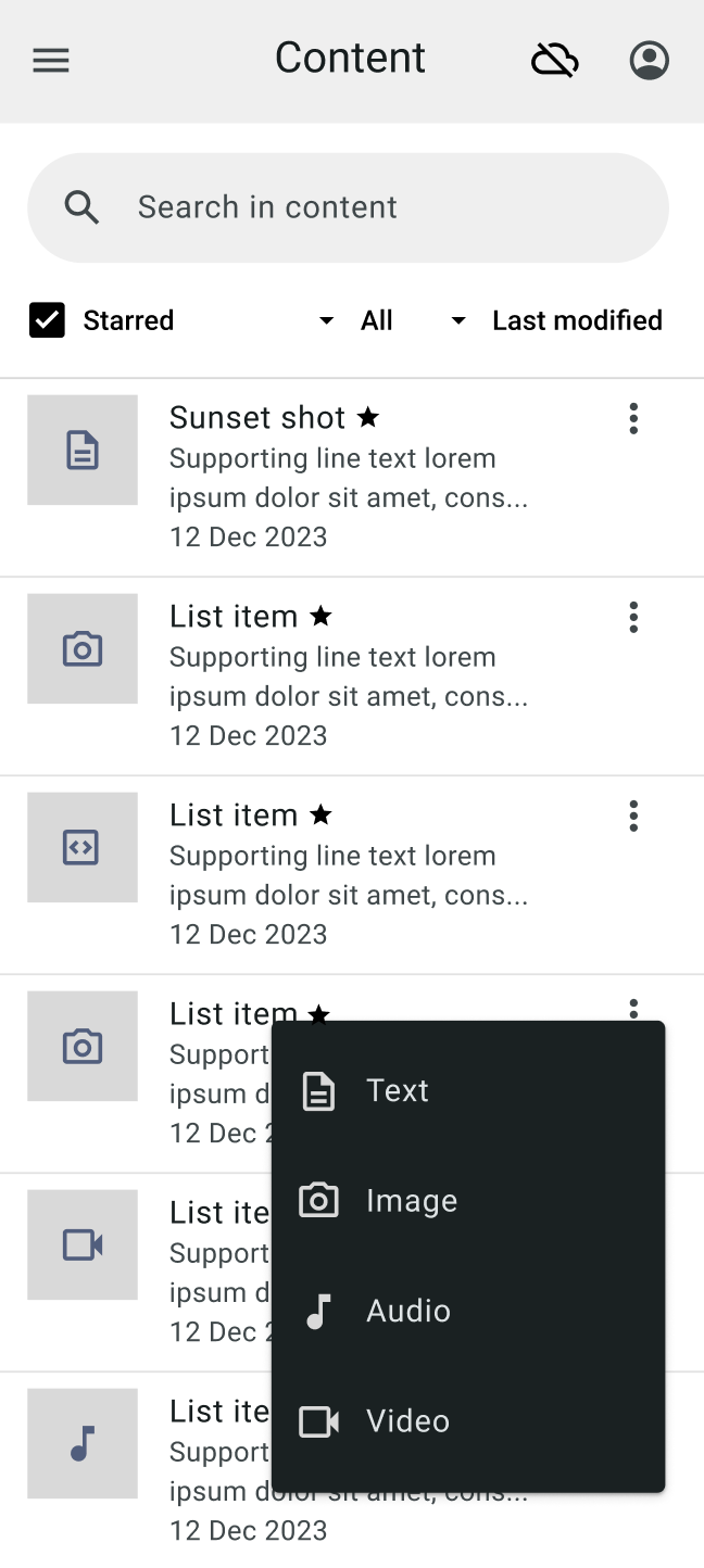
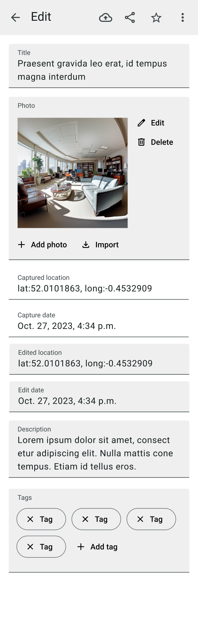
On mobile, capture is a one-handed, interruption-resilient flow for notes, images, video, and audio. Items land in a visual newsroom where information architecture does the work: sensible grouping, strong scanning patterns, and context-aware actions. Story building feels like composition, not assembly—inline AI suggestions for headlines, structure, and tags appear where decisions happen, and draft generation is opt-in, respectful of voice and tone. The editor favors momentum: reduced chrome, relevant controls only, and a reading-first hierarchy that keeps writers thinking in narrative, not UI.
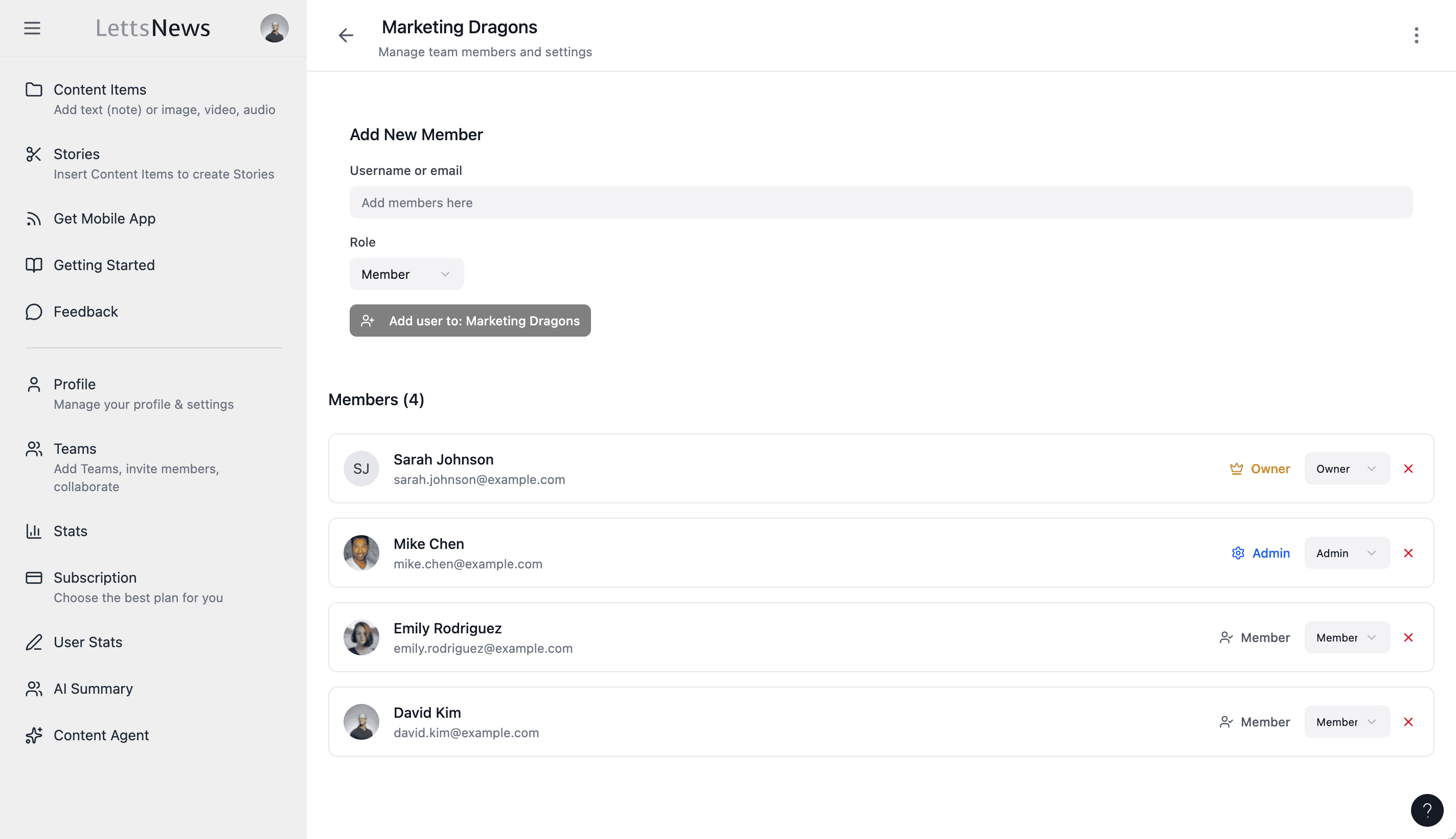
Publishing is designed as a single, trustworthy moment. Distribution targets are previewable, image/caption parity is guaranteed, and progress and outcomes are always visible. Collaboration is presence-led: subtle avatars, clear roles, and conflict-avoidant editing that keeps teams moving. The marketplace and content control sit on the same principles—make ownership visible, permissions explicit, and value-creation part of the flow rather than an afterthought. Pricing is expressed in human terms with guided selection: three tiers, transparent limits, no surprises.
Across devices, the interface holds a coherent tone—measured, modern, and quiet—so the product looks and feels like a professional tool from the first minute of use.
Learning
Leading with design paid off in speed and quality. A strong information architecture reduced surface-area bugs and simplified onboarding. Investing in a calm, minimal UI increased trust and made the AI feel integrated rather than ornamental. We learned that AI requires ongoing tuning to protect voice and control cost—so limits, feedback, and overrides must be part of the UX, not hidden in settings. Platform constraints are design constraints; acknowledging them early saves time and keeps flows honest. Once live, data beats intuition—KPI-led iteration sharpened activation, retention, and perceived performance in ways no static review could.
My Contribution
As the Design and UI/UX lead, I built LettsNews from zero with a design-first methodology. I defined the product’s information architecture and mental models, mapped end-to-end user journeys for solo and team scenarios, and created the interaction patterns and component system that make the product feel coherent and “grown-up” under deadline pressure. I designed core workflows—capture, organize, compose, publish, collaborate—validating them through rapid prototypes before shaping pixel-accurate UI across mobile and desktop. I integrated AI where it meaningfully reduces cognitive load, crafting prompts, limits, and feedback to be contextual and respectful of voice.
Using AI-accelerated design tools, I translated strategy into responsive layouts and production-ready specs quickly, keeping engineering velocity high without sacrificing nuance. I worked shoulder-to-shoulder with product on outcomes and prioritization, partnered with engineering on feasibility and scalability, and co-shaped marketing so our external narrative reflected the real product. The result is a platform whose speed comes from its structure, whose confidence comes from its clarity, and whose AI feels like an expert colleague—not a trick.
Trusted by product teams at