
Background
Greatpixel, a Milan-based design studio, was hired to improve the conversion funnels and user experience of the subscription process for TKart magazine. As the project lead, I supported the designers in delivering the desired outcomes. TKart is a widely popular magazine for karting enthusiasts, professionals, and amateurs worldwide.

Challenge
The TKart magazine had the goal of increasing revenue from its paid subscription service. The company needed to identify and address existing friction points in the subscription process, as well as clearly communicate the value and differentiation of premium content to users. Additionally, the magazine’s niche positioning presented an opportunity to expand the customer base and increase brand awareness. The project required a team to lead the analysis and improvement of the subscription process, with a focus on optimizing conversion funnels and enhancing the user experience for potential subscribers. The ultimate objective was to achieve a significant increase in paid subscriptions and revenue, while also improving the brand image of the TKart magazine.
Process
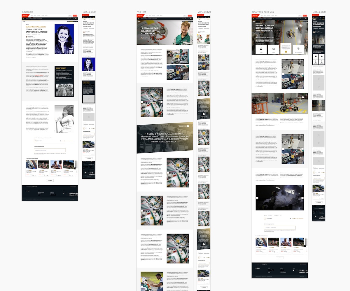
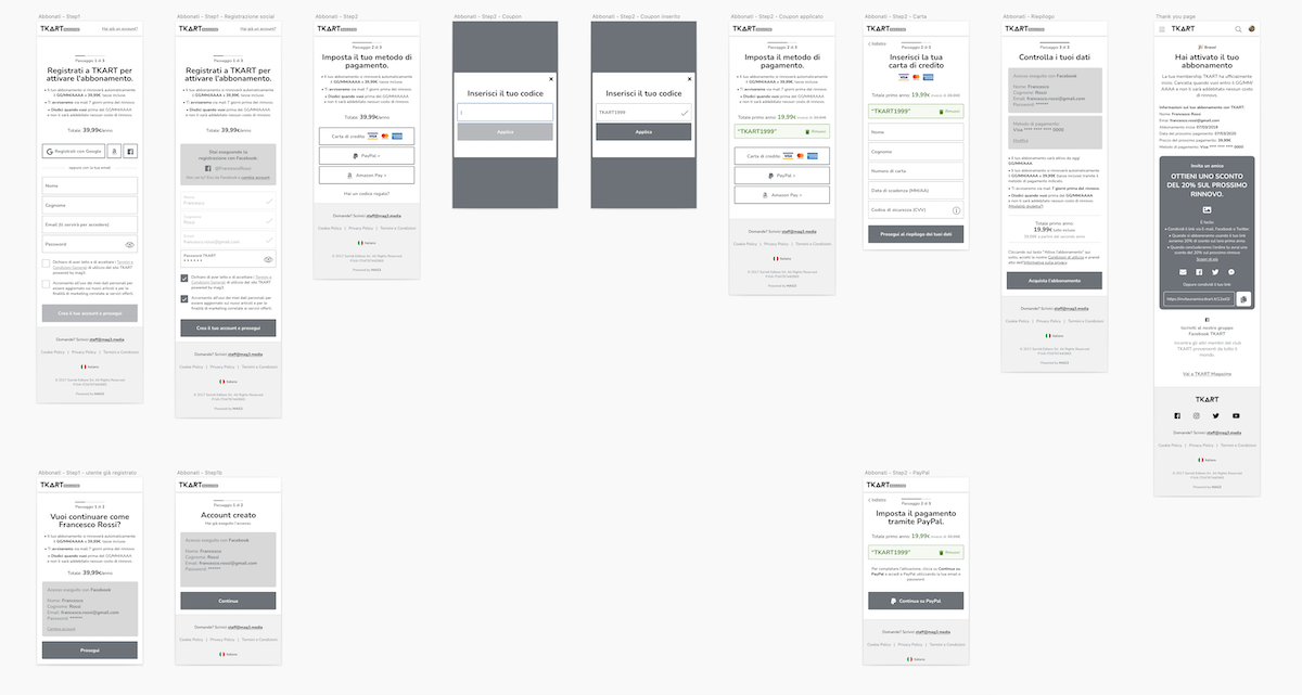
To deliver the desired outcomes for TKart’s subscription service, the project team adopted a structured and thorough process. The project began with a research phase, in which the team identified the challenges TKart was facing and gathered insights about the target audience. During the project research phase, the team conducted workshops with key stakeholders to identify priorities and develop a roadmap for the project. From there, the team moved into a funnel analysis mapping phase, carefully analyzing all the drop points to determine where users were experiencing friction in the subscription process. Based on the insights gathered, the team entered the UX design phase, creating user journeys, wireframes, and personas to guide the creation of a more streamlined and intuitive subscription process. Once the UX design was finalized, the team moved into the visual design phase, developing new layouts and design patterns that would clearly communicate the differentiation between free and premium content. After the new subscription process was launched, the team conducted a series of A/B tests to identify areas for improvement and further optimize the user experience. Throughout the process, the team maintained close communication with TKart to ensure that the design decisions aligned with the project goals and would result in a successful outcome.
“Poplab’s blend of AI-powered User Research, funnel analysis, and agile product design fueled a direct lift in TKart’s subscription conversions—every iteration was grounded in real data and user insight.”
— Growth Lead, TKart
Solution
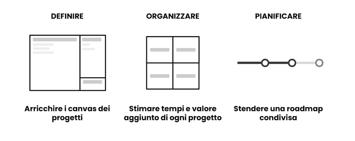
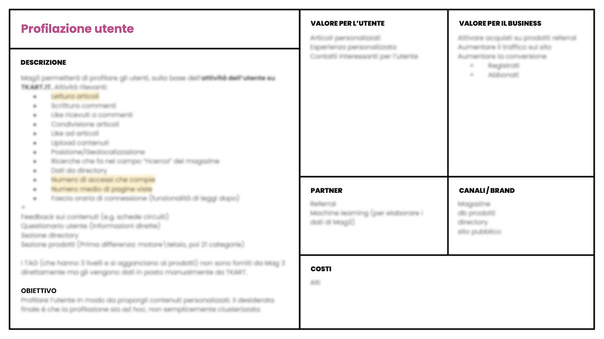
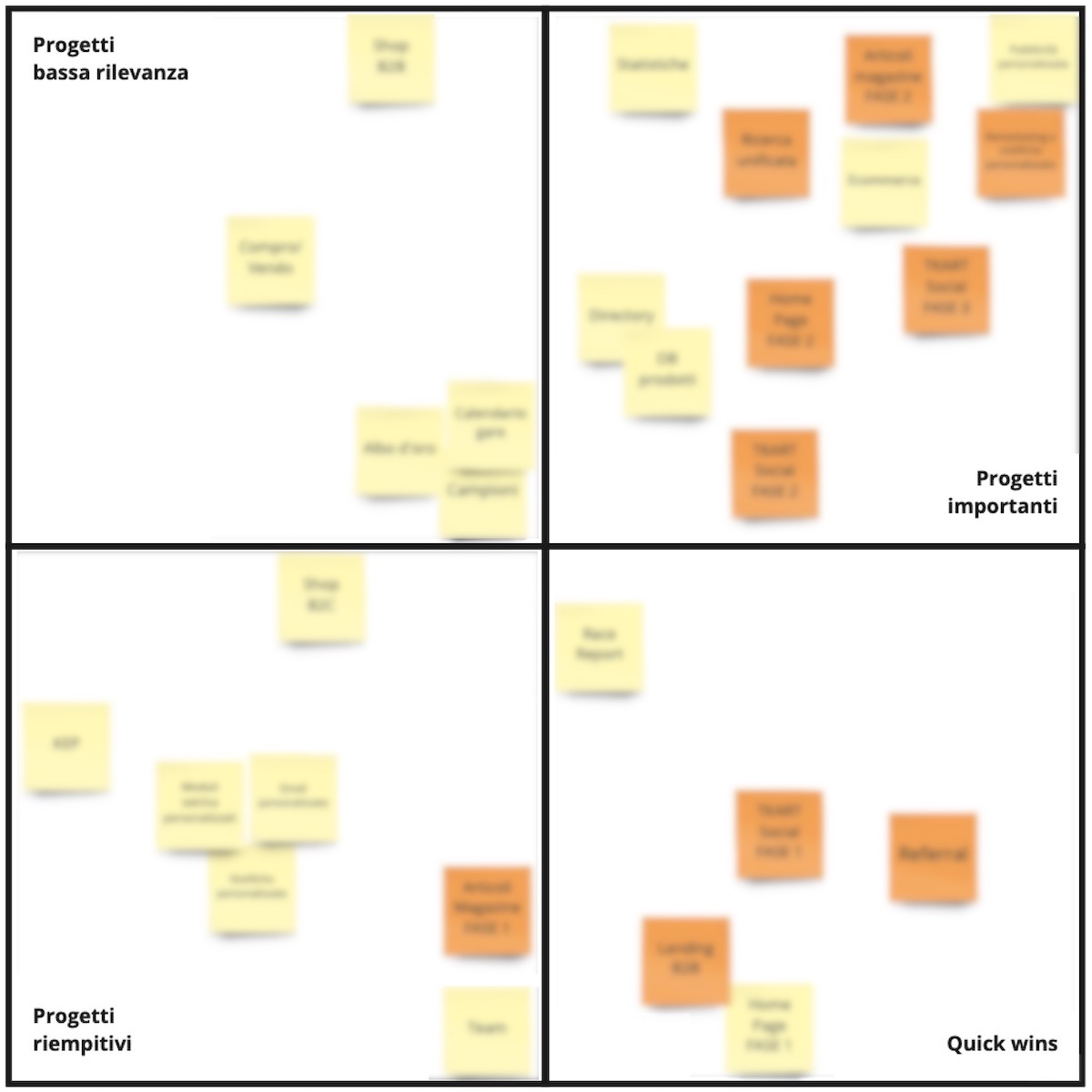
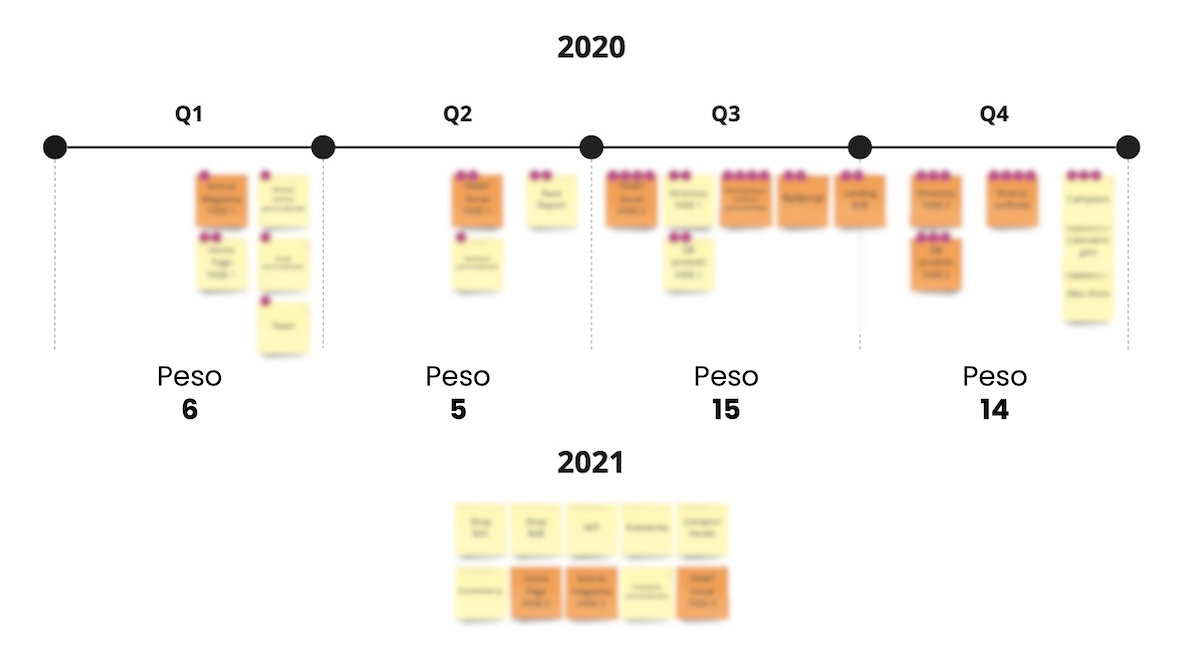
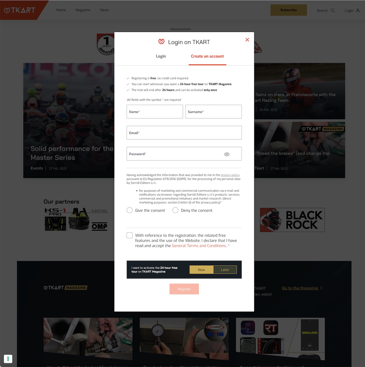
To provide a comprehensive solution to the challenges faced by TKart, the project team conducted an in-depth analysis of the current subscription process, examining the existing user flows, conversion rates, and drop points in the funnel. This analysis provided essential insights for the design team to develop a new solution that would address the identified issues, including the development of a membership dashboard, multiple subscription plans, a paywall, checkout process, and landing pages. The team held two workshops with key stakeholders to define priorities and a detailed mid-term roadmap, ensuring that the project remained aligned with the business objectives. The client team was engaged and driven, contributing significantly to the success of the initiative.
“Workshops and roadmap planning, supported by AI-driven journey mapping, revealed friction points in our subscription funnel. The resulting upgrades made the difference—transforming sign-up flow and driving new revenue streams.”
— Subscription Manager, TKart
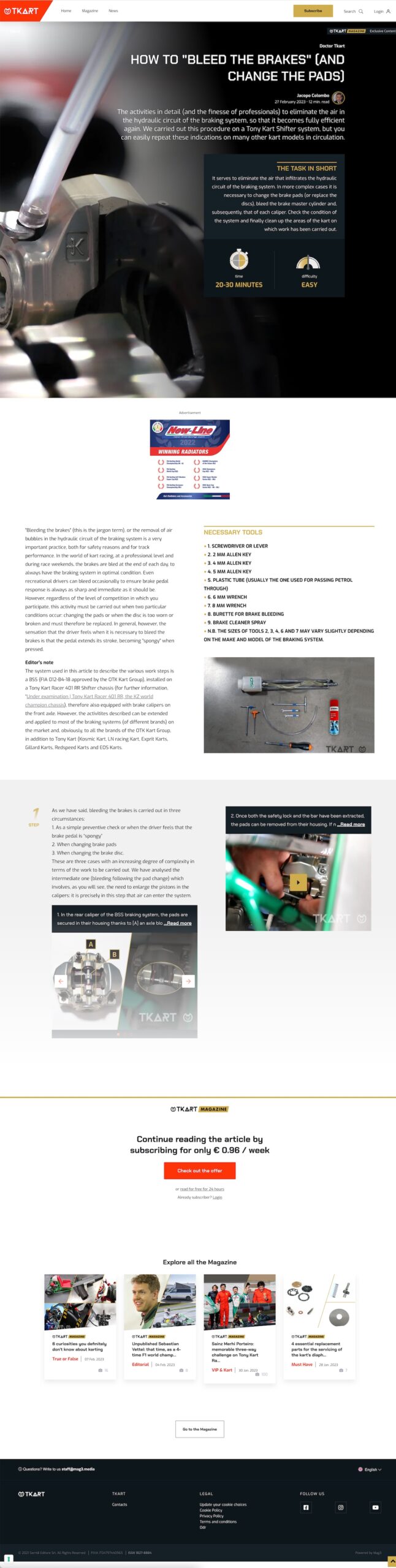
The new branding, with its refreshed visual design, looked amazing and helped reinforce tkart’s position as a leader in the industry. Shortly after the launch of the new solution, conversion rates increased, and feedback from subscribers and free tier users was encouraging. The success of the project paved the way for new initiatives, including the creation of additional content and services, as well as continued optimization of the subscription process. Overall, the project demonstrated the value of a user-centered approach and collaborative design process in achieving the business objectives of TKart.
My contribution
As the project lead for the delivery of the new subscription process for TKart, I played a crucial role in the success of the initiative. My involvement was both hands-on and strategic, and I was responsible for managing the entire delivery project. This included setting up and conducting the workshops with the customers to define priorities and the detailed mid-term roadmap, as well as coordinating with the developer teams to ensure smooth handoff of the design assets. I also played a key role in reviewing wireframes, user journeys, and visual design outputs, and was responsible for solving ongoing roadblocks for the wider project team. Additionally, I implemented a Jira-based agile delivery process to ensure that the project was delivered on time and within budget. Overall, my role was critical to the success of the project, and I am proud to have played a key part in delivering a solution that met the needs of both TKart and its subscribers.
“By integrating AI-enhanced UX/UI Design and continuous A/B testing, Poplab unlocked new content creation momentum and tighter funnel performance—delivering sustainable business impact from launch day onward.”
— Digital Editor, TKart
Learning
Through my work on the TKart project, I gained several key learnings that have since informed my approach to similar projects. Firstly, I realized that a deep understanding of the business objectives and key requirements was crucial to delivering an improved user experience that ultimately increases business returns. It was also essential to analyze and address product-related drop points in the funnel. Secondly, I learned the importance of focusing on the highest priority problems and aligning the team’s activities around them to ensure that we were making the most impactful changes. Lastly, I learned the importance of being flexible and iterative in adapting to the client’s changing requirements, and the value of consistently demonstrating flexibility and agility as a design team. These lessons continue to guide my work on subsequent projects, as I strive to deliver user-centered designs that meet the needs of both the user and the business.
Trusted by product teams at