
Background
Colla Studio, a design agency, was hired by Geologie – a men’s skincare manufacturer and retailer – to improve the UX of their mobile and desktop web presence. As an external consultant, I joined the project as a Product Designer with the main task of improving the UX of two key user journeys.
Challenge
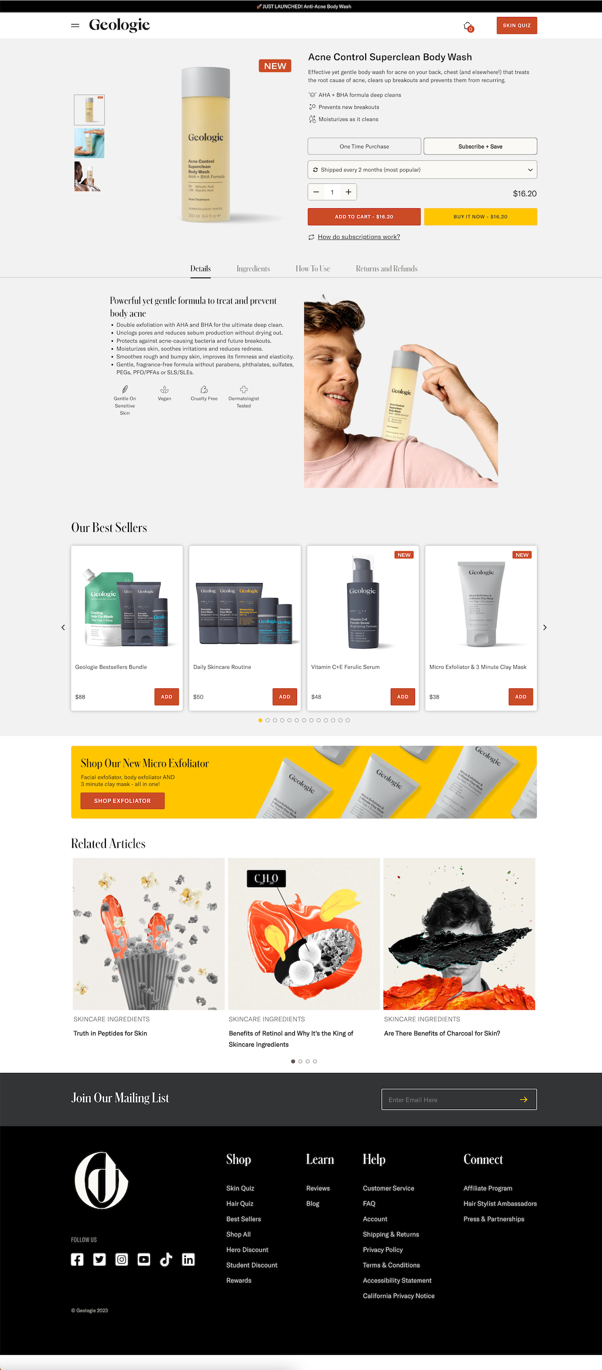
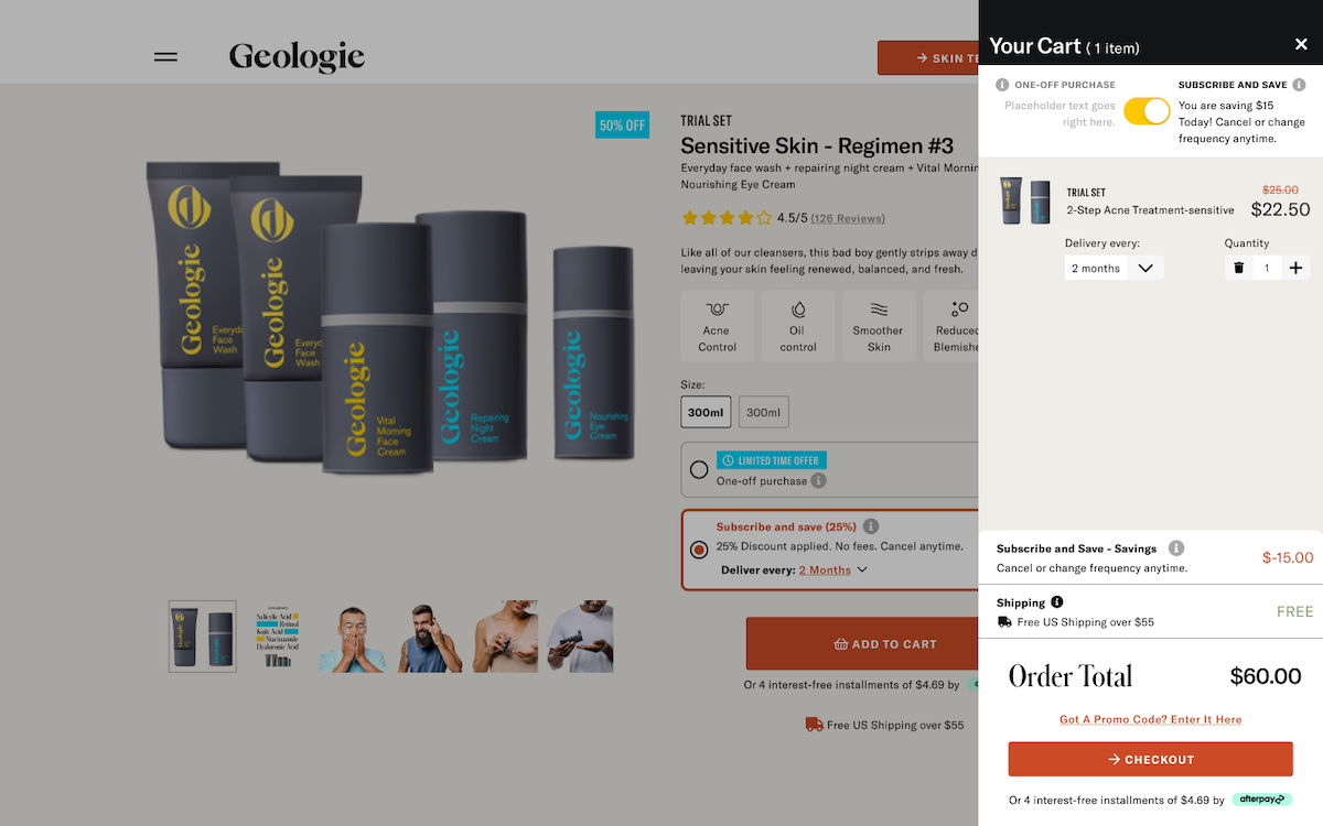
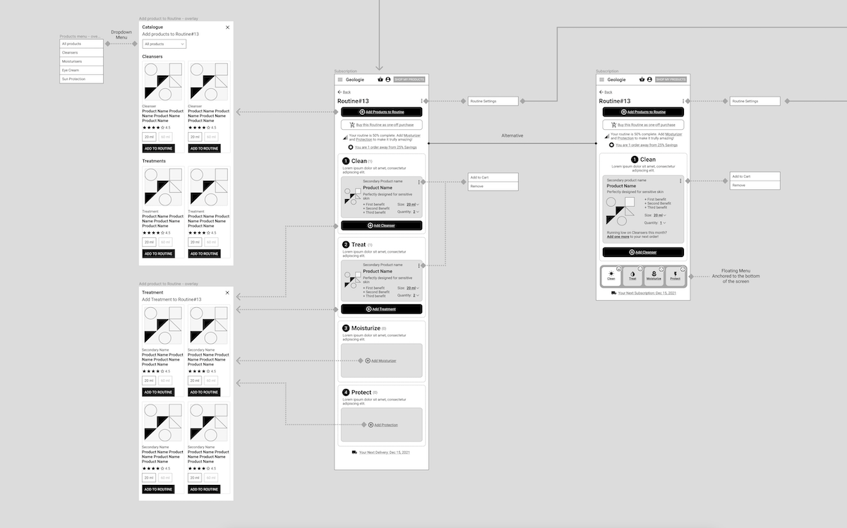
The initial engagement was focused on two key user journeys: shopping and account management experience. The main goals of the redesign were to improve product discovery, increase conversion rates in both one-off and subscription buying modes, and enhance subscription management experience of skincare routines available in the buyers’ account.
Process
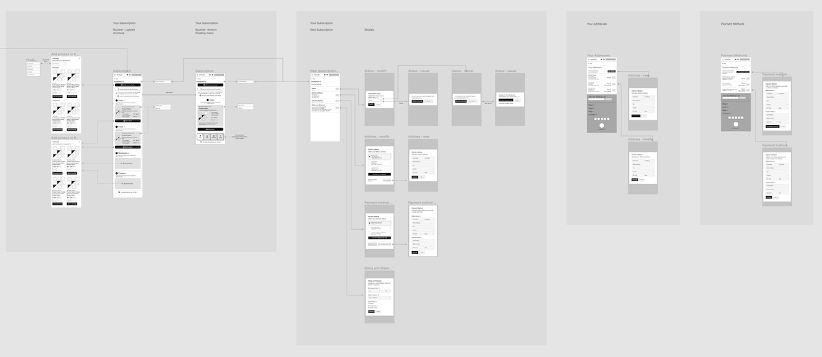
The process adopted to deliver the desired outcomes was straightforward since the customer had a semi-polished idea of the final outcome in their minds. Two workshops were conducted in the initial phase where the brief and key business metrics were presented to the team. This was followed by a short benchmarking phase and the team quickly started generating concept sketches and wireframes. Short but focused review sessions followed until the final outcome was approved, and the project moved towards the UI design phase. Figma combined with Slack enabled teams to collaborate fluidly on concepts and initial ideas, refining more polished deliverables until the final outcome was handed over to the client’s dev team.
“Poplab’s AI-driven UX workshops and rapid-fire wireframing lifted conversion and subscriptions while keeping our premium brand intact.”
— UX Lead, Geologie
Solution
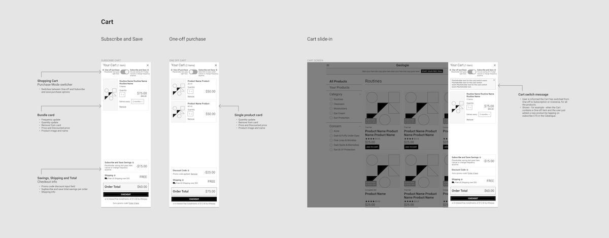
Geologie is a customer with very solid knowledge about their business and customer behaviours, which was extremely helpful in starting the project. Our goal was to build our solution on top of the tremendous knowledge and business experience Geologie accumulated over years of doing business in the skincare space through digital channels. Our solution was laser-focused on key problems to solve that we were briefed on since day one: enhancing the overall UX, increasing subscriptions to skincare routines, and setting up an experience where customers can buy more products and feel good about it. We opted for an incremental approach since we knew the current implementation was already doing well in terms of sales. We were asked to preserve the existing design guidelines, so we focused initially on the UX. We carefully improved the hierarchy of the key pages and all the elements present in those pages. This approach, combined with accurate selection of elements to prioritize in every step of the user journey, made the difference and delivered the desired outcome requested by Geologie.
“Strategic AI design and advanced product management put business and user goals on the same track. Growth and delight, measured and delivered.”
— COO, Geologie
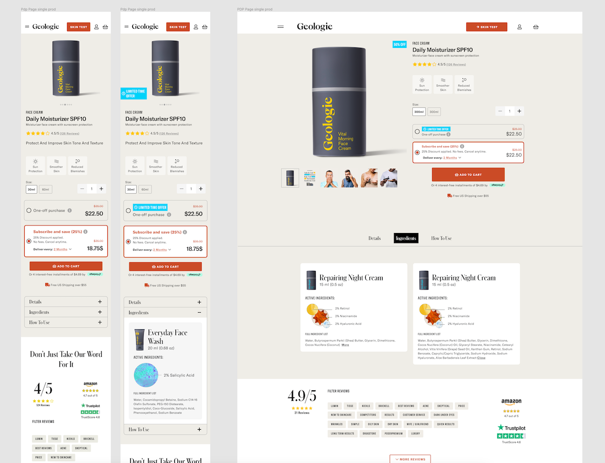
My contribution
During the Geologie project, I served as a Product Designer responsible for improving the UX of the shopping and account management experience for the brand’s web and mobile platforms. As part of the project, I was involved in user experience design activities, including the creation of hi-def wireframes that served as the final outcome. I also took part in the initial project discovery phase, working with the customer to generate the project brief and agree upon key strategic directions. Additionally, I led several workshops with the entire workgroup to review and iterate wireframes and user journeys. Our collaborative approach involved close communication and alignment on project goals, timelines, and design decisions with the aim of creating meaningful digital experiences that met and exceeded the expectations of end-users.
Outcomes by the Numbers
19%
growth in new skincare subscription enrollments within 3 months of launch
13%
increase in average order value for new and returning customers
22%
improvement in overall website conversion rate (sessions to purchases)
17%
decrease in abandoned carts at checkout
23%
of new customers made a repeat purchase within the first 3 months
48%
of users who completed the skin quiz purchased a recommended routine
24%
improvement in conversion rate on mobile devices
16%
growth in organic sessions driven by SEO-focused redesign
Results achieved three months after go-live.
Learning
The importance of asking the right questions on priorities during the initial conversations with the customer was reinforced. Sometimes the key information and project priorities aren’t disclosed, which can negatively impact the project timeline by increasing the number of iterations needed to close the design cycle.
“Instead of a full overhaul, targeted AI-informed UX updates delivered compounding results—faster, founder-focused, risk-free.”
— Ecommerce Manager, Geologie
Trusted by product teams at