
Background
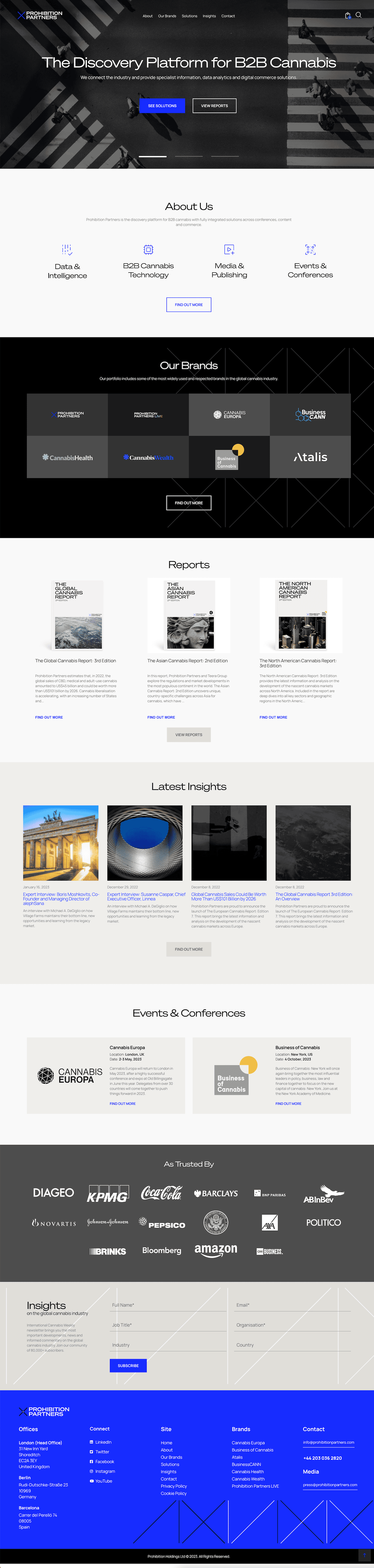
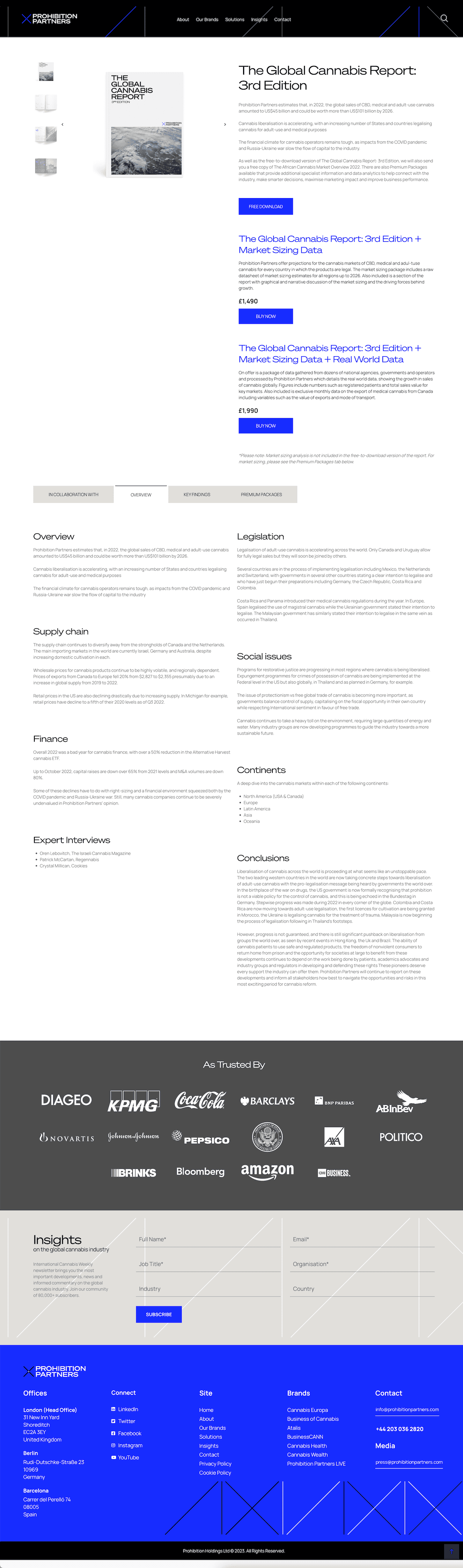
Prohibition Partners provides advisory services and strategic solutions to investors, operators, major companies, and governments to help them access the potential of the cannabis industry. The project initially aimed to consolidate the group’s multiple web properties into one entity and update the website’s visual language with new branding, which includes the new branding elements.

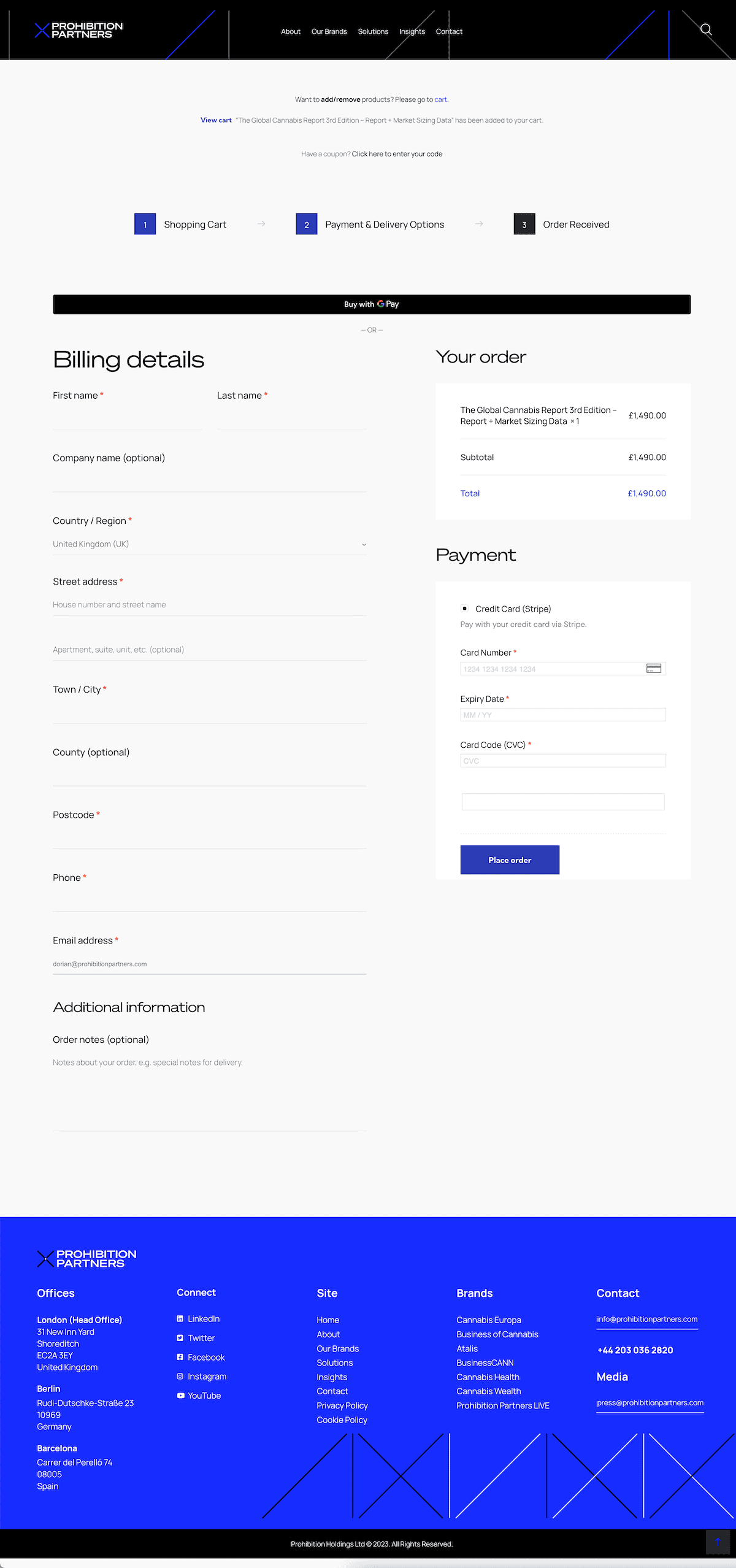
However, the scope later shifted to improving the existing B2B e-commerce component and de-emphasizing the multi-site merge initiative.
Challenge
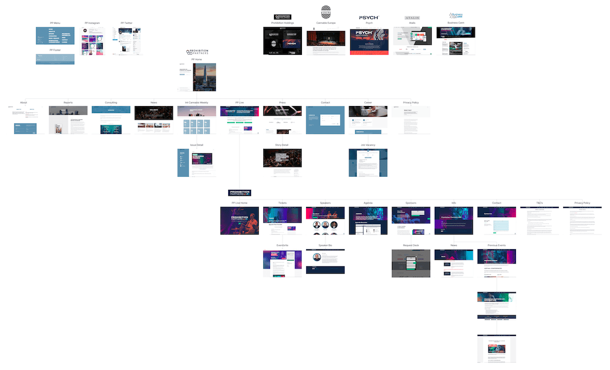
Prohibition Partners, a subsidiary of a B2B group that includes Cannabis Europa, Business of Cannabis, BusinessCann, and Atalis, embarked on a project to streamline its digital portfolio of brands and products. The website of Prohibition Partners required a significant overhaul of its content, branding, and other assets, as well as structural integrations with other group properties into the revamped Prohibition Partners website.
“Deep dive AI audits and sentiment analytics let us spot and fix critical frictions—every redesign move mapped to growth-ready metrics.”
— Analytics Lead, Prohibition Partners
Process
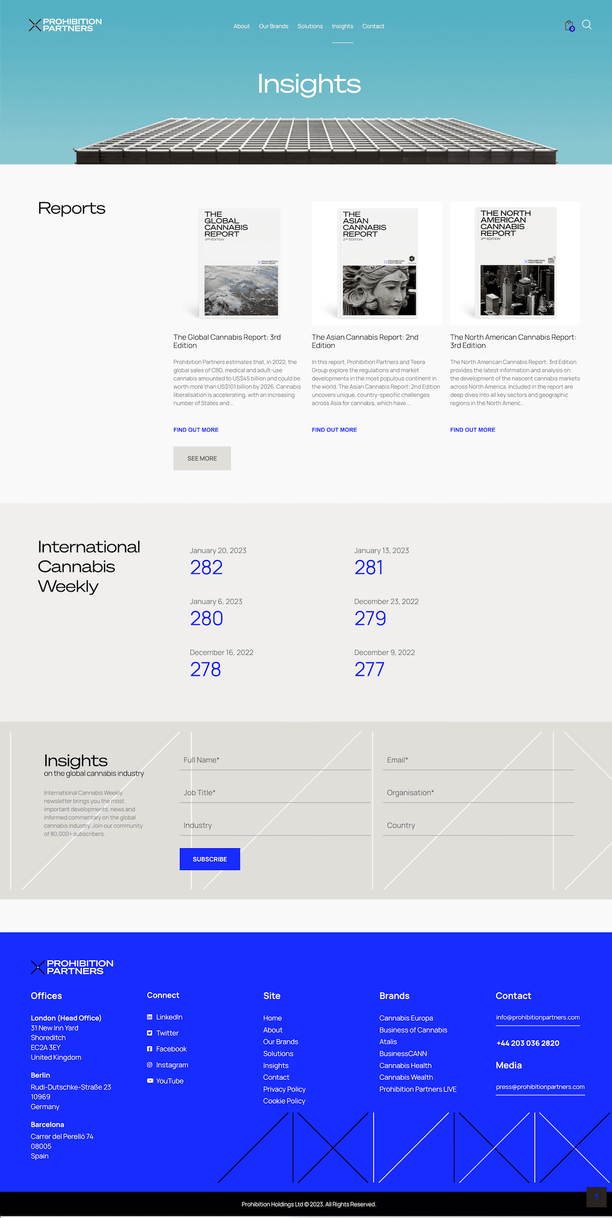
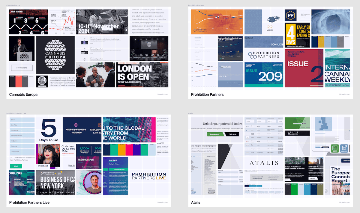
The first phase of the project involved conducting a benchmarking analysis of competitors, followed by an assessment of the website’s content. These two critical activities helped inform the next phase of the project timeline. Through a series of rapid iterations, the team defined and approved a consolidated high-level sitemap, and subsequently developed a detailed sitemap. Wireframes were then created, and an interactive prototype was completed. To help guide the team, mood boards were created to understand the inconsistencies in visual language across the group’s web properties and products. At the end of this process, the visual design was developed in Figma, and detailed specifications were created in Zeplin for the developer team to implement.
“Poplab’s AI-driven rapid prototyping and advanced UX/UI design consolidated multiple brands, delivering clarity, and real KPI impact from the very first sprint.”
— Head of Digital, Prohibition Partners
My contribution
As a User Experience designer, my key role on the Prohibition Partners project was to carefully analyse the company’s existing web properties and strategically combine important content and functionality to build a new entity. It was important to do this without compromising the existing brand architecture and established user patterns, while also enhancing the overall user experience. This process required carefully orchestrated rapid prototyping and iteration cycles, as well as feedback sessions with key stakeholders from different organizations. Since there was no dedicated project management role in the early stages of the project, additional effort was required to establish optimal workflows and ensure efficient implementation.
Outcomes by the Numbers
27%
increase in qualified B2B leads captured through digital channels
39%
growth in website traffic from targeted cannabis industry segments
33%
higher conversion rate for report downloads and content access
42%
increase in traffic to thought leadership and market insights pages
24%
higher engagement with premium content and industry reports
58%
more newsletter and event sign-ups via the website
29%
growth in qualified inbound partnership inquiries
30%
greater completion rate of contact and partnership forms
Results achieved six months after go-live.
Learning
One key takeaway from a project like this is the importance of thorough preparation in order to properly evaluate the current content landscape. Additionally, conducting in-depth stakeholder interviews is crucial to minimize the risk of missing important aspects of the project. Analytics can also be a valuable tool for crafting solutions, as even small details that may not seem important at first glance can make a significant impact. Lastly, involving users in the early stages of the project was essential in order to gain valuable insights on their perspective.
“Integrated AI content and branding strategies allowed us to hardwire new growth levers directly into the digital experience—brand and business scaling, powered by design.”
— Director of Strategy, Prohibition Partners
Trusted by product teams at