Background
Jot didn’t start as a product spec. It began with a provocation: in a world glutted with half-baked journaling apps, why does digital diary-keeping still feel stuck in last decade’s UI—and why is it still so much work for the TikTok generation?
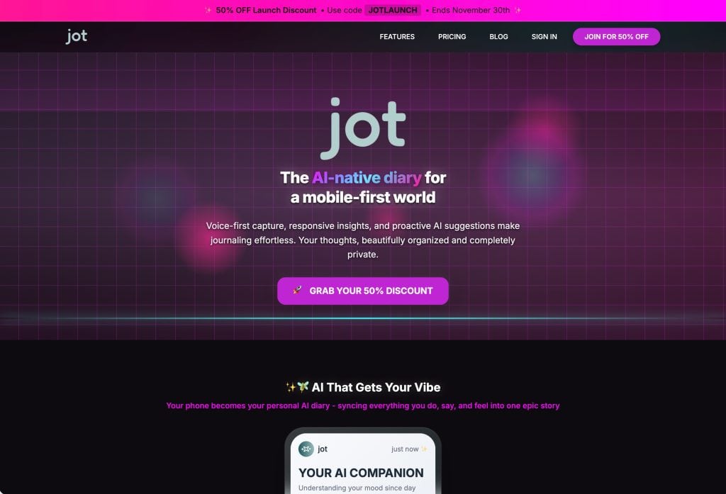
The mandate from LettsGroup was blunt: move fast, use only AI tooling, and ship something the Gen Z crowd would actually use (and pay for) in weeks, not months. The result is Jot—an AI-native, mobile-first diary engineered for simplicity, privacy, and “just talk and your story writes itself” hands-free capture.
Challenge
Building Jot meant taking on every annoyance people have with digital journaling. First, we had to make journaling feel fun—not like boring homework—because Gen Z won’t use anything that feels like a chore. That meant removing every barrier to entry, especially the old-school obsession with typing everything out.
We also had to balance thoughtful, meaningful reflection with fun, social features that keep people coming back, all without turning it into shallow content. Sticking to an AI-only development process made everything even more challenging—every bug, glitch, and missing feature had to be solved with AI tools, fast.
On top of that, we had to build trust with real privacy, not just empty promises, in a time when “AI” often means collecting user data. The bottom line: if Jot wasn’t dramatically easier, smarter, and more secure than other apps, there was no point in launching it.
Process
Poplab built Jot the experimental way: pure AI-stack, rapid prototyping, and furious iteration over Figma-driven blueprints. Design, backend, mobile code—all wrangled with generative tools. When the mobile export broke, we ditched native and doubled down on a progressive mobile web app to keep speed and control our destiny (and revenue).
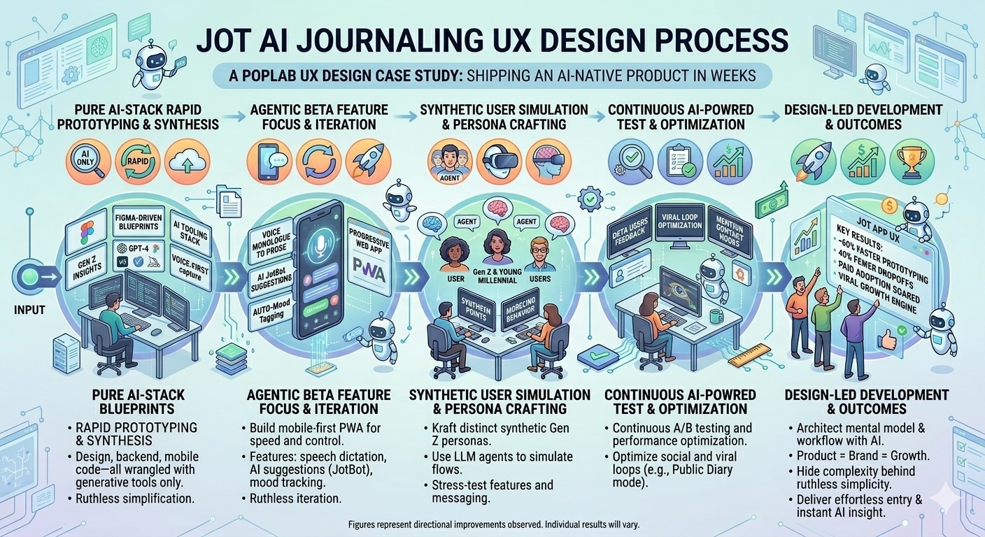
“Poplab’s AI-Enhanced Product Innovation and voice-enabled user flows dropped onboarding to seconds and got Gen Z to rate the experience a ‘frictionless 10/10.’”
— UX Researcher, Jot
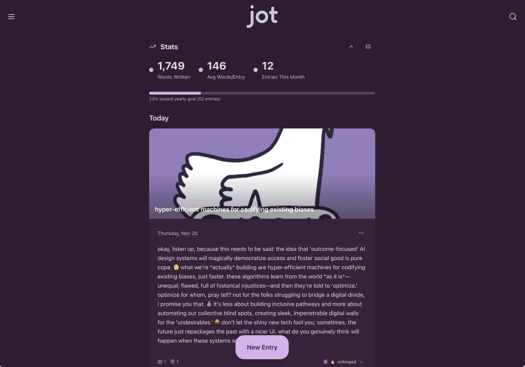
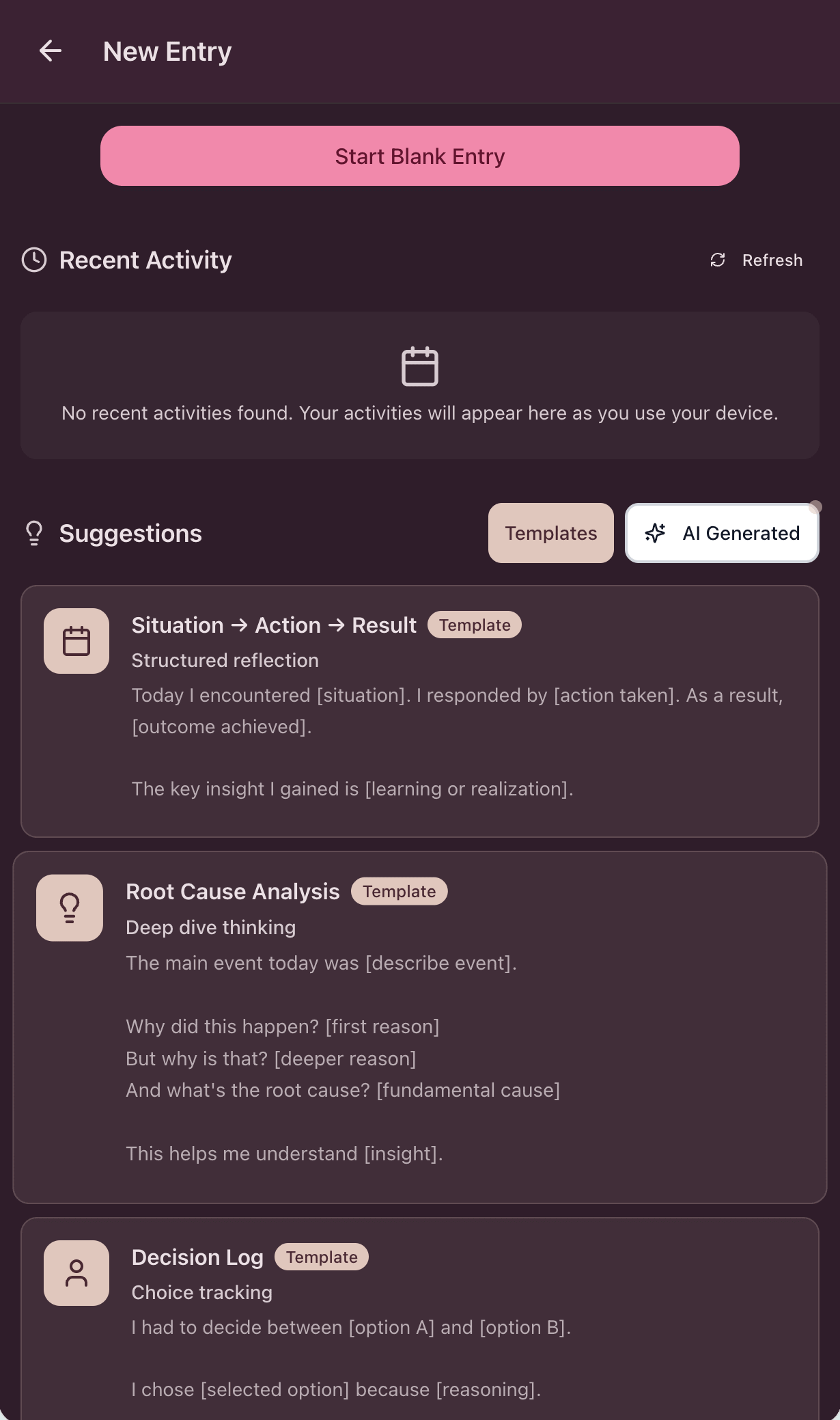
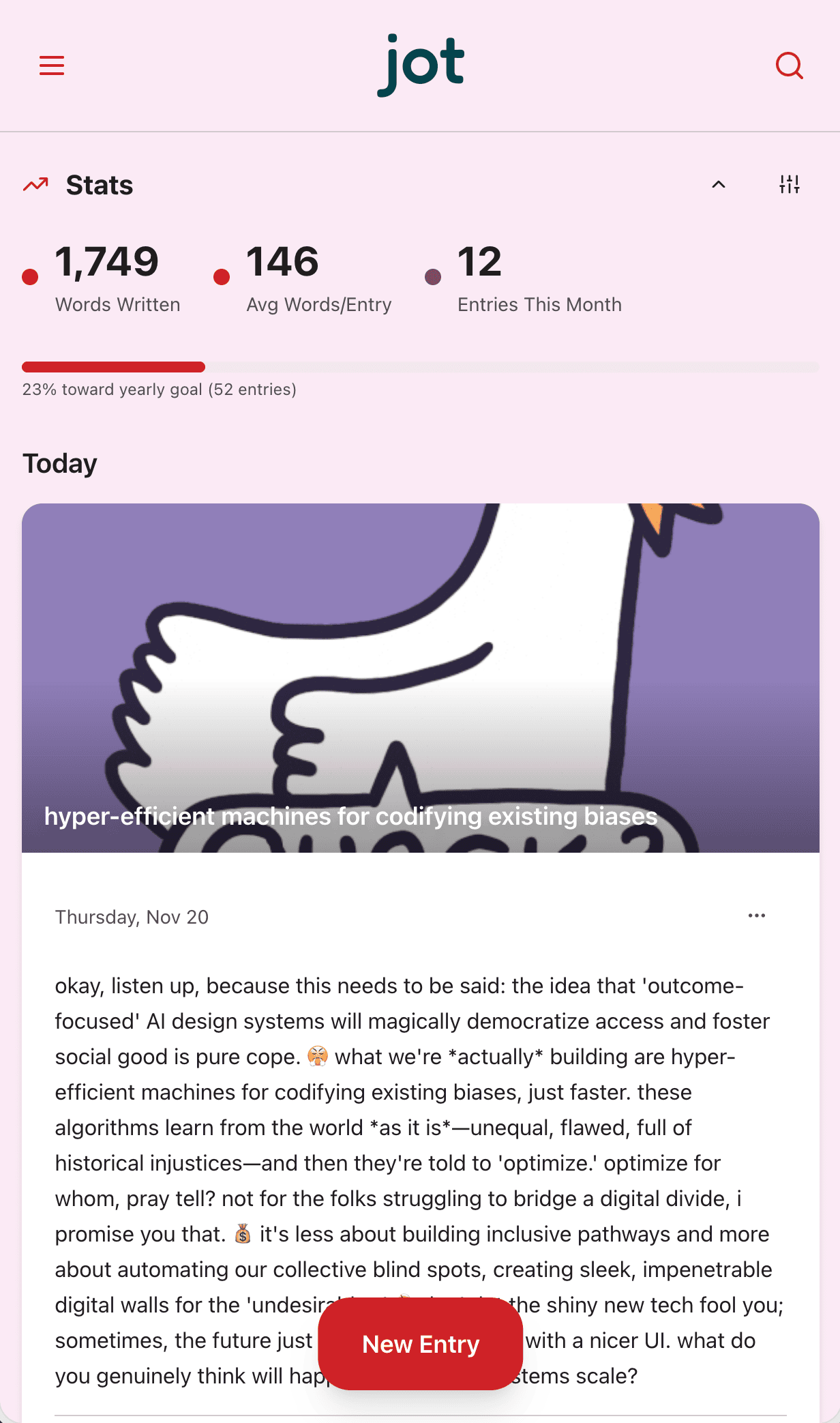
Beta features were ruthlessly focused: speech dictation converts up to three minutes of monologue into ready-for-TikTok prose; AI “JotBot” offers suggestions in your vibe (Analytical, Creative, Encouraging, Mindful); auto-tagging, mood tracking, “mention a contact” viral hooks, and a price model designed for annual ownership, not kill-you-slowly SaaS churn.
Testing? We let the chatbots eat our own cooking—OpenAI Atlas running synthetic Gen Z user flows, surfacing friction points and must-haves. Marketing? Same spirit: a “Dear Jot” public diary, social-first content, and gorilla-hugging the first 100 users through peer outreach.
Solution
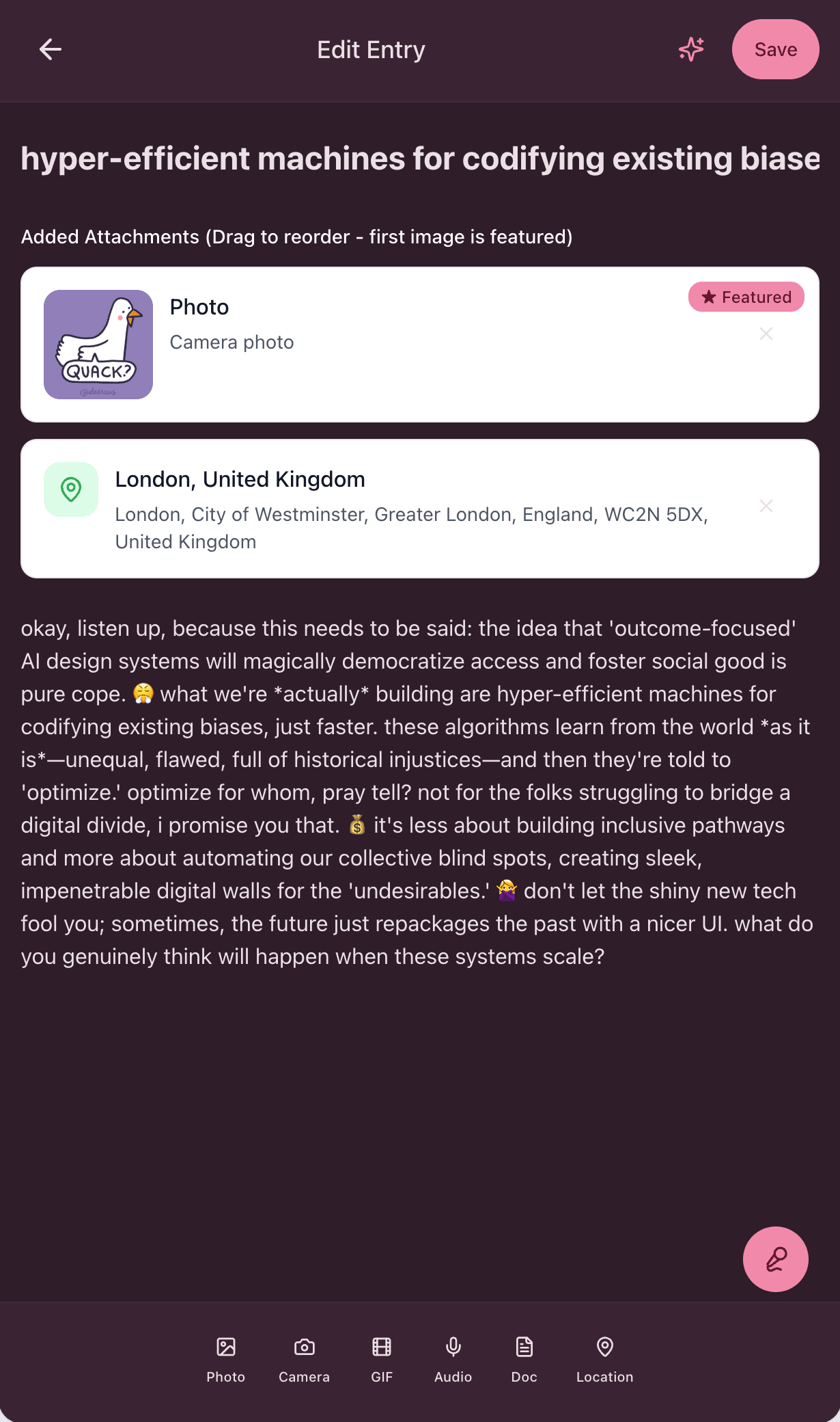
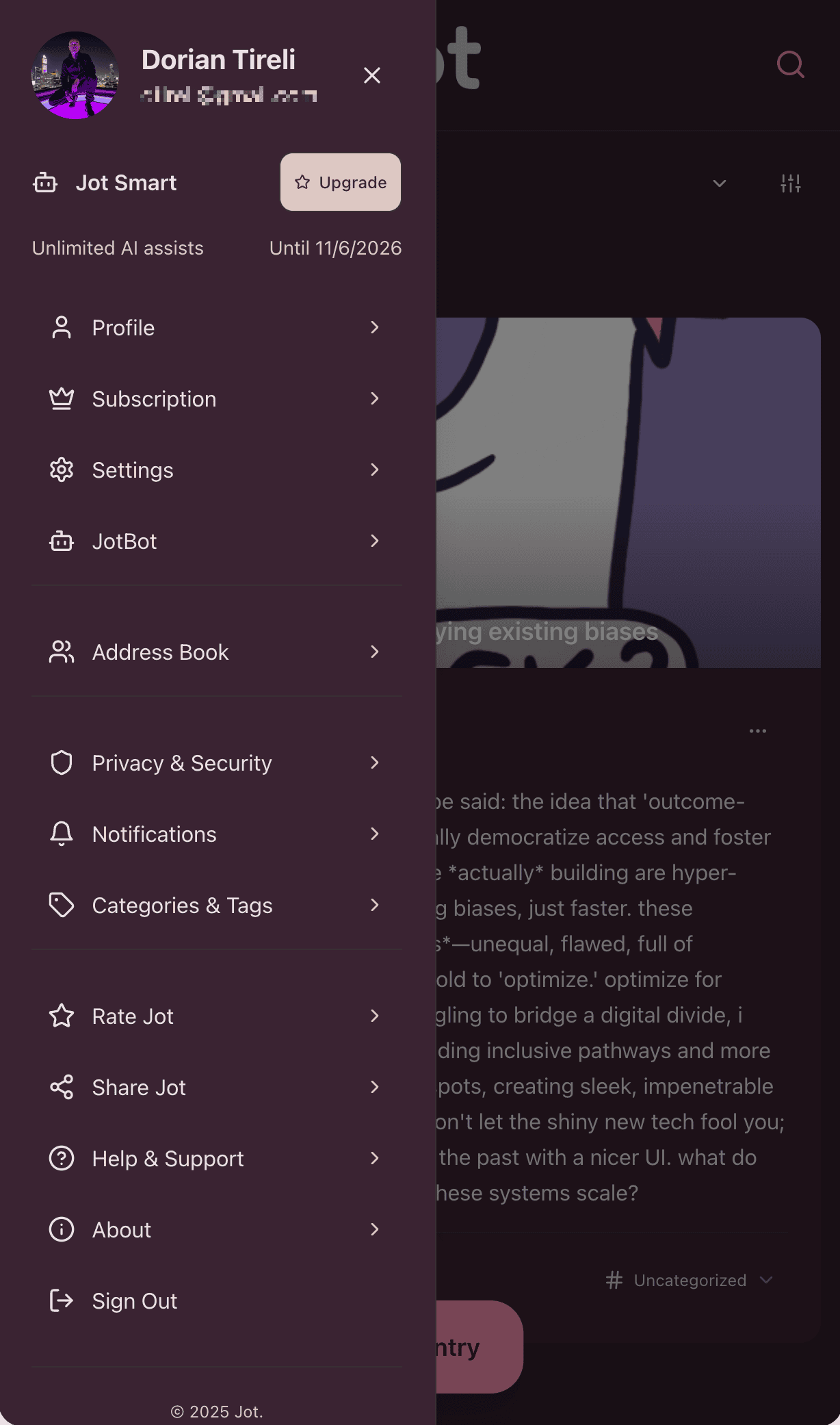
Jot delivers what every journaling app promises and fails to land: effortless entry, instant AI insight, and a vibe that says “Gen Z runs the show.” Users can talk, type, snap, or attach media—entries become smart memories, organized and insight-rich, not digital dust. AI is ever-present, never invasive: it suggests, reflects, and even matches your voice and mood, but always lets you steer.
“Churn vanished. Paid adoption soared. By leveraging AI-powered prototyping and continuous optimization, every new feature doubled as a viral growth engine.”
— Product Owner, Jot
- Monetization: Annual subscription only. No free tier, no gimmicks. You buy your diary, just like the analog days—with one killer caveat: you get a souped-up AI sidekick.
- Voice-First Game-Changer: Dictate and done. The “just talk to your diary” feature made testers call it a frictionless, 10/10 experience.
- Real AI Utility: Writing suggestions, prompts, mood tagging, and more, all genuinely context-aware—not just filler.
- Viral Loops: Mention a friend, trigger an invite. Public journal mode for shareability. All with ironclad privacy.
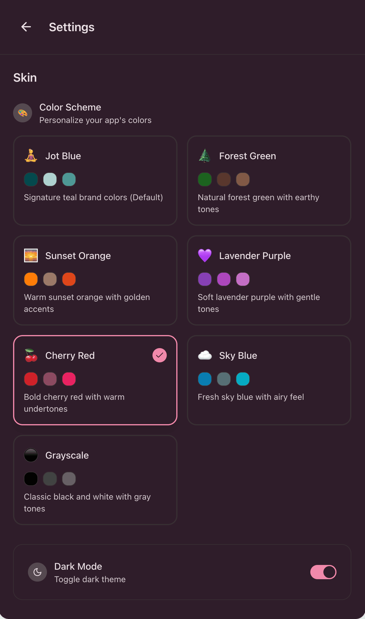
- Design: Clean, minimal, distraction-proof. Skins, dark mode, and a reading-first interface.
Learning
Building Jot wasn’t just about pushing pixels—it was a crash course in designing with AI, for humans who don’t tolerate time-wasting. From day one, every decision was validated by synthetic user simulations and rapid persona crafting. We used AI not only to prototype but to model how our Gen Z/young millennial audience would behave, test messaging, and surface friction before real users ever touched the app. Personas weren’t generic—each one was stress-tested against the product, and the results fed right back into the feature roadmap.
“Hands-free AI capture and personalized content journeys, architected by Poplab’s AI-driven UX, completely transformed how users engage and share.”
— Product Manager, Jot
- AI-only dev is brutish—but fast. Building with AI tools showed that complexity is the enemy of user delight, and it pays (in both speed and cash) to hide it behind ruthless simplicity.
- Minimal UI = maximal adoption. Anything that slowed Gen Z down got torched. Beta showed “public diary for Gen Z” content is a magnet if you nail voice and authenticity.
- Platform constraints = opportunity. Running as a web app first saved margin and let us update at full throttle, outpacing anyone chained to app store process hell.
- Product = Brand = Growth. Every feature doubled as a marketing hook. Social “Dear Jot” diaries drove early hype and word-of-mouth.
My Contribution
As hybrid design lead, co-founder, and product owner, I architected both the product’s mental model and workflow—using AI from the first Figma prototype to pixel-perfect UI. I prototyped the solution in Figma Make, built the public-facing website, generated AI-powered social media videos, and defined the brand identity from scratch. My process included crafting personas, validating flows with synthetic users, and relentlessly ensuring AI powered the core experience (not just the pitch deck). I shaped messaging so every touchpoint delivered on the “private, intelligent, frictionless” promise, while partnering with engineering and marketing to make sure vision shipped real, fast, and on-brand.
Trusted by product teams at