Your landing page is probably beautiful. Nice gradient. Clean hero. A clever AI-flavored tagline that took you three iterations to land on. And somewhere in there — a “Book a Demo” button that’s getting a 1.2% click-through rate.
You’re about to walk into a Series A meeting. That page is the first thing the partner’s associate will open on their laptop. In the 90 seconds before you start your deck.
Here’s the uncomfortable question: does it do its job?
Most AI Startup Landing Pages Are Built to Impress, Not to Convert
There’s a specific kind of landing page failure that’s almost invisible — because it looks great.
The problem isn’t the visual design. It’s the strategic layer underneath. The page answers the wrong question. Instead of “why should I care right now,” it answers “look how sophisticated we are.”
Investors have seen thousands of these. They can smell the gap between product confidence and narrative clarity in about eight seconds.
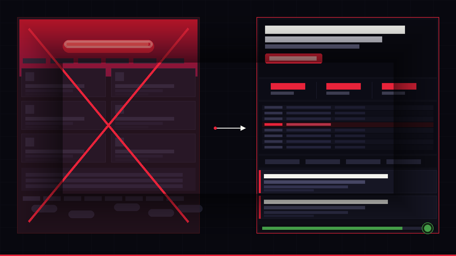
Here’s what a strategically broken page looks like in practice:
- The hero says what you are, not what you do. “Agentic AI for enterprise workflows” is a category, not a value proposition. Investors don’t fund categories — they fund outcomes.
- Social proof is decorative, not specific. “Trusted by 200+ companies” next to a grid of logos means nothing without a number that matters: ARR, churn rate, activation time, NPS.
- The CTA is vague. “Get started” or “Learn more” is a conversion dead end. The best-performing AI startup landing pages use CTAs tied to a specific next step and a specific promise.
- The page assumes too much prior knowledge. You’ve been living in your product for 18 months. Your visitor arrived 11 seconds ago. You’re not speaking the same language.
The Investor Lens vs. The User Lens
Most founders optimize their landing page for one of two audiences — users or investors — and accidentally alienate both.
The fix isn’t writing two pages. It’s understanding that both audiences need the same three things answered, fast:
- What does this actually do? (One sentence. Plain language. No jargon.)
- Why does it matter more now than six months ago? (Timing is a thesis, not a feature.)
- What happens if I click? (The CTA should feel like the obvious next step, not a commitment.)
When a landing page fails to answer all three in the first scroll, you’re losing warm leads, investor interest, and trial signups simultaneously. That’s not a design problem — that’s a revenue problem.
The 5-Second Test You Can Run Right Now
Open your landing page. Read only the hero section — headline, subheadline, and CTA.
Now answer these:
- Could I explain your product to a non-technical colleague based only on what I just read?
- Is there a clear reason to act today rather than bookmark and forget?
- Does the CTA tell me what I’ll get — not just what I’ll do?
If the answer to any of these is “no” or “maybe,” your page is leaking conversions right now. Every day you run paid acquisition into it, you’re paying to fill a bucket with a hole in it.
What Conversion-Optimized Actually Means for AI Products
“Conversion optimization” gets thrown around a lot. For AI startups specifically, it means something precise: reducing the cognitive distance between what a visitor sees and the decision you want them to make.
AI products have a specific trust problem. The technology is still new enough that visitors are skeptical by default. A generic SaaS landing page structure doesn’t account for that.
The pages that perform — the ones with 4-6% CTRs and demo-to-close rates that hold up in board decks — they do a few specific things differently:
They show the product in 10 seconds. Not a mockup. Not a feature list. The actual interface, doing a real thing. GIFs, embedded demos, or a 30-second Loom embedded above the fold. Credibility through specificity.
They translate AI into business outcomes. Not “our model achieves 94% accuracy.” Instead: “Your team closes support tickets 3× faster. With no retraining required.” One is a technical fact. The other is a reason to buy.
They use friction strategically. The best landing pages don’t try to remove all friction — they remove unnecessary friction and add deliberate friction at the right moment. A multi-step onboarding quiz before a demo CTA can double conversion quality because it pre-qualifies intent.
The Real Cost of a Broken Landing Page
Let’s be direct about the numbers.
If you’re running even a modest $5,000/month in paid acquisition and your landing page is converting at 1.5% when it should be at 4%, you’re wasting roughly $175 per potential lead. Over a quarter, that’s $16,000 in vanished budget — not counting the organic traffic, the warm referrals, and the investor visits that quietly bounced without a word.
A conversion-optimized landing page isn’t a cosmetic upgrade. It’s infrastructure. And unlike most infrastructure, it pays back fast — usually within the first month of launch.
What to Do Next
If your current page was built by a developer, a generalist freelancer, or a tool like Webflow with a template, it was probably built to look good — not to perform.
The fix is a structured sprint: user research, a competitive teardown, copy and design rebuilt around your conversion goal, and a live page with tracking set up correctly from day one.
At Poplab, that’s a three-week engagement. It typically moves CTR from under 2% to 4%+. The Aeonvis team saw a 36% increase in qualified leads. The process is the same every time — fast, measurable, repeatable.
If you want to know what’s broken on your current page before committing to a full rebuild, start with a Design Audit. You’ll get an annotated friction map, a copy scan, and a prioritized fix backlog — in under a week.
Because a great AI product deserves a landing page that tells the truth about it.
Dorian Tireli is the founder of Poplab, a rapid design studio for AI startup founders. He helps teams compress design cycles from months to weeks — and build products that convert.
→ See our Conversion-Optimized Landing Page sprint
→ Book a free strategy call
Leave a Reply