Effective landing pages are essential for AI startups but often focus on explaining rather than converting. Many visitors decide to leave within the first scroll, so it’s crucial to communicate the value proposition clearly.
Common pitfalls include vague headlines, weak calls to action, and mobile optimization issues. In a competitive landscape, landing pages must engage visitors quickly to prevent losing them to competitors. Addressing specific gaps between visitor intent and page content can significantly improve conversion rates.
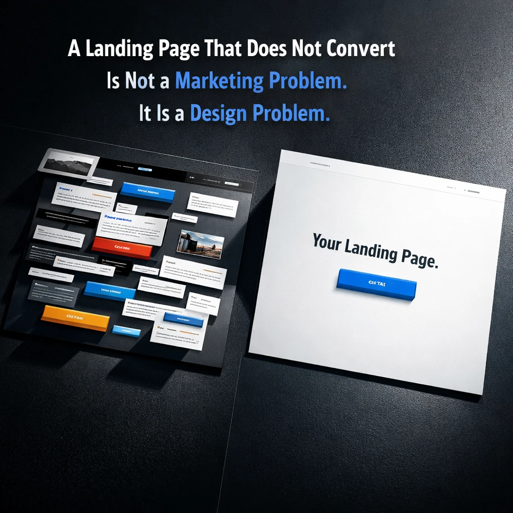
You can have the right product, the right audience, and a paid acquisition channel that is technically working — and still watch your landing page bleed money every single day. Not because the offer is wrong. Because the page was designed to explain rather than to convert.
These are not the same thing, and confusing them is one of the most expensive mistakes an early-stage AI startup can make.
Explanation Is Not Conversion
The instinct of most founding teams when building a landing page is to explain the product thoroughly. Here is what it does, here is how it works, here is why it is different, here are six use cases, here is a feature list, here is a testimonial section. By the end of the page, a visitor who reads everything understands the product completely.
The problem is that almost nobody reads everything. Most visitors make a decision about whether to stay or leave within the first scroll. That decision is not based on the completeness of your feature list. It is based on whether the first thing they see answers one question with enough clarity to keep them moving: is this for me, and is it worth my time to find out more?
A landing page optimized for explanation puts the burden of that judgment on the visitor. A landing page optimized for conversion removes that burden entirely — by making the value proposition so immediately legible, the CTA so frictionless, and the social proof so contextually placed that the visitor never has to work out whether the page is relevant to them. The page does that work for them.
The Specific Things That Kill Conversion
Most underperforming landing pages share a recognizable set of failures. A hero section with a headline that describes the product category rather than the outcome the user gets. A primary CTA that says something forgettable like “Get Started” or “Learn More” with no specificity about what happens next. A page structure that front-loads features and buries proof. Social proof that is generic rather than role-specific — logos without context, quotes without attribution that means anything.
There is also the mobile problem. A landing page built primarily for desktop, running traffic from social channels where the majority of clicks come from phones, is structurally compromised before anyone reads a word. Conversion on a poorly adapted mobile layout falls not because the offer is weak but because the experience is.
Each of these failures is independently measurable and independently fixable. Together they compound into a conversion rate that looks acceptable until you model what it would be if even two of them were resolved.
The Competitive Pressure That Makes This Urgent
In a market where AI startup categories are consolidating quickly, the landing page is often the first and only chance to establish a preference before a visitor evaluates three of your competitors in the same session. Category awareness among buyers is higher than it was eighteen months ago, which means the threshold for “good enough” on a landing page has risen in parallel.
A visitor who has seen five AI products in your category before they reach yours is not comparing your page to an abstract standard. They are comparing it to the best page they have seen today. If yours does not win that comparison in the first scroll, the traffic you paid for is funding your competitor’s brand awareness.
One Thing You Can Do Right Now
Find the most recent source of meaningful traffic to your landing page — paid, organic, or referral — and identify what the visitor was looking for or thinking about immediately before they arrived. Then open your hero section and ask whether the headline speaks directly to that intent. Not to your product category. Not to your feature set. To the specific outcome that visitor was hoping to find.
If there is a gap between what brought them there and what the hero says first, you have a conversion mismatch that no amount of traffic volume will fix.
Poplab’s Conversion-Optimized Landing Page sprint closes that gap in three weeks: user interview, competitive teardown, full copy and design, built and live in Framer or Figma Make, with conversion tracking configured from day one.
Book a free strategy call and get a proposal within 24 hours.
Leave a Reply