AI startups often miss the mark by delaying native app development while relying on responsive web apps. This approach undermines user experience and engagement, making it vital to prioritize mobile design from the outset.
Designing for mobile requires rethinking interaction patterns, focusing on user behavior and context. Teams that adapt their AI products for mobile can enhance user retention and create a more engaging experience. Addressing mobile usability gaps is crucial for success.
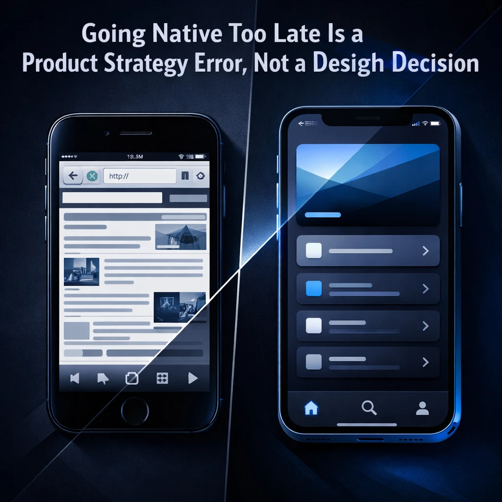
The most expensive mobile strategy decision most AI startups make is not building native too early. It is waiting too long and pretending a responsive web app is a product.
There is a familiar founder logic behind this: mobile can wait until we validate on desktop, going native is a distraction from core product work, a good PWA is good enough for now. All of that sounds reasonable in a planning meeting. None of it holds once you look at where your users actually are and what they are doing when they leave your product and open a competitor’s instead.
The Responsive Web App Is Not Neutral Ground
A responsive web app is not a placeholder. It is a statement about how seriously you take the mobile experience — and users read that statement accurately. The pinched layouts, the browser chrome eating screen real estate, the lack of native gestures, the push notification limitations, the absence from the App Store search results where a meaningful portion of your next thousand users are actively looking right now.
None of these are small frictions. In aggregate, they define a product tier. And in a market where your AI feature might be genuinely differentiated, the last thing you want is for users to form their first impression of it inside a mobile browser that was never designed for what you built.
The app store credibility gap is real and underestimated. A native iOS or Android presence communicates product seriousness in a way that no amount of responsive design compensates for. Enterprise buyers evaluating your product check whether it exists on mobile. Consumer users make snap judgments about trust and longevity based on whether a product has a real app. A web clip on a home screen is not the same thing, and users know it.
What Mobile-First Actually Means for AI Products
AI products have a specific mobile challenge that desktop-first teams tend to underestimate. The interaction patterns that work on desktop — long input fields, complex configuration panels, multi-column data views — do not translate to mobile. They need to be rethought from the ground up for a context where users are in motion, attention is fragmented, and the input surface is a thumb.
This is not a scaling-down exercise. It is a design discipline in its own right. The teams that handle it well — that design AI product workflows for one-handed use, ambient context, and interrupted sessions — end up with a mobile product that feels native to the way people actually behave. The teams that treat mobile as a shrunken desktop end up with something that technically works and experientially disappoints.
Voice input, haptic feedback, push notifications that re-engage without annoying, gesture-driven navigation that reduces cognitive load — these are not nice-to-haves in a mobile AI product. They are the surface where user habit forms. And user habit is what retention is actually made of.
One Thing You Can Do Before Your Next Sprint
Open your product on your phone right now — not in a demo, not on a large-screen device, but on the phone you actually use. Navigate to the single most important action a new user needs to complete. Count how many taps it takes. Note every moment where the interface feels like it is tolerating mobile rather than designed for it.
If the answer is more than four taps to reach your core value, or if anything feels like a compromise, you have a mobile experience gap that is costing you retention and acquisition every day it exists.
Poplab’s Native Mobile App Design sprint closes this gap in four weeks: platform strategy, a mobile UX audit, eight to twelve production-ready Figma screens, a thirty-component library, and a full dev handoff for iOS and Android. No twelve-week agency commitment, no open-ended retainer.
Book a free strategy call and get a scoped proposal within 24 hours.
Leave a Reply