Background
Atalis is a European wholesale cannabis marketplace that aims to provide a digital commerce infrastructure and tools for legitimate businesses to thrive in the European cannabis industry. It aims to fuel trade, raise standards, and remove barriers that have held the market back by improving buyer confidence, fast tracking the growth of reputable suppliers, and enabling successful, long-term commercial partnerships built on trust and transparency.

The Atalis Marketplace enables customers to confidently buy products from vetted sellers, and for sellers to reach pre-vetted customers on a platform that helps them increase their revenue, enhance their reputation and stand out.

Challenge
Building a new cannabis B2B marketplace like Atalis required careful coordination between business, engineering, and design teams. The design team faced the challenge of creating a flexible user experience that could be easily rebranded after the initial alpha launch, while also ensuring full parity of features across large and small screens. The engineering team had to work with Adobe’s Magento while building a multi-vendor environment. Another major challenge was to design and implement a smooth user and product onboarding process, which is crucial for the success of the marketplace. The project also faced challenges due to a lack of defined scope in the beginning, resulting in designs often requiring rework and major changes to support new functionalities added along the way.
Process
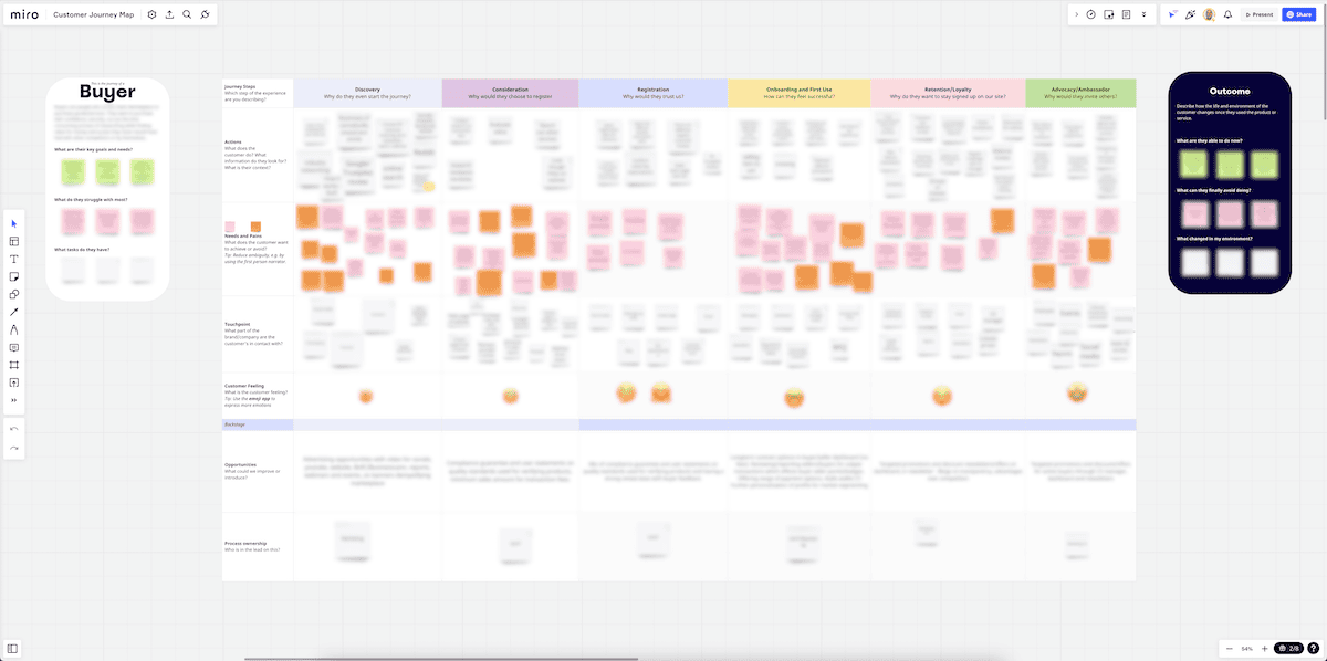
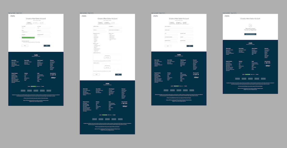
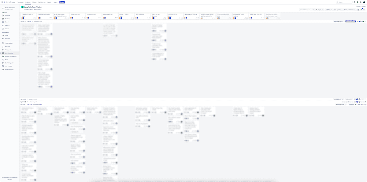
The design process for the cannabis B2B marketplace at Atalis was fully integrated into a Scrum process using two-week sprints from the start of the project. The research phase began with customer interviews to refine the project scope and set the foundation for the design phase. The team also reviewed other marketplaces in related industries. To speed up the alpha launch, the decision was made to create user journey’s first, then skip wireframes and move directly to producing batches of UI screens in Figma, covering everything from account management to data visualization modules. User flows were created to establish a common understanding of user interactions and main tasks. The team made efforts to optimize font sizes, colors, and other UI elements across different screen sizes for ergonomics and user experience. Handover and Q&A with developers were managed in Figma and Jira, and the team communicated through Slack. The project was fully remote with teams based in the UK, Poland, Croatia, Spain, and Greece.
“AI-powered product management and modular web development let Atalis launch a founder-grade B2B marketplace with no-code speed—and full AI value.”
— Founder, Atalis
Solution
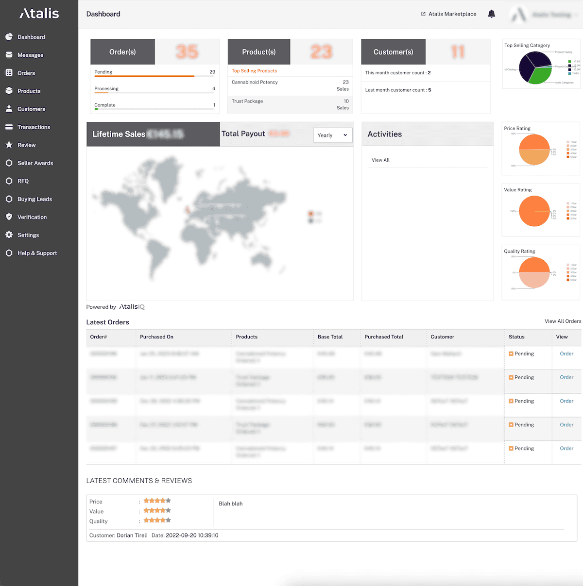
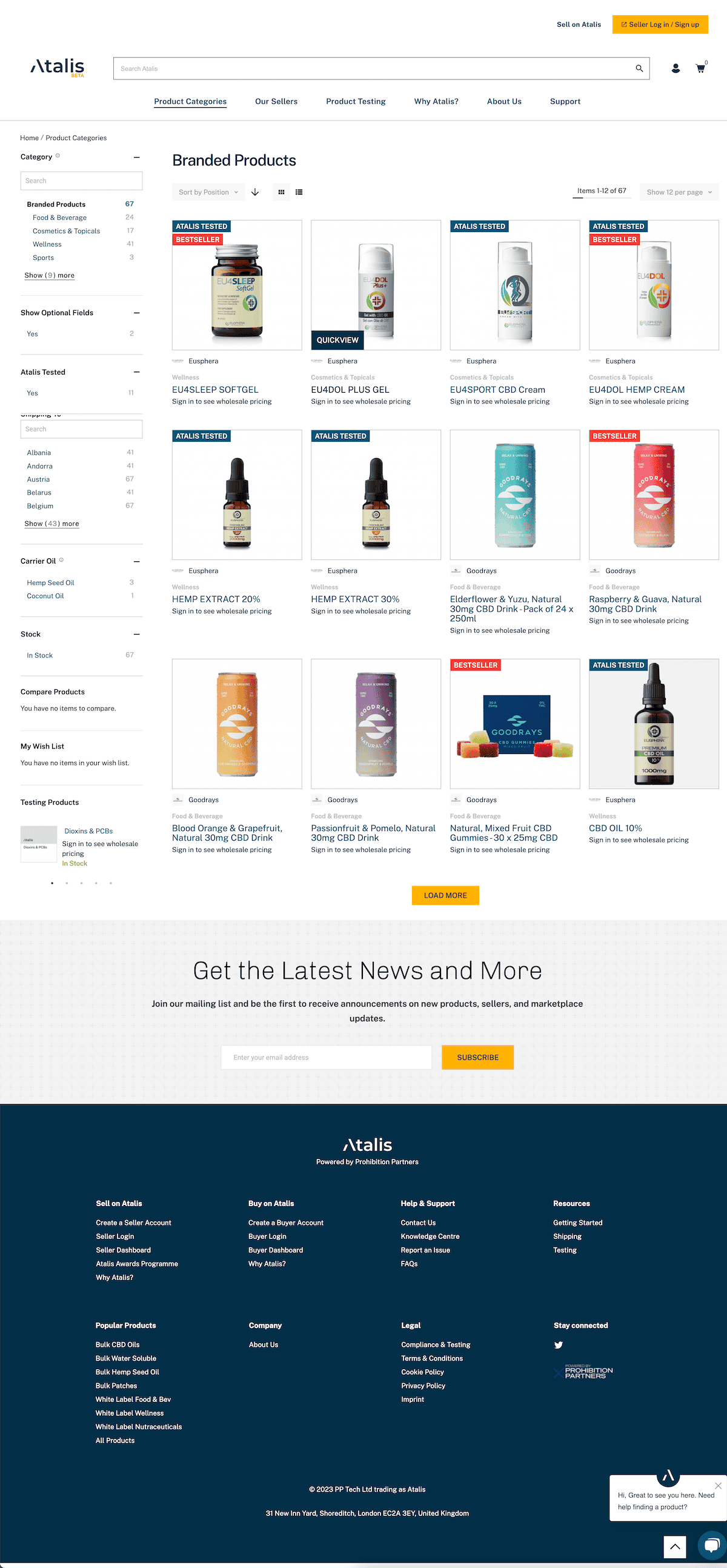
The Atalis marketplace alpha was successfully delivered in early 2022 and private beta in October of the same year. The project team was able to deliver key marketplace features with the new branding by utilizing a carefully curated technology stack based on a no-code architecture. A significant amount of time was spent on both user and product onboarding journeys, which were critical for a smooth marketplace launch. Other key features such as product discovery, an intelligent search, a smooth B2B checkout process and buyer and seller dashboards completed the user experience. All features were seamlessly optimized for mobile devices as well.
“AI-augmented onboarding and conversion-oriented UX/UI Design elevated user trust and transaction volume in a deeply regulated space.”
— Platform Manager, Atalis
My contribution
My role on the Atalis marketplace project was of a hybrid nature, covering both product design activities and product and project management. Due to the startup environment, many team members were required to wear multiple hats, and I was no exception. I was responsible for building the designs in Figma, planning roadmap activities, managing scrums in Jira, and conducting weekly workshops and design show-and-tell sessions. However, it was the only possible way to deliver a very complex system on time. My role required me to navigate these challenges and find creative solutions that would ultimately enhance the user experience.
“Real-time AI analytics and smart experience design unlocked expansion across markets—Poplab made ‘design for AI startups’ more than a slogan.”
— Operations Lead, Atalis
Learning
The Atalis marketplace project was a complex and challenging undertaking, offering many learning opportunities for the entire project team. The fully-remote team distribution and geographical fragmentation presented a number of obstacles, with communication being a critical success factor. Effective project management practices played a crucial role in fostering team cohesion and ensuring smooth delivery of the project on time. One of the main challenges faced during the design process was the constraint of using multiple no-code platforms to build the marketplace. These platforms had pre-existing UI patterns that created obstacles in creating a unified user experience. Despite these challenges, the team was able to deliver the marketplace on time, thanks to the successful project management that contributed to team cohesion and smooth delivery. The team was able to work around the constraints by leveraging their expertise in no-code platforms and by adopting a flexible approach to design. This allowed them to deliver a very complex system that met all of the key requirements, including a flexible and modular user experience and smooth performance on both mobile and desktop devices. The experience of working on this project allowed me to further develop my skills in product design, project management and team coordination.
Outcomes by the Numbers
370
qualified B2B leads generated
120
active suppliers onboarded and verified
910
unique products listed on the marketplace
630
orders processed through the platform
4.2 weeks
average onboarding time from registration to first transaction
61%
of onboarded suppliers remain active after 6 months
37%
repeat purchase rate among buyers
220
demo or meeting requests submitted by prospective buyers
Results achieved six months after go-live.

