The Short Version
Mimecast was a NASDAQ-listed cloud email security company serving 50,000+ enterprise customers across 150+ countries — later acquired for $5.8B. Their flagship admin console was the primary daily touchpoint for IT administrators managing business-critical email security, but it was generating millions in avoidable support costs: customers couldn’t complete basic tasks without calling in, and the self-service premise the product was built on was failing at scale.
I was hired as Director of User Experience to fix it — and inherited a function of two junior designers and one copywriter, reporting into Product with no research capability, no design system, and no process.
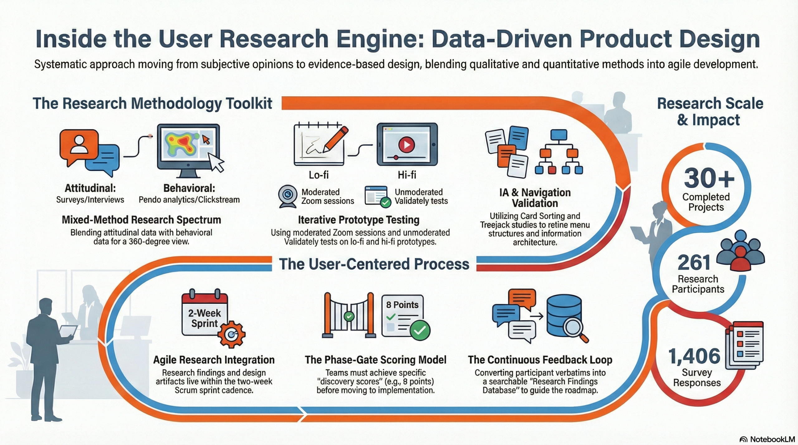
I built Mimecast’s first internal user research function, establishing a practice that delivered over 30 projects in its first year — hundreds of participants, thousands of survey responses. I chose an incremental redesign approach over a big-bang overhaul, allocating capacity across each product swimlane to tackle UX debt alongside new features — a decision that generated early wins, built internal trust, and expanded design’s mandate progressively. I built the design system bottom-up through real product work rather than as a separate initiative, and established content design as a first-class discipline with measurable impact on user comprehension and support volume. I scaled the team from 3 to 11 practitioners across design, research, and content.
The result: 91% task success on critical admin workflows, a 38% reduction in support tickets, a 42% drop in average time-on-task, and a 21-point NPS improvement — delivered at a company that went on to be acquired for $5.8B.
Role: Director of User Experience
Company: Mimecast — cloud email security, archiving & continuity | 50,000+ enterprise customers | 150+ countries | acquired for $5.8B
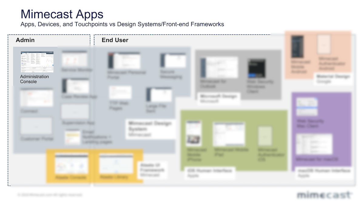
Scope: Admin console redesign, full product ecosystem (native apps, browser apps, third-party integrations), design system, UX research function, team scaling 3→12
Background
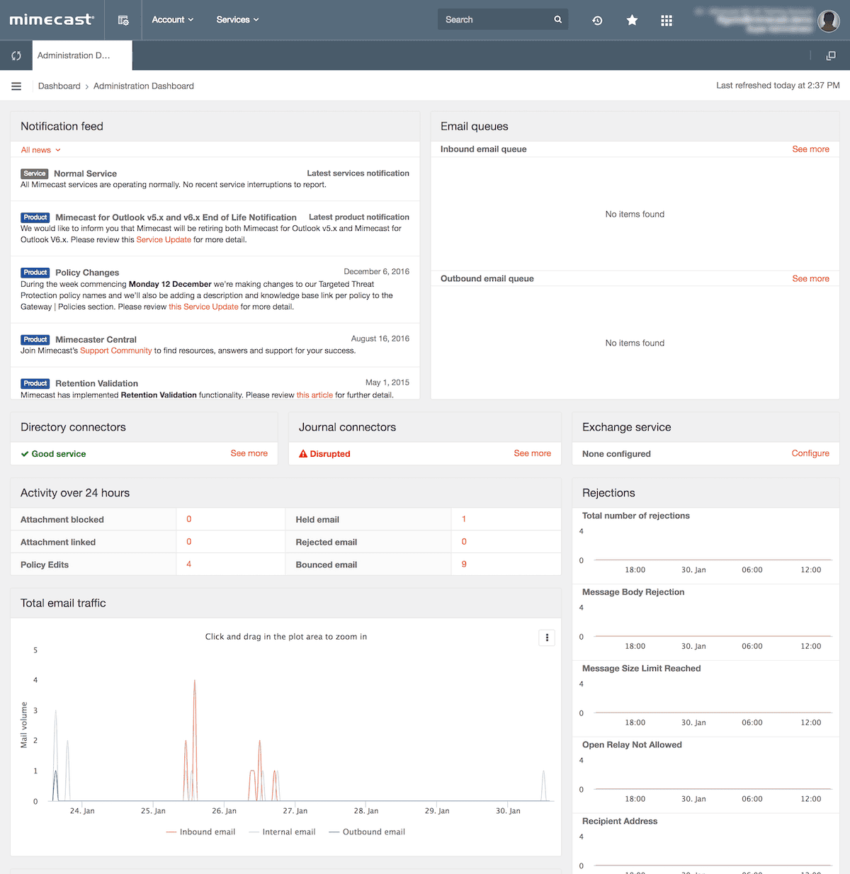
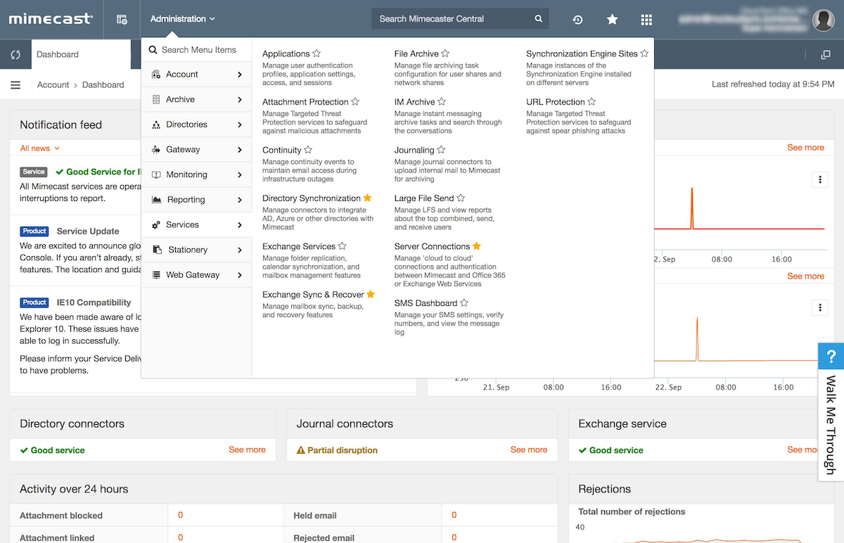
Mimecast’s flagship product was a sophisticated enterprise admin console used by IT administrators worldwide to manage email security policies, cloud archiving, and business continuity. Technically robust, the platform was trusted by some of the world’s largest organisations to protect business-critical communications infrastructure. The product worked. The experience of using it did not.

My team’s remit extended beyond the admin console. We owned the end-to-end Mimecast product ecosystem: native desktop and mobile apps used daily by employees across customer organisations, browser-based end-user web applications, and third-party integrations and plugins connecting Mimecast to the wider enterprise stack. The dashboard was the most critical and most broken surface — but the design system, research practice, and UX standards we built had to scale across the entire product portfolio simultaneously.
The Problem
When I joined, the design function consisted of a small group of junior designers and writers — completely siloed from engineering, reporting into Product Management with no independent mandate, no process, and no research capability. Design was perceived as the last step before shipping: UI decoration, not a strategic discipline.
The business consequence was concrete and costly. The entire premise of the product was self-service: IT admins should be able to configure email security policies, onboard new tenants, and manage their organisation’s protection without external help. In practice, they couldn’t. Support volumes were running in the thousands of tickets per month. Customers were calling in to be walked through tasks the software should have made obvious — generating millions in avoidable cost-to-serve across multiple product areas. The company was effectively subsidising poor UX through its support organisation, and nobody had formally connected those dots yet.
“As a new customer, still struggling with the admin interface in terms of policies and definitions. The platform appears very capable and I have not yet discovered anything it cannot do. However, accomplishing simple tasks is not often simple at all.”
— Admin Console user on Legacy Administration Console
The product team knew something was wrong. Customers complained constantly — not about missing features, but about not being able to use the features that existed. Real customer feedback captured in research told the story clearly: “As a new customer, still struggling with the admin interface in terms of policies and definitions. Accomplishing simple tasks is not often simple at all.” And: “The navigation and approach to configuring and applying policies is clunky.” That gap between technical capability and usable experience was the brief they hired me to close.
Design Principles
Before touching a single screen, I established four principles that governed every design decision across the programme:
- Research-driven — familiar experiences designed from observed behaviour, not assumption
- User-centric focus — provide experiences that are intuitive, delight users, and empower customers to achieve success independently
- Reduce friction — use industry-standard terminology, not Mimecast-internal language; policies and definitions as one harmonious workflow
- Best practice — recommended settings and industry standards surfaced by default, not buried in documentation
Strategic Decisions
1. Establish user research before redesigning anything.
The organisation had no data on how users actually behaved inside the product. Every design opinion was just that — opinion — and engineering and product had years of seniority to override it. My first move was building Mimecast’s first internal user research function: a dedicated team that profiled IT admin personas, mapped behaviours and pain points, and created a continuous feedback loop from real customers. In the first full year, the research team I built ran over 30 projects — hundreds of participants across surveys, interviews, and prototype testing sessions. Every major feature on the roadmap was preceded by a defined problem statement, real customer verbatims, and prototype testing before a single line of code was written. Once we had research data, design decisions became evidence-based conversations rather than preference battles. Product managers who had previously dismissed UX concerns became our advocates when they saw user behaviour mapped against their roadmap assumptions.
2. Incremental redesign, not big bang.
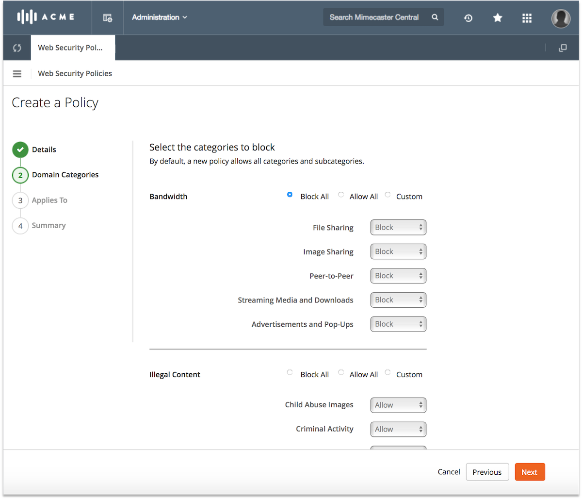
My initial instinct was a full-product redesign — clean slate, new system. I changed my mind fast. The legacy codebase was a decade of engineering decisions layered on top of each other: a genuine monolith that couldn’t be refactored all at once. A big-bang approach would have taken years, required massive engineering investment, and given us zero early wins to justify the effort. I pitched incremental instead: allocate approximately 30% of each product swimlane’s capacity to tackling UX debt alongside new feature development — identify the highest-friction, highest-volume workflows, fix them visibly, measure the improvement, and use each win to expand design’s mandate further. Product leadership backed this immediately — it aligned with how they already managed roadmap risk. It also gave us something big-bang never would have: momentum.
“This looks great. You just want to see the most important business critical information as quick as possible when people are screaming at you.”
— Admin Console user on Custom Dashboards
3. Fix the most painful workflow first — email policy configuration and message tracking.
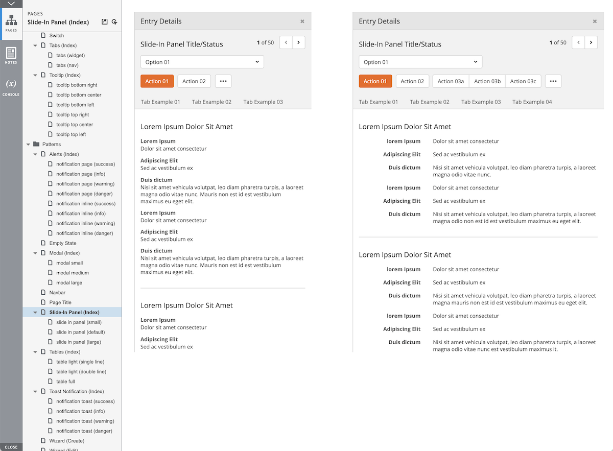
The first things we tackled were the configuration of core email management policies and the message tracking workflow — the foundation of every Mimecast deployment and the single biggest driver of support calls. Customers described the existing tracking experience as “a total mess, jumping between screens depending upon message status” and “difficult for helpdesk techs.” We simplified a fragmented multi-screen journey into a clean 2-step experience with consolidated search, a progress indicator, and a slide-in detail panel. Customer response after prototype testing was immediate: “This will save us a lot of time!” and “Finally, an indication of what is going on.” Getting these right was both the highest-impact starting point and the strongest signal we could send internally that design could deliver.
“I really like the advanced filter options, especially attachments and date range, these to me are quite unique and would be something that I would use in my every day to day at work.”
— Admin Console user on Advanced Filtering
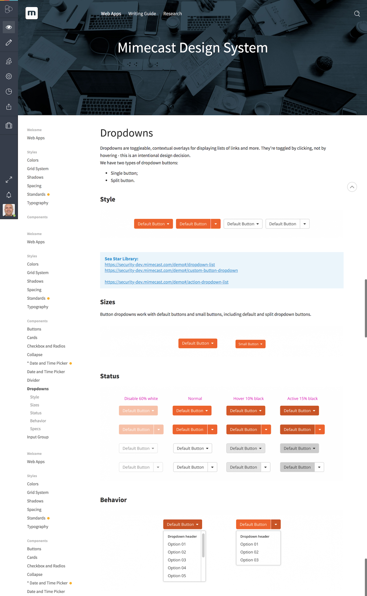
4. Build the design system bottom-up, in lockstep with delivery.
Nothing existed when I arrived. Rather than pause delivery to build a comprehensive system upfront, we adopted an atomic approach: every new or redesigned component was documented, built into the system, and made available to the next sprint. The system grew to encompass a full style guide, pattern library, writing guide, design principles, brand identity standards, and a front-end framework — built incrementally through real product work, not as a separate initiative. We chose Axure as our shared tool — a joint decision made with Product and Engineering — because it could simulate the complexity of an enterprise dashboard at the fidelity level our stakeholders needed to evaluate decisions. Adoption came through relentless walkthroughs, demos, and shared sessions. The goal was shared ownership: I wanted every product manager and engineering lead to feel like the design system was partly theirs, not something being imposed on them.
5. Hire player-coaches, then empower them to build their own teams.
Scaling from an initial 2 designers and 1 copywriter to a full function of 6 designers, 3 researchers, and 2 copywriters required people who could both do the work and lead others doing it — no pure ICs, no pure managers. My first senior hire was a User Research Manager: someone who could establish the research practice and hire their own team without me having to be the domain expert. I extended the same principle across all hires — give senior people real hiring authority and real team ownership from day one. I partnered closely with a dedicated talent partner from the product organisation, spending significant time educating them on what to look for in design and research candidates: portfolio quality signals, problem-solving approach, how to read a design process, what seniority actually looks like in our discipline.
“I like it when it auto finds things that look relevant when you start typing.”
— Admin Console user on Predictive Search
Process & Approach
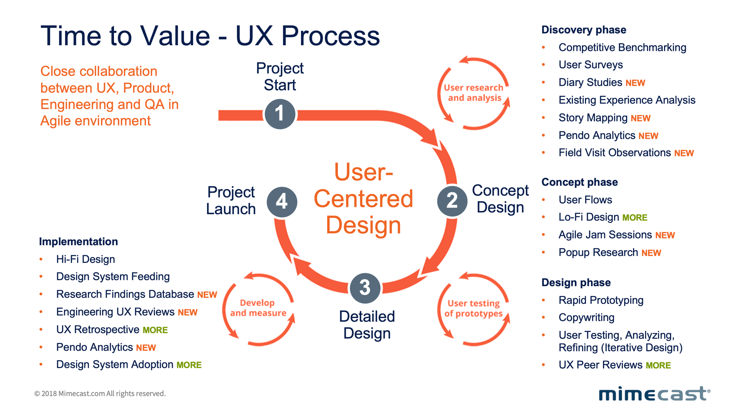
The delivery model was Scrum-based from the start — two-week sprints shared across Design, Product, and Engineering through a common project management and issue tracking platform. This wasn’t a design-led process bolted onto an engineering workflow; it was a genuinely integrated cadence where design artefacts, research findings, and engineering tickets lived in the same system and were reviewed together.
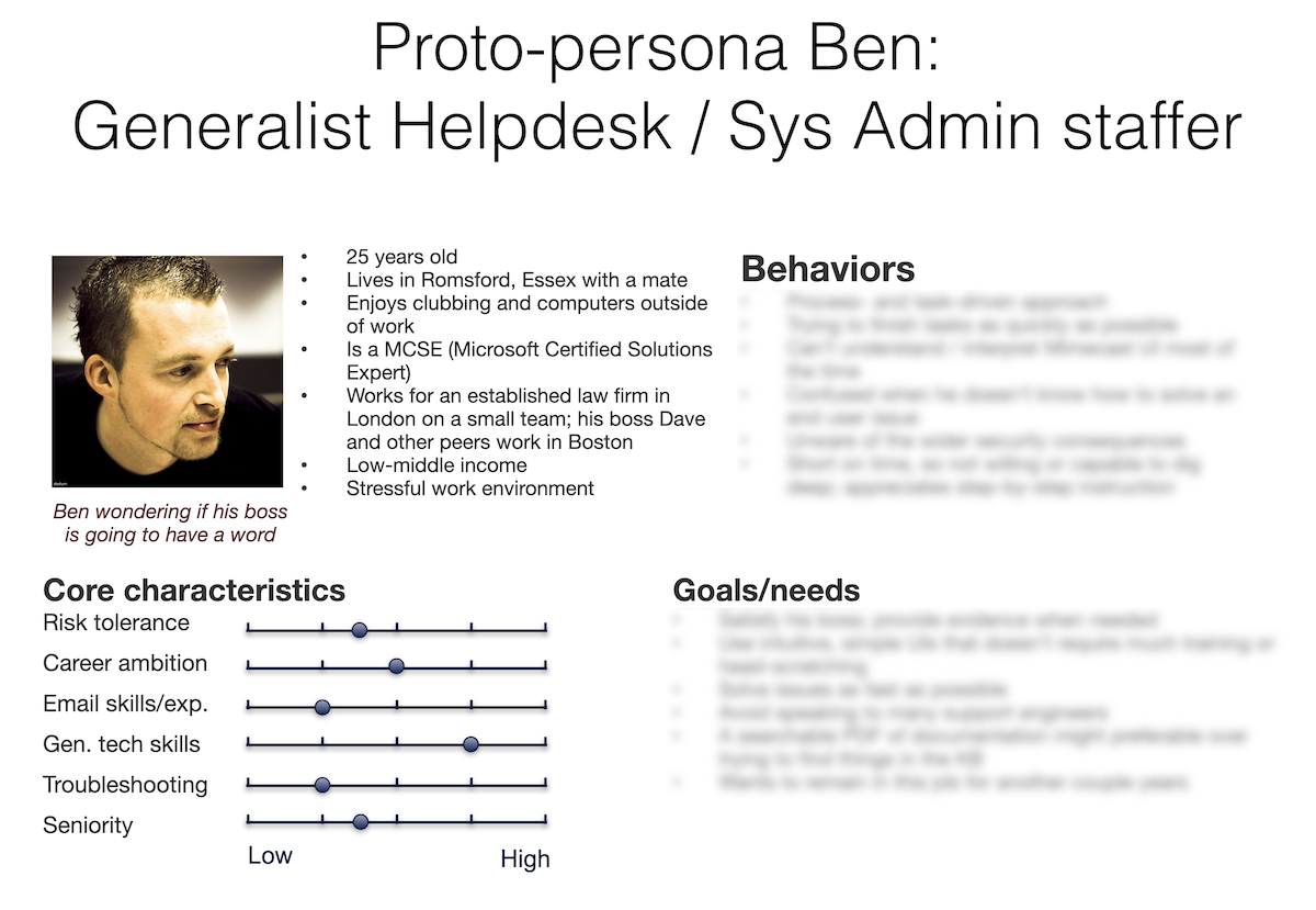
Our first user research outputs were proto-personas built directly from observed admin behaviour — not marketing archetypes. The primary persona, a generalist helpdesk and systems administration staffer, became the shared reference point across all six product teams: a constant reminder that the person configuring email security policies was not a security expert, but an IT generalist under pressure to keep things working. Every design decision was stress-tested against that person’s context. In the first full year, the research team delivered over 30 projects — hundreds of participants across interviews, surveys, and prototype testing sessions with early adopters spanning multiple geographies. That volume of insight meant design decisions were never opinion-based arguments. They were evidence.
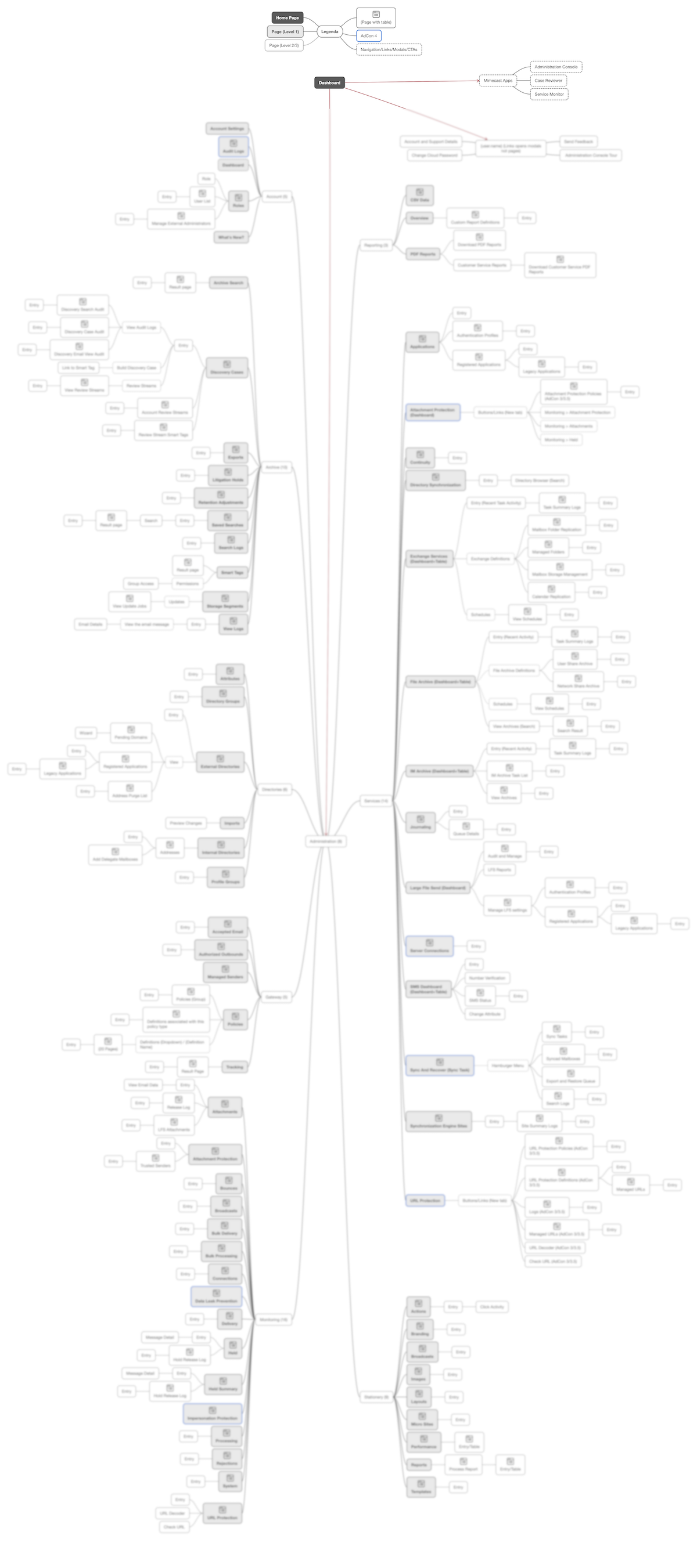
We mapped the entire application from a functionality standpoint before touching a single screen — cataloguing every feature, workflow, and entry point to identify where the highest friction and highest support volume intersected. That map became our prioritisation tool: low-hanging fruit tackled first to generate momentum, critical workflows next to generate measurable impact. In parallel, we introduced a dedicated product analytics platform to track real usage behaviour inside the dashboard — giving both Product and Design teams a continuous, data-driven view of adoption, drop-off, and task completion that hadn’t existed before.
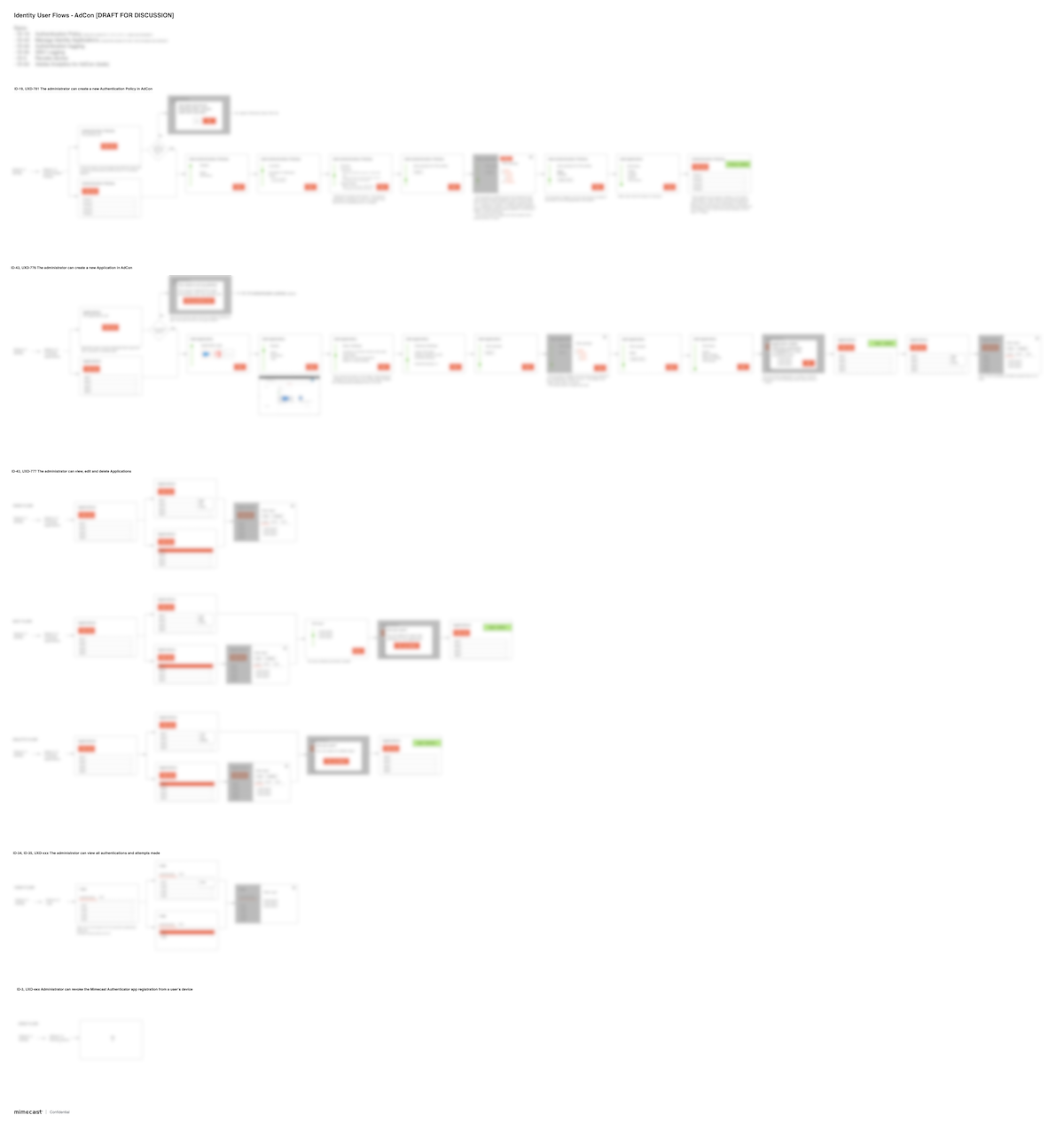
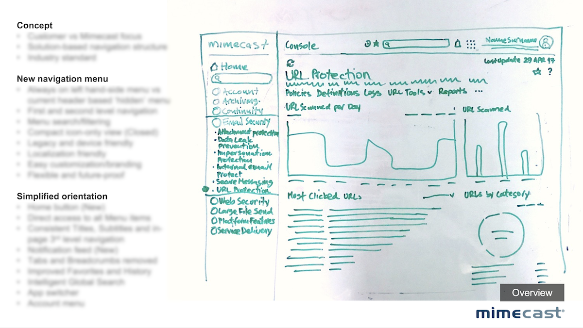
With no existing visual language to build on, we started from first principles. Early concepts were deliberately lo-fi — rough sketches and low-fidelity wireframes used to stress-test flows with product and engineering before any visual investment was made. This hi-fi vs lo-fi discipline was a conscious decision: in a legacy-constrained environment where engineering bandwidth was limited, presenting polished UI too early created false confidence and wasted rework cycles. Once a flow was validated, we moved to high-fidelity screens built directly against the emerging design system — so every pixel produced was simultaneously a product deliverable and a design system contribution. Navigation patterns, data visualisation modules, form structures, and policy configuration flows were all designed, tested, iterated, and documented as reusable system components. The result was a design system that grew organically from real product work rather than being designed in isolation — which is exactly why engineering actually adopted it.
“I like the design, it’s clean. I like the status! It’s nice to be able to refine the search…cool! I love it that I don’t need to get back to the previous page. Attachment filter – I would use it all the time! I love the fact that I can change the date range on the fly.”
— Admin Console user on Message Tracking
UX writing was one of the most underestimated levers in the entire programme. The dashboard’s language had been written by engineers for engineers — full of internal terminology, inconsistent labelling, and error messages that explained what went wrong without helping users understand what to do next. I established a dedicated content design function within the team: writers who worked directly inside the design process, not as a downstream copy-review step. They audited every surface for terminology consistency, rewrote onboarding instructions, policy descriptions, and error states from the user’s mental model outward, and created a writing guide that became a core component of the design system. The impact was measurable: a significant share of the support ticket reduction came not from redesigned flows, but from users finally understanding what the existing flows were asking them to do.
Collaboration
The hardest part of this project was organisational, not design.
With Product: I embedded the design team directly into product squads from the discovery phase, not just execution. I invested deliberately in relationships with product directors and managers — pulling them into daily design reviews, validating decisions in real time, and making sure product knowledge informed every design choice. This created a joint sense of ownership that made it much harder for anyone to dismiss design output as disconnected from product reality. Senior designers were formally partnered across each product swimlane to maintain consistency while enabling squad autonomy.
“The overall layout is less confusing… [than the current process which] can be a little overwhelming. I was never sure how to add a policy.”
— Admin Console user on Unified Policy Workflow
With Engineering: Legacy code was the practical blocker — years of accumulated technical decisions that created real constraints on what we could change and how fast. The political blocker was equally significant: the engineers who had built the product from the ground up were deeply skeptical that a design function could add meaningful value. I didn’t argue my way around this. I showed results, ran demos, shared research data, and made the design system a shared artefact rather than a design team deliverable. The moment engineering started contributing to the system — flagging inconsistencies, suggesting patterns — was the moment I knew the culture had shifted.
With Leadership and Stakeholders: I translated design impact into business language from day one. Support ticket reduction, onboarding time, policy misconfiguration rates — these were conversations Finance and Operations understood. Design stopped being a cost centre discussion and became a margin conversation. The research programme gave me the ammunition to make that case with data rather than advocacy.
“All of Mimecast’s products blend into their single pane of glass seamlessly, creating the most effective admin experience I have ever seen.”
— Admin Console user on Unified Experience

With the Design Team: My biggest cultural challenge was making a technically complex, unglamorous enterprise security product feel worth caring about. There’s no consumer delight in email policy configuration. I worked hard to create genuine pride around the difficulty of the problem — the idea that simplifying something this complex, for this many users, at this scale, was harder and more meaningful than designing something beautiful. The team that emerged was tight, technically confident, and genuinely invested in the product’s success. I’m most proud of the fact that even the less glamorous tasks — taxonomy reviews, error message rewrites, policy terminology audits — were treated with the same rigour as the headline features.
Outcomes by the Numbers
91%
Task success on critical admin workflows
4 days
Time-to-Value from tenant provisioning to first enforced policy
−38%
Support tickets per 1,000 tenants
−45%
Misconfiguration rate during policy validation
−42%
Average time-on-task across top 10 workflows
+46%
Adoption of new dashboard modules within 90 days
−37%
Average time taken to resolve email security rule threats
+21
NPS points among admin users, tracked via post-journey surveys at onboarding, post-support resolution, and quarterly touchpoints
33
Research projects delivered in the first full year
3→12
practitioners across design, research, and content — built from scratch over 3 years
-35%
Reduction in design-to-development cycle time driven by design system adoption
Results measured across two quarters post-launch; deltas vs. pre‑redesign baseline.
The single most important long-term outcome: onboarding became genuinely self-service. The product could be deployed, configured, and enforced by an IT admin without a support call. That was the original promise of the software — and it finally delivered on it. Mimecast was subsequently acquired for $5.8B.
What I’d Do Differently Today
The research and hiring cycles consumed enormous time — interview scheduling, synthesis documentation, candidate evaluation, prototype testing logistics. With today’s AI tooling, I’d compress that dramatically: synthetic user testing for early-stage validation before live research, AI-assisted synthesis tools to process session recordings and surface patterns in hours rather than weeks, and automated screening for design and research candidates. The design system build would also look fundamentally different: with MCP integrations and AI agents like Claude embedded directly in the Figma workflow, what took multiple quarters of manual atomic construction could be prototyped, documented, and maintained at a fraction of the effort — freeing the team to focus on the hard strategic and organisational work that no tool can replace.
“[The integration between threat intel and Mimecast policies] is ‘a thing of beauty’… it is a cutting edge automation use case in the industry.”
— Admin Console user on Collaborative Innovation
Trusted by AI startup founders from pre-seed to Series B
The brands and organizations we’re privileged to work with.