The Short Version
Libero.it was Italy’s largest internet platform — a web portal, webmail service, and news aggregator reaching over 13 million unique monthly visitors and serving 4.5 billion ad impressions per month. The business ran entirely on display advertising, but the model was eroding: Google and Facebook were cannibalising traffic, programmatic buying was compressing CPMs, and the commercial response — pushing ad density higher — was measurably damaging the user engagement that made the inventory valuable. There was no design governance, no shared component system, and a design function brought in consistently after strategic decisions had already been made.
I built and led design across all eight product surfaces — portal homepage, webmail, news aggregation, premium mail, mobile, cloud, advertising formats, and merger integration — while leading a cross-functional team through a corporate spin-off, a major rebranding, and the acquisition of ITnet/Virgilio.
I established design authority upstream by inserting design into product discovery before briefs were written, then built an advertising format taxonomy that converted a reactive, sales-driven inventory problem into a governed design system operationalised by both engineering and sales. I designed the UI architecture to absorb brand mutations rather than require rebuilds — a decision that survived two major identity shifts and the Virgilio integration without platform rebuilds.
The platform sustained 8.2 million monthly mail users and 13 million total unique visitors through two redesign cycles and a corporate merger, with no measurable audience decline. Mobile scaled from zero to 3 million unique monthly users. Italiaonline went on to become Italy’s largest internet advertising company by reach.
Role: Head of UX/UI Design & Product Design Lead
Company: Italiaonline S.r.l. (Libero.it / ITnet / Virgilio) — Italy’s largest internet company, operating the country’s leading web portal, webmail service, news aggregator, cloud platform, and digital advertising network | ~180 people post-spin-off; 13M+ unique monthly visitors; 5 offices across Italy; acquired ITnet/Virgilio during this period
Scope:
- Portal homepage — primary revenue surface, display advertising architecture, full information architecture
- Libero Mail (free + premium) — Italy’s most-used webmail; UX, advertising integration, premium tier design
- Libero News / 24/7 — automated news aggregation platform; UX, editorial content quality oversight, partner integrations
- Advertising format portfolio — format taxonomy, placement rules, high-impact units across all surfaces
- Libero Cloud — product homepage, onboarding, pricing UI for cloud infrastructure offering
- Libero Mobile — mobile portal, mobile webmail, app design strategy
- Design system & rebranding — visual governance, component library, Interbrand rebranding application
- ITnet/Virgilio merger integration — design harmonisation, platform rationalisation, team integration
Background
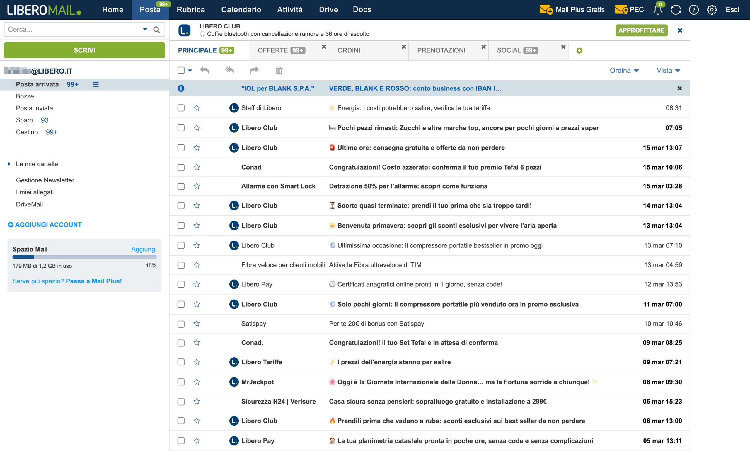
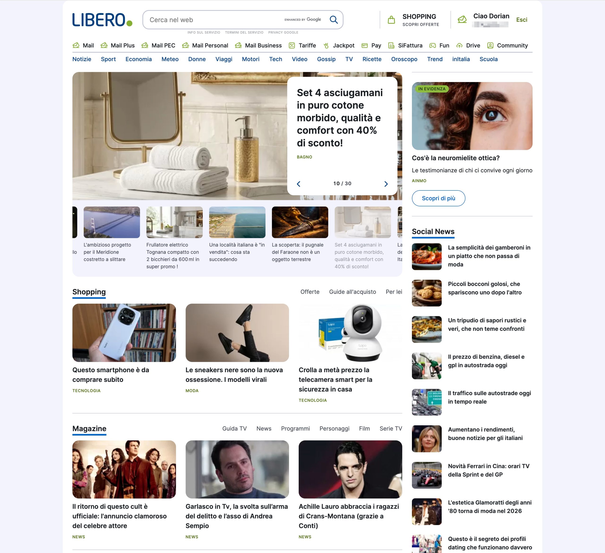
Libero.it was Italy’s original free internet portal — launched in the late 1990s as one of the country’s first IP providers, it grew into the dominant web portal and email service for Italian consumers. By the time I joined, it reached over 13 million unique monthly visitors, held a 46% market reach, and served upwards of 4.5 billion ad impressions per month across the full platform. The business ran on display advertising: homepage placements, email-adjacent formats, run-of-network inventory, and premium sponsorships. Libero Mail — with more than 8 million unique monthly users and approximately 2 million daily active users — was the gravitational centre of the entire platform and the primary reason most users came back every day.
Users ranged from teenagers receiving their first email address (often bundled with a Wind SIM) to adults who had been using Libero since dialup — adults who treated the homepage as their default internet gateway and the inbox as their primary digital identity. This legacy user base was fiercely habitual, which was both an asset and a design constraint: every change had to work within the mental models of tens of millions of users who didn’t want to be surprised. Alongside the consumer platform, the company also operated ITnet — a B2B infrastructure and data centre business that would eventually become the acquisition target bringing Virgilio.it into the fold.
I joined as a senior UX/UI designer and progressively took on broader design and product leadership responsibility across the full platform. My scope eventually covered eight distinct product surfaces — from core webmail and portal homepage to cloud infrastructure UI and mobile — plus the advertising format system that underpinned the entire revenue model. Over five years, I worked through a corporate spin-off from Wind Telecomunicazioni (creating Libero S.r.l. in 2011), a major Interbrand-led rebranding exercise, and the acquisition and integration of ITnet/Virgilio that created Italiaonline as the combined entity.
The Problem
Libero’s advertising business was simultaneously its biggest asset and its most dangerous dependency. The platform generated the majority of its revenue from display advertising sold against premium placements on the homepage and inside the webmail — and that model was under structural pressure from every direction. Google was eroding search and portal traffic. Facebook was cannibalising time-on-site and social engagement. Gmail was eroding email stickiness among younger users. Programmatic buying was compressing CPMs on standard IAB formats. The commercial response, consistently, was to increase advertising density — more formats, larger formats, more invasive formats. The design consequence was that every major product surface was in a slow erosion cycle: more ads, less space for content and functionality, declining engagement, which justified more ads to compensate. This was not a UX problem. It was a revenue model problem expressing itself through UX.
The product symptoms were visible across every surface. The homepage had grown into an advertising delivery mechanism with editorial content layered around it, rather than the reverse. The webmail inbox carried a level of advertising load that was measurably damaging session depth and return frequency — but the sales team’s quarterly targets made it politically impossible to pull formats back without a defensible design rationale. The news aggregator — one of Italy’s first fully automated aggregation platforms, predating Google News’s Italian presence — was generating significant traffic but with heterogeneous content quality, inconsistent partner feeds, and no coherent design language for editorial presentation. Across all surfaces, the fragmentation was severe: multiple product lines, editorial verticals, and advertising initiatives had each developed their own visual language in parallel, with no governance enforcing consistency. Typography, colour, component patterns, and interaction models diverged across channels, making Libero feel like a collection of loosely connected microsites rather than a coherent platform.
The organisational root cause was structural. Design sat within a product and marketing organisation that made strategic and technical decisions before involving design — which meant the function was perpetually in execution mode, without the upstream influence needed to prevent the problems it was then asked to fix. There was no shared design process, no component library, no design authority at the product level, and no mechanism for enforcing visual consistency across initiatives. When the Wind spin-off and subsequent rebranding added a new layer of identity change on top of an already fragmented system, the risk was a platform that users would progressively stop trusting — and a business with no design infrastructure resilient enough to absorb the change.4. Strategic Decisions
Strategic Decisions
1. Established design authority upstream, before the briefs arrived
The default model at Libero was design-as-execution: product managers and commercial leads made decisions, wrote briefs, and handed them to designers. I decided to break that pattern by inserting design earlier — attending product planning sessions uninvited if necessary, producing wireframes and prototypes before they were requested, and reframing conversations from “how should this look” to “what problem are we actually solving and for whom.” The alternative — continuing to accept briefs downstream — would have meant perpetually polishing decisions already made by others.
The trade-off was political friction in the short term. Product managers initially read early design involvement as overreach; I had to earn the right to be in those conversations by demonstrating that earlier design input consistently produced better outcomes — faster delivery, fewer revisions, fewer post-launch fixes. I made that case through accumulated project evidence, not advocacy. Within a year, the pattern had shifted: product discovery and design definition were happening in parallel, not sequentially.
The downstream effect was significant. Design stopped being a bottleneck and started being a decision-shaping function. This repositioning also made it possible to push back on commercially-driven decisions that would have damaged user experience — because I was now in the room when those decisions were being made, not after the fact.
2. Built the advertising format system as a design governance tool
The advertising inventory was managed commercially but designed inconsistently — formats were added reactively as sales closed deals, with no systematic view of how they coexisted on a page, how they interacted with editorial content zones, or what their cumulative effect was on the reading experience. I decided to treat the advertising format portfolio as a design problem, not a sales problem. I defined a complete format taxonomy — covering IAB-standard units and Libero-proprietary high-impact formats — with explicit coexistence rules, placement hierarchies, and design specifications for each unit across all surfaces.
The alternative would have been to continue managing formats ad hoc, which would have accelerated the erosion cycle. The trade-off was a direct confrontation with the sales team’s expectation that any format should be deployable anywhere. I made the case by connecting advertising placement decisions to user session data: specific format combinations that correlated with drop-off, login abandonment, and reduced return frequency. That made the conversation about commercial risk, not design preference — and it landed.
The format taxonomy became the design governance document that the sales team referenced when closing deals. It shifted the dynamic: instead of design being asked to accommodate whatever had been sold, sales was now working within a defined design system. That was a meaningful structural change.
3. Designed the platform for brand mutation, not brand stability
When the Wind spin-off triggered a rebranding initiative — informed by Interbrand research and focus groups across four Italian cities — the instinctive design response would have been to wait for the new brand identity before rebuilding the UI. I rejected that approach. The rebranding process was non-linear, politically complex, and subject to business direction changes; waiting for it to resolve before designing anything would have paralysed the product for months. Instead, I built the UI system to absorb brand mutations without requiring full rebuilds.
Practically, this meant modular component architecture with theming layers separated from structural layout decisions. Colour, typography, and identity-adjacent components were isolated so they could be updated without touching the underlying interaction model. This was a systems decision, not a visual one — and it required convincing product and engineering partners that the short-term investment in modularity was worth it. I made that argument on maintainability grounds: every brand iteration would cost significantly less if the system was built to accommodate it.
This decision paid off multiple times over. The platform absorbed at least two significant brand direction shifts during my tenure without full rebuilds — and when the Virgilio merger introduced another layer of identity complexity, the modular system made harmonisation substantially faster than it would have been on a monolithic design.
4. Held the line on webmail advertising density
Libero Mail was the platform’s most-used product and its most commercially sensitive surface. The sales team consistently pushed for more advertising formats inside the inbox — larger units, more positions, more aggressive placements. I pushed back, consistently, on the basis of user session data that connected advertising density in the inbox to measurable declines in session depth, daily return frequency, and login completion rates. The email product had earned its users’ trust over years. That trust could be lost quickly and was very unlikely to be recovered once gone.
The decision was to define explicit advertising boundaries for the webmail product — not as a preference but as a documented policy with commercial justification. Crossing those boundaries required a business case that acknowledged the retention risk, not just the short-term revenue upside. This made some commercial conversations uncomfortable, but it prevented several format deployments that, based on comparable behaviour data, would have materially damaged the product’s engagement metrics.
The principle generalised: every product surface had a threshold beyond which advertising optimisation became user experience destruction. Identifying those thresholds, quantifying them in business terms, and holding them against short-term commercial pressure was one of the most important things I did in this role.
5. Led design through the ITnet/Virgilio acquisition with a stabilisation-first approach
The acquisition of ITnet — which brought Virgilio.it into the Libero group — created Italiaonline as the combined entity. Libero was the acquiring, dominant brand. Virgilio came from a different editorial culture, a different product tradition, and an entirely incompatible design system. The instinctive response to that situation is usually one of two things: integrate everything immediately, or run both systems in parallel indefinitely. I rejected both.
I chose a stabilisation-first approach: in the immediate post-acquisition period, the priority was maintaining design quality and team coherence on both sides while the organisational structure settled. Premature integration of incompatible design systems would have introduced inconsistency at exactly the moment users were most sensitive to change. I mapped the two design systems against each other, identified the components and patterns that could be harmonised quickly versus those that required deeper rationalisation, and sequenced the integration work accordingly.
The cultural dimension was as important as the technical one. Two companies that had been competitors were now one team. Editorial teams, content operations, design functions, and product management had overlapping roles and conflicting assumptions. I navigated that by focusing the design team’s energy on shared work — joint projects that required collaboration rather than competition — and by being explicit that the integration goal was a better combined platform, not a Libero takeover of Virgilio’s way of working.
6. Built commercial literacy into the design team’s operating model
Most of the designers I managed had been trained to think about users and craft, not about business metrics. In a company where every design decision had a measurable downstream effect on advertising revenue, user retention, and premium subscription conversion, that gap was a liability. I decided to close it deliberately, by making business data a standard part of design team conversations.
This meant introducing weekly dashboards into design review sessions, requiring that design proposals include a hypothesis about measurable impact, and — most importantly — creating a feedback loop where post-launch data came back to the team that had made the design decisions. Connecting a UI choice made in a wireframe session to a metric that moved three weeks later is one of the fastest ways to develop commercial instinct in a design team.
The broader effect was that the team stopped presenting work in terms of “better experience” and started presenting it in terms of “here’s the behaviour change we’re designing for, and here’s how we’ll know if it worked.” That shift made design proposals substantially more persuasive at the leadership level and substantially harder to override without engaging with the evidence.of the client’s budget and our engagement.
Collaboration
With Product
Product management at Libero operated on commercial targets, not user-centred discovery. My strategy was to make design indispensable to the scoping process, not just the delivery phase. I introduced wireframe-first scoping as a standard practice: before a brief was written, I would produce a rough wireframe or concept that reframed the requirement in terms of user behaviour and business outcome. This gave product managers a concrete artefact to react to — which proved far more efficient than starting from a written spec. Over time, product leads stopped writing detailed functional specs and started co-creating with design from the outset. Joint weekly sessions — combining analytics review, user feedback, and design exploration — became the standard discovery ritual for the core product surfaces.
With Engineering
Engineering teams at Libero were under constant delivery pressure, with a legacy codebase that constrained what was buildable in any given sprint. I approached that constraint as a design input rather than a design blocker. For every major surface, I produced detailed wireframe specifications — including ADV placement rules, interaction state documentation, and layout behaviour across viewport widths — that gave engineers the clarity they needed to build confidently without constant design check-ins. Where legacy constraints ruled out the ideal solution, I worked with engineering leads to find the closest feasible implementation — and documented the gap explicitly so it could be addressed in a future iteration. The advertising format taxonomy was the most successful example of this: a document that engineering, design, and sales all referenced, which eliminated a class of last-minute format accommodation requests that had previously consumed significant engineering time.
With Leadership / Stakeholders
The most important stakeholder dynamic at Libero was between design and the commercial organisation — specifically the advertising sales team, whose quarterly targets consistently generated pressure to increase ad density at the cost of user experience. I built my credibility with senior leadership by learning to speak in commercial terms: session depth, return frequency, login completion, premium conversion. When I pushed back on an advertising placement decision, I did it with data, not principles. That made me a peer in commercial conversations rather than a design advocate asking to be accommodated. I also invested in relationships with marketing leadership during the Interbrand rebranding process — positioning design as the function that would make the new brand real in the product, not just in the guidelines document. That repositioning gave the team a strategic mandate it hadn’t previously had.
With the Design Team
I built a cross-functional team that included designers, UX practitioners, and — unusually — project managers and product managers reporting into the design function. Managing non-designers was a genuine stretch that I’d underestimated: PMs and project managers operate from fundamentally different mental models, and building working relationships that didn’t compromise design quality required more deliberate effort than I’d anticipated. I’m most proud of two things from this period: first, introducing commercial literacy as a core competency for the design team — moving the team from “better experience” framing to “measured behaviour change” framing; and second, the way the team held together and continued to ship quality work through the organisational turbulence of the spin-off, the rebranding, and the Virgilio acquisition simultaneously. Stability and quality under pressure is harder to build than any specific design capability.
Outcomes by the Numbers
13M+
unique monthly users across the Libero platform — sustained at scale through two major redesign cycles and a corporate merger
8.2M
unique monthly users on Libero Mail — Italy’s most-used webmail, maintained throughout the period with no significant audience decline
2M
daily active mail users — consistent daily engagement preserved through multiple inbox UX iterations and premium tier introduction
4.5B+
monthly ad impressions served across the platform — with a defined format governance system that had not existed at the start of the period
800M+
monthly impressions on the homepage alone — Italy’s most commercially valuable single-page advertising surface
3M
unique monthly mobile users by 2012 — a channel that was effectively zero when mobile design work began
1→8
product surfaces under design ownership, growing from single-surface execution to cross-platform design leadership
180
person org navigated through spin-off, rebranding, and acquisition with no design quality regression on core surfaces
Results measured over the 2011–2013 period vs. platform state at start of design leadership tenure.
What I’d Do Differently Today
The single biggest time drain in this project was design governance at scale — maintaining consistency across eight product surfaces, multiple parallel teams, and a constantly shifting brand identity, without the tooling to enforce it systematically. Today, I’d approach that problem with a combination of Figma’s component and variable system (which simply didn’t exist in usable form in 2009–2012), an AI-assisted design audit workflow using Claude or GPT-4 to scan for component divergence across files, and synthetic user testing — tools like Maze or UserTesting’s AI analysis layer — to run continuous lightweight validation on high-traffic surfaces without the two-week research cycle we operated on. The advertising density debate specifically would have benefited enormously from AI-assisted session analysis: connecting individual format deployments to behavioural change in near-real time, rather than waiting for weekly dashboard reviews. The governance argument would have been faster to make, harder to dismiss, and easier to maintain — which would have freed the team to spend more time on the design work itself and less on the organisational politics that surrounded it.
Trusted by AI startup founders from pre-seed to Series B
The brands and organizations we’re privileged to work with.