The Short Version
blur Group (now Maistro) was an AIM-listed B2B technology company running the Global Services Exchange — a managed marketplace connecting enterprise buyers with vetted service providers across 145 countries, with over $450M in services requirements submitted. Built entirely by engineers with no UX function, the commercial consequences were direct: buyers abandoned mid-journey, operational teams manually compensated for every UX failure, and the unit economics of a supposedly scalable model were consumed by the human scaffolding required to keep it running.
I joined as the company’s first design leader and built the UX and front-end function from a single designer to over 20 practitioners — UX/UI designers, interaction designers, researchers, content specialists, and front-end engineers.
I started by refusing to redesign anything until I’d mapped the actual problem, producing a pain-point audit and six research-validated personas that reframed UX failures as commercial costs and secured executive buy-in for a genuine platform strategy rather than a reskin. I sequenced the redesign surface-by-surface by revenue impact, built the design system and content guidelines from scratch, and embedded design into product discovery and enterprise client proposals — shifting the function from execution lane to commercial differentiator.
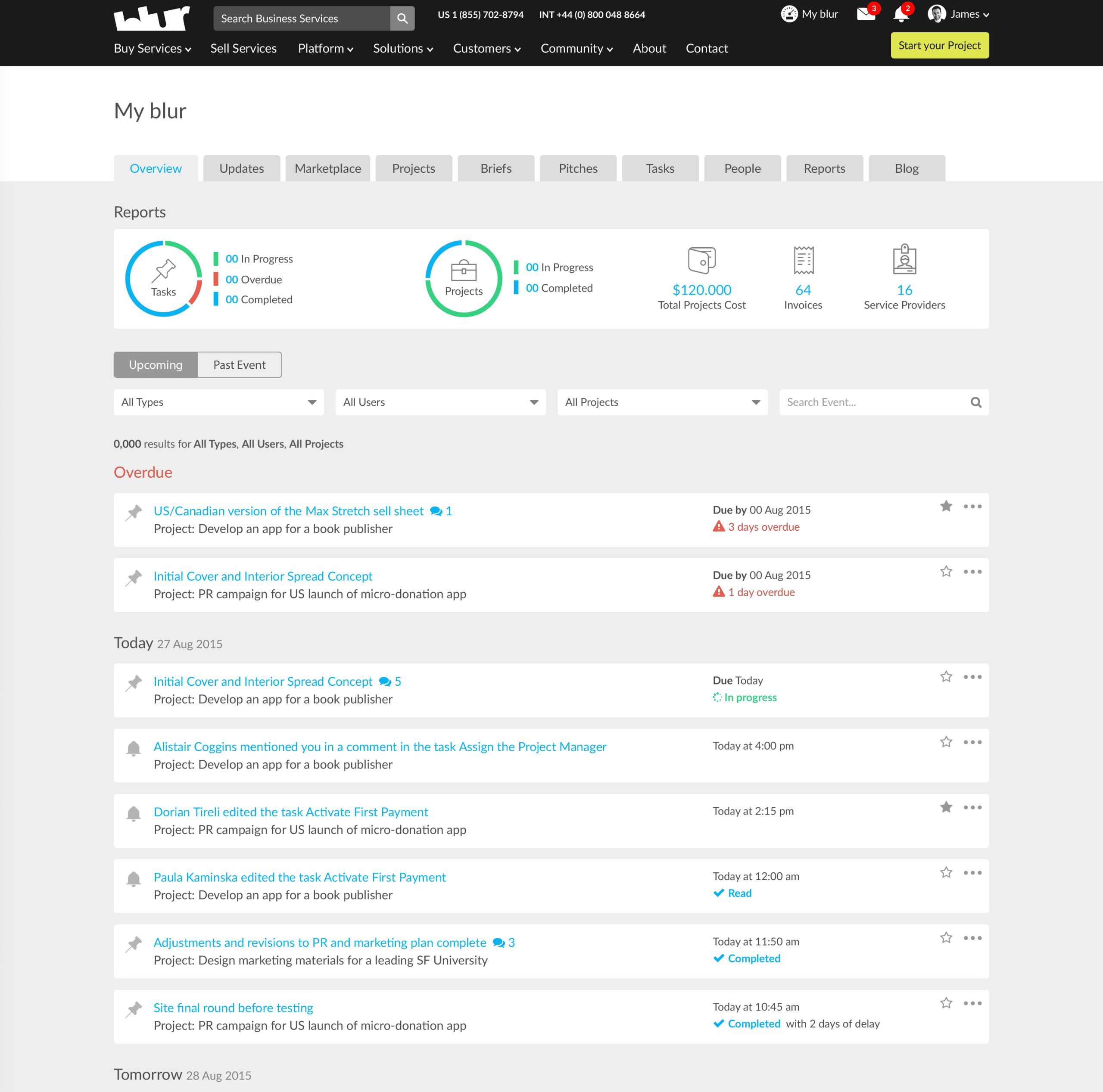
Platform projects grew 183% during my tenure, enterprise project completion reached 75%, and 84% of enterprise projects in the final quarter came from repeat customers. The sourcing cycle dropped from ten weeks to seven to ten days. The platform that arrived needing manual support at every stage became the self-service procurement foundation on which the company — now Maistro — continues to build.
Role: Global Head of User Experience
Company: blur Group plc (now Maistro) — a London-listed enterprise services platform connecting buyers of business services with vetted expert service providers worldwide | AIM-listed on the London Stock Exchange, ~100–150 employees, operating across 145 countries, 65,000+ service providers, $450M+ in services requirements submitted
Scope:
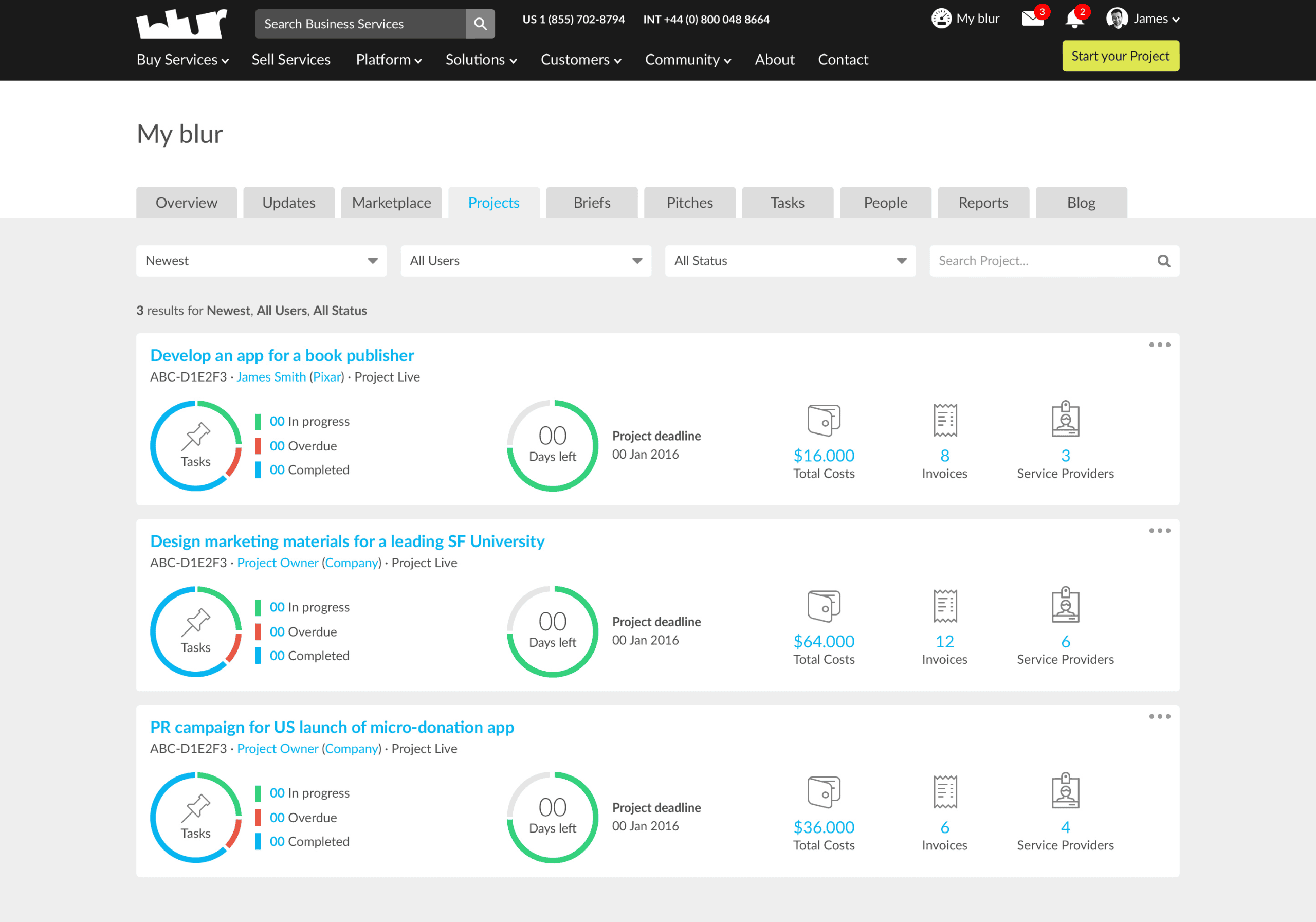
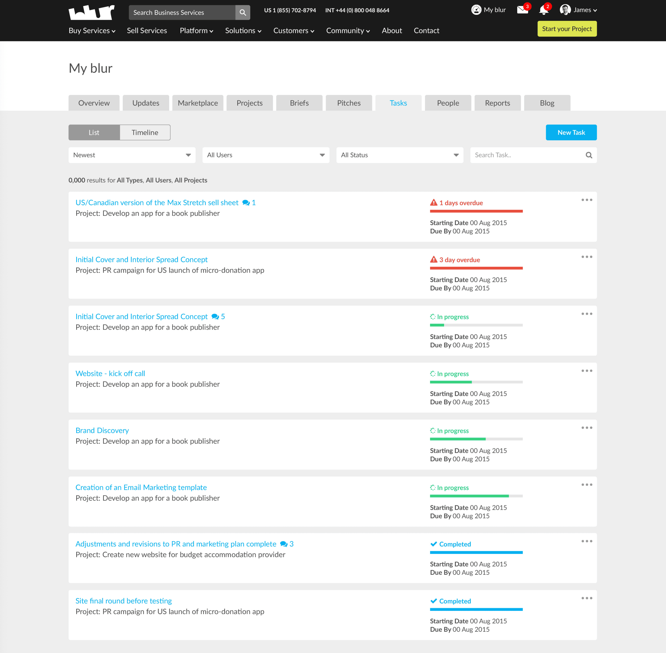
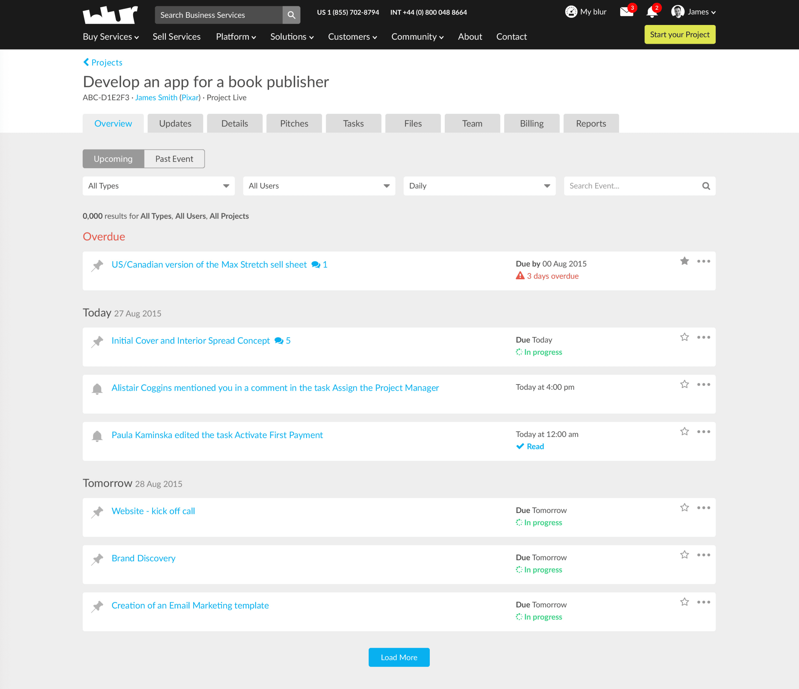
- Full platform redesign across three major platform versions: public-facing marketing site, buyer onboarding and brief submission flows, expert sign-up and pitching interface, Project Space (real-time collaboration and project management), enterprise buyer dashboards, and all supporting operational tooling
- Internal administration interfaces for Exchange Support and delivery teams, including the proprietary matching, market intelligence, and payment management surfaces
- Design system, component library, and front-end architecture standards across all platform surfaces
- UX writing, content guidelines, and brand-aligned terminology across every platform touchpoint
- Enterprise client-facing presentation and proposal design for major accounts
Background
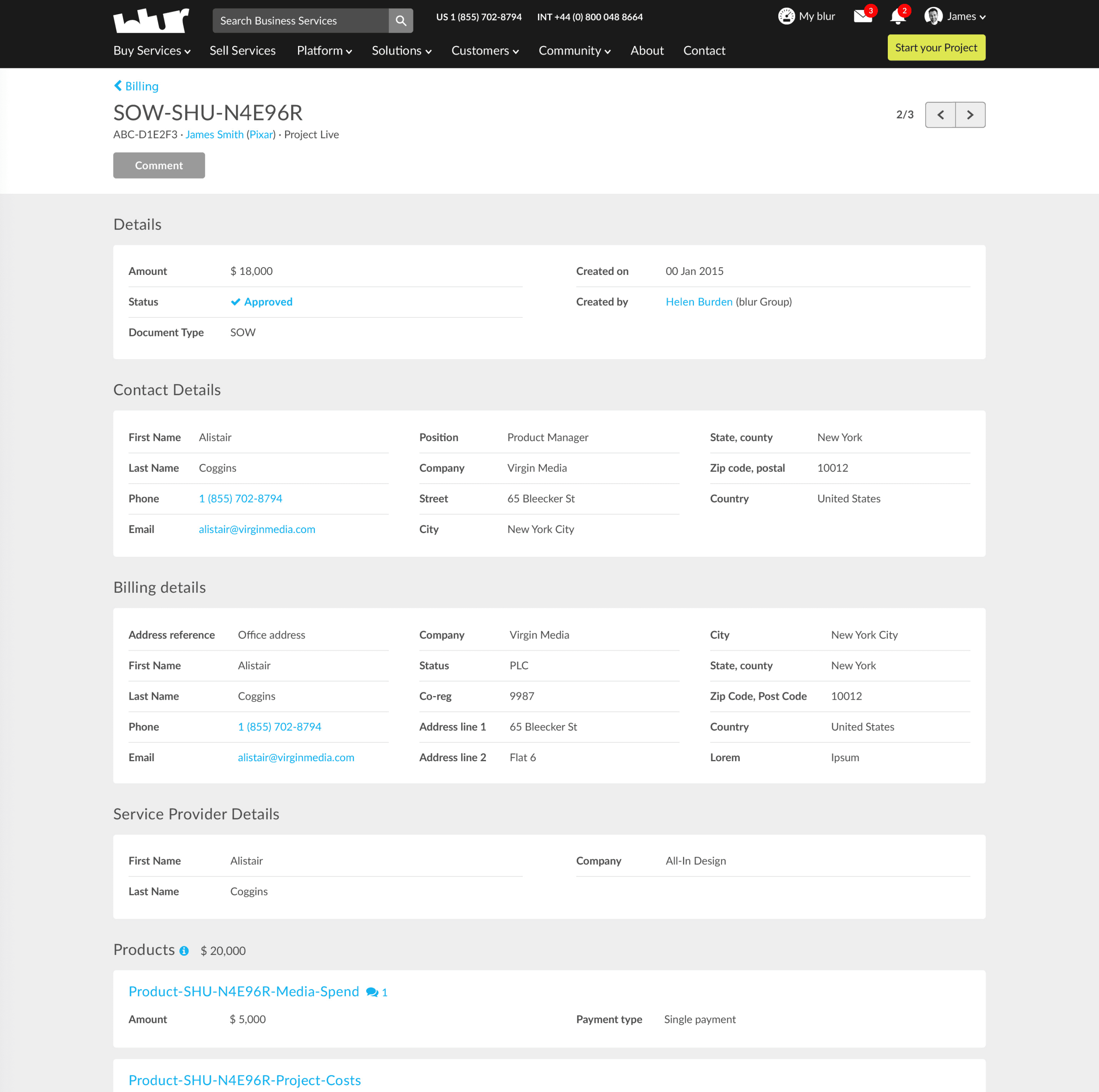
blur Group was an AIM-listed B2B technology company operating the Global Services Exchange — a managed marketplace that let enterprise buyers source, procure, and deliver business services online across ten categories: design, marketing, technology, content, art, accounting, legal, HR, innovation, and video. Unlike a pure self-serve platform, blur sat in the middle of every transaction: vetting service providers, shortlisting pitches via its proprietary matching engine, managing Statements of Work, processing payments through a secure payment gateway, and running project delivery through its Project Space collaboration tool. The core business problem it solved was tail spend — the long tail of business services procurement that accounts for a disproportionate share of supplier volume but is typically unmanaged, wasting an estimated 15–20% of indirect spend annually across enterprise organisations.
The two primary user groups were Customers (buyers — procurement managers, marketing heads, and operations leads at SMEs and enterprises) and Experts (sellers — freelancers, agencies, and consultancies vetted and approved to pitch on projects). The buyer-side ranged from a tech-savvy startup founder running a dozen projects per year to a senior procurement manager at a 500-person firm overseeing multiple concurrent projects across departments. The expert side ranged from independent copywriters pitching dozens of times per year to established creative agencies looking to expand their global client base. The platform served both simultaneously, with entirely different workflows, incentive structures, and definitions of success for each user type.
When I joined, the platform had been built iteratively by engineers and product managers without a dedicated UX function. I was reporting directly to the Chief Product Officer and brought in as the company’s first design leader — with a single designer already on the ground. Within six months I had grown the team to three practitioners. By the end of the first year we were eight. By the end of my tenure the function had expanded to over 20 people — a full-spectrum team of interaction designers, UX/UI designers, illustrators, content specialists, and a front-end development team I took direct responsibility for in the later stage of my time there.
The Problem
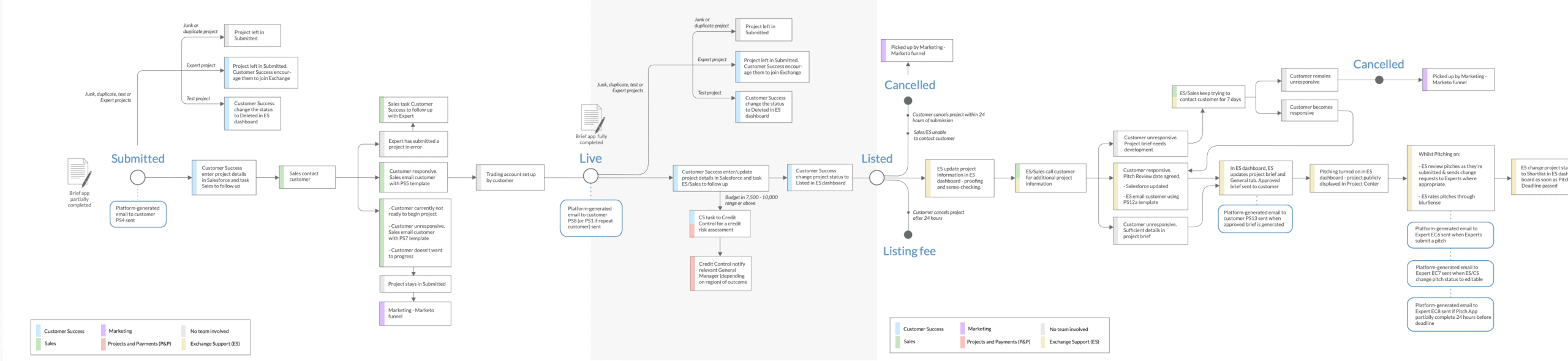
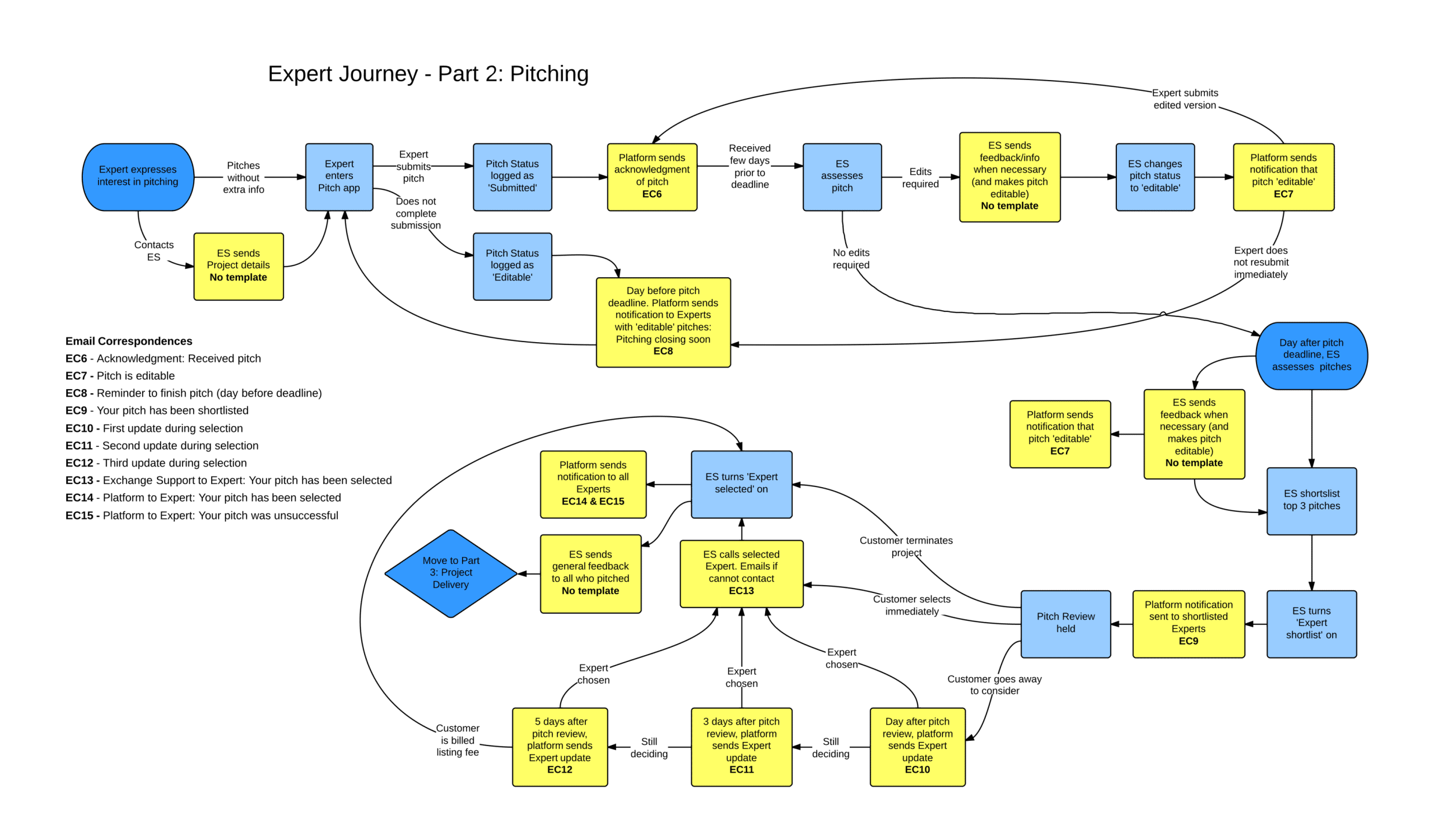
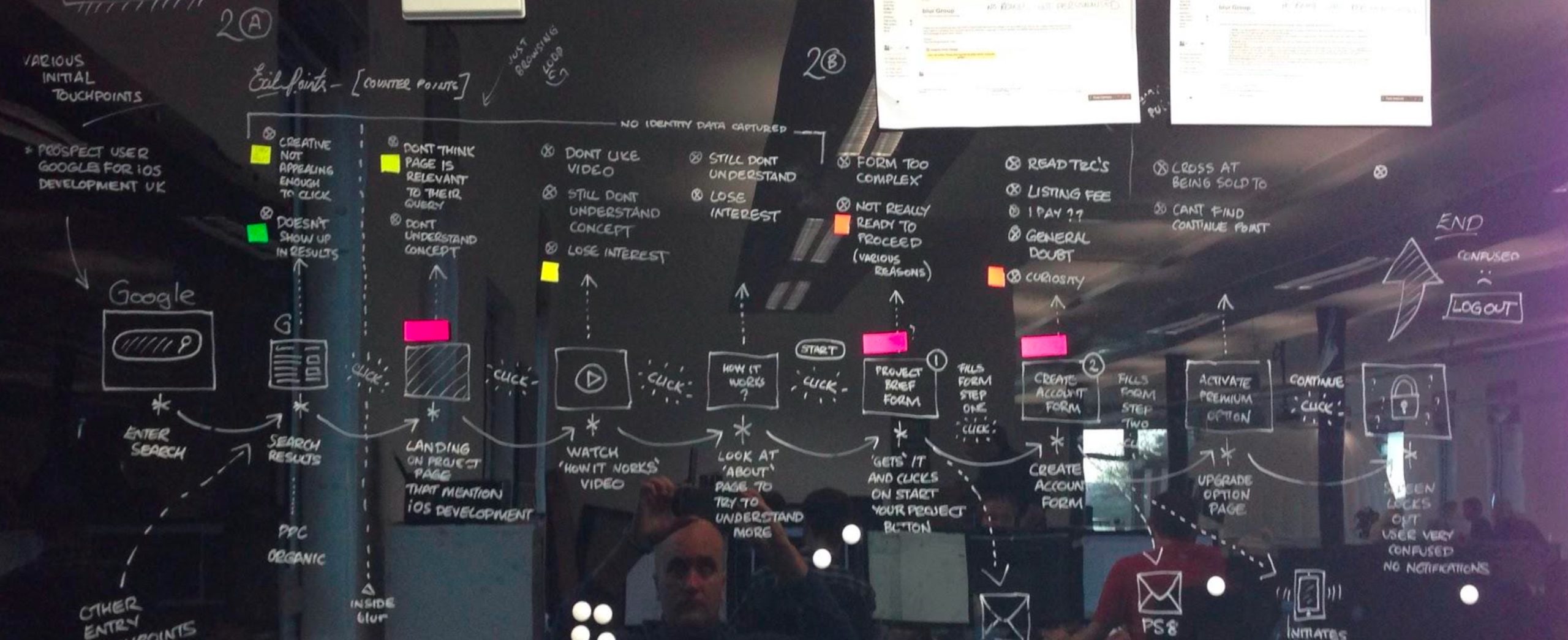
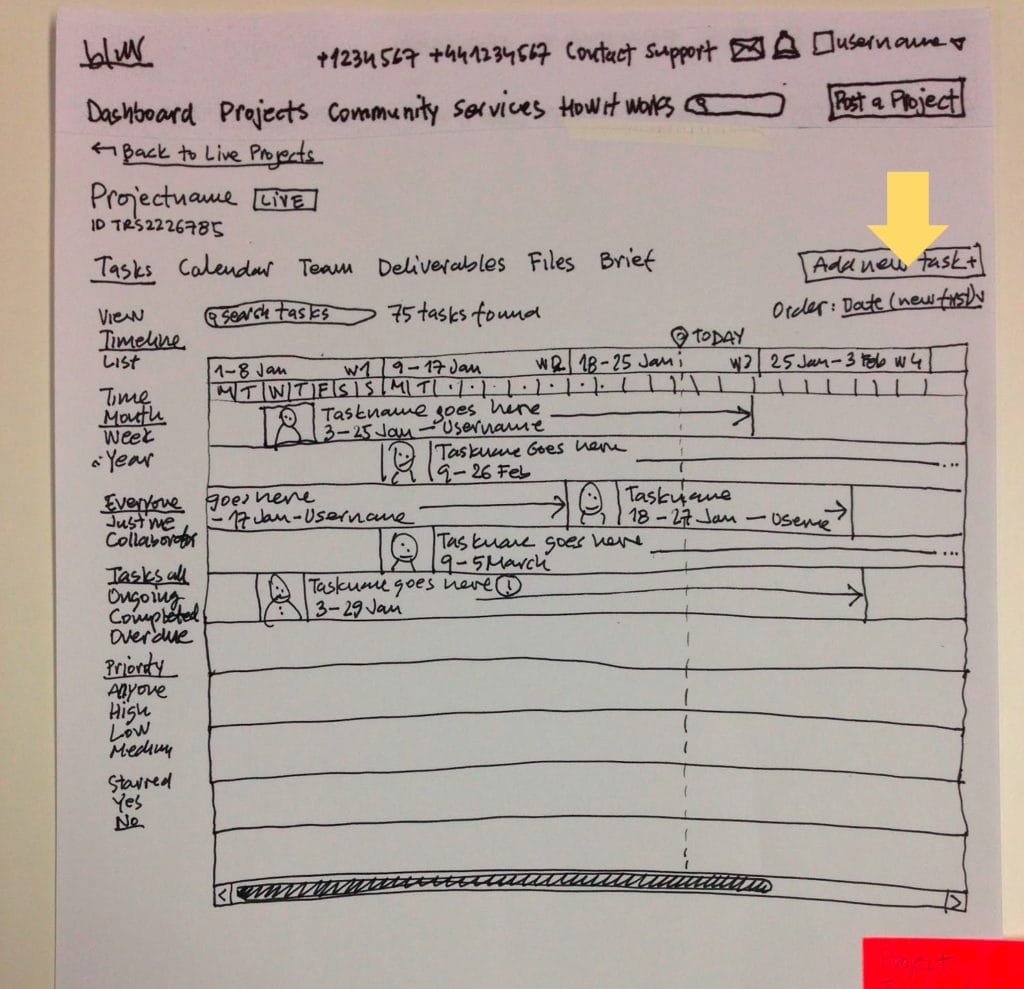
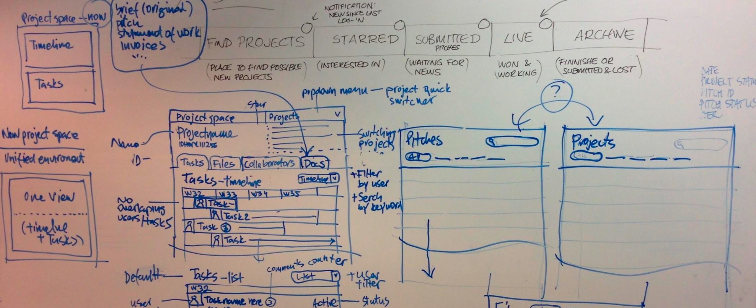
blur Group’s commercial model depended on projects completing. Every project that stalled at onboarding, abandoned mid-journey, or failed to progress through Project Space was lost revenue — a commission unrealised, a listing fee unpaid, or an enterprise account failing to repeat-purchase. The platform had been designed by engineers to function correctly, not to be understood. The brief submission flow locked users out mid-journey with no feedback; Project Space presented procurement workflows as raw task lists with no contextual scaffolding; and the public-facing site failed to communicate the concept fast enough to retain first-time visitors. The documented exit points from the buyer journey read like a usability audit written in red: “doesn’t understand concept,” “confused by project space tools,” “form too complex,” “screen locks out user, very confused, no notifications.”
The commercial consequences were visible in operational overhead. Because the platform was so difficult to navigate independently, the Exchange Support and Projects & Payments teams were manually bridging every failure point — chasing customers who hadn’t confirmed accounts, calling experts to explain features, emailing instructions for tasks that self-serve design should have made obvious. The documented user journey alone contained dozens of manual email touchpoints that existed solely to compensate for platform UX failures, consuming specialist team capacity at every stage of the project lifecycle. For a company trying to prove a scalable, automated s-commerce model to institutional investors and enterprise buyers — with reporting obligations on the London Stock Exchange — a platform requiring this much human scaffolding was a structural threat to the unit economics.
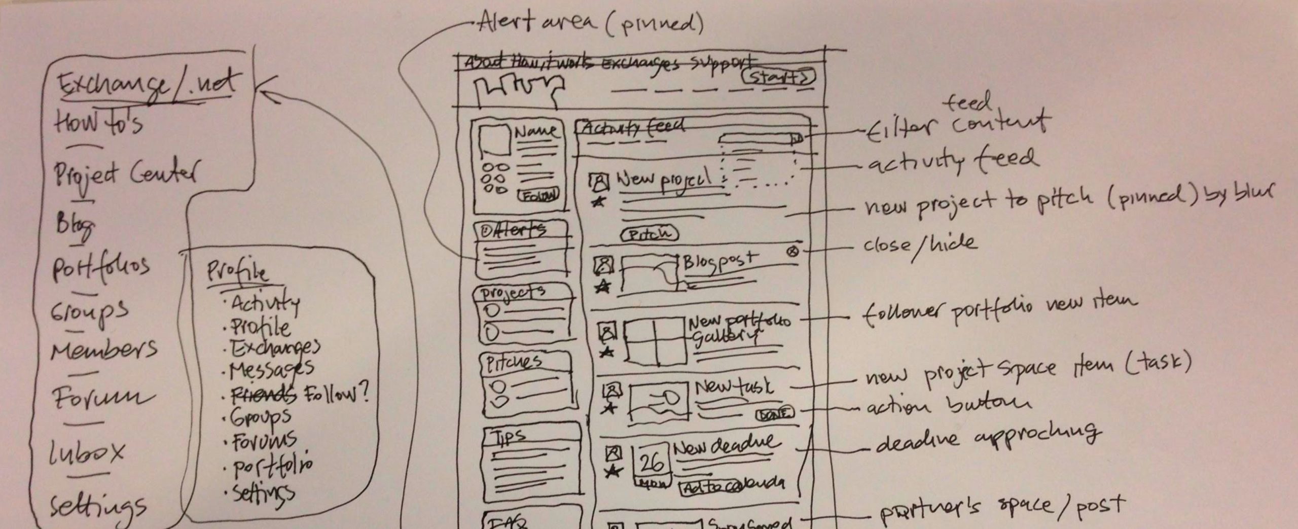
Organisationally, design didn’t exist as a discipline when I arrived. UX was understood by the business as visual design and interface layout, nothing more. A document I produced early in my tenure illustrated this precisely — showing that field research, user testing, persona development, information architecture, prototyping, UX writing, and interaction design were all invisible to the company’s operating model. There was no research practice, no shared component library, no front-end standards, and no framework for evaluating design decisions against actual user behaviour. The risk if nothing changed was a platform that would continue scaling its operational support costs faster than its revenue — a trajectory already visible in the company’s financial reporting.
Strategic Decisions
1. Built the UX function before designing anything
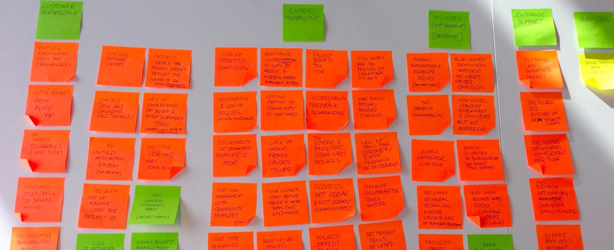
My first decision was to refuse to jump straight into visual redesign. The business pressure was to “make it look better” — I pushed back and spent the first quarter mapping the actual problem before touching a single screen. I ran a comprehensive platform audit using live analytics visitor flow data, conducted a large-scale expert survey across the service provider community, ran a persona workshop with C-level directors and the CEO, and produced a multi-stakeholder pain-point map covering five perspectives simultaneously: Customer, Expert, Visitor, Exchange Support, and Investor. The alternative — visual polish on top of a broken foundation — would have produced cosmetic improvements that didn’t move the metrics that mattered. The trade-off was a slower start to visible output, which created internal pressure. I managed it by presenting the pain-point audit and six research-validated personas to senior leadership within the first two months, framing every user problem as a revenue or cost consequence rather than a UX quality issue. The result was executive buy-in for a genuine redesign strategy rather than a reskin.
2. Defined a design vision that locked in product direction
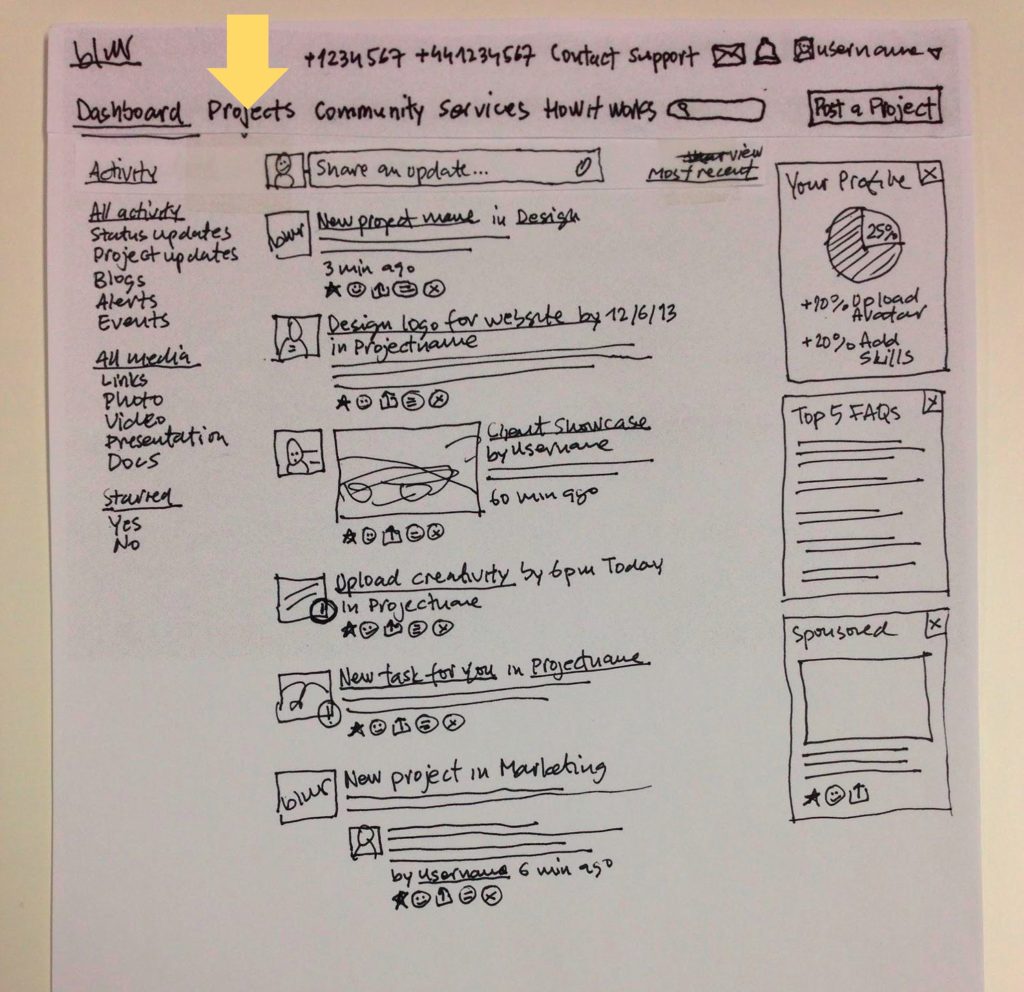
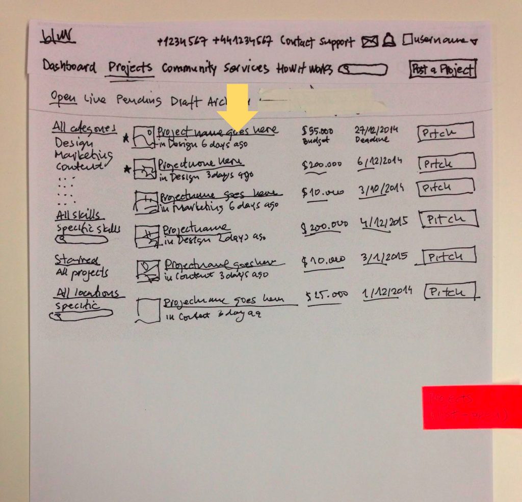
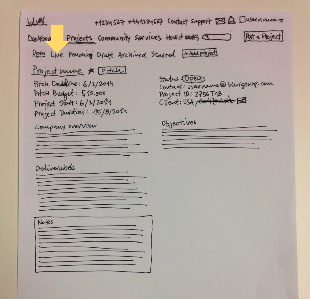
I produced and presented a comprehensive UX and design approach document that defined the redesign philosophy across four principles: 100% User Focused, Driven by Design, Easy/Lean/Light/Fresh/Clean, and Mobile-First with a seamless cross-device experience. This wasn’t a mood board. It was a product direction document intended to survive stakeholder disagreement across engineering, product, and commercial teams. The mobile-first principle was contested — the platform’s primary users were desktop enterprise buyers — but user data showed growing mobile traffic and competitive pressure was moving fast. By anchoring mobile-first in the design vision from the start, I prevented it from becoming a late-stage afterthought that required expensive rework. The document also established a rapid prototyping methodology — progressive fidelity from lo-fi paper sketches through in-browser prototypes to high-fidelity handoff — that became the team’s standard delivery model for every subsequent feature cycle.
3. Rebuilt the platform surface by surface, not as a big-bang rewrite
I rejected a full platform rebuild in favour of a systematic, surface-by-surface redesign sequenced by business impact. Engineering instinct favoured a single large release; I argued this was too risky for a live, revenue-generating marketplace with tens of thousands of active users and a board watching every quarterly number. Instead, I structured the redesign by user journey stage: public marketing site and category pages first (conversion impact), then buyer onboarding and brief submission (activation), then Project Space and expert dashboard (retention and delivery completion). This sequencing meant we could ship, measure, and iterate in production rather than rebuild in a vacuum for months. The trade-off was a period of visual inconsistency as redesigned sections sat alongside legacy ones — a real cost to perceived quality that I had to actively manage upward. I managed it by building a shared component library from the outset, so even legacy screens could adopt new components incrementally without requiring full page rebuilds.
4. Made content and UX writing a first-class design discipline
One of the most consequential decisions I made was treating UX writing as a core design output, not downstream copy review. The platform’s terminology was inconsistent across surfaces — the same workflow described differently in the buyer interface, the expert interface, internal operations tooling, and external marketing materials. I produced formal content guidelines establishing platform-wide terminology rules across every touchpoint. I owned the UX writing for error states, empty states, onboarding tooltips, and the extensive library of system-generated notification emails that formed the operational backbone of the managed marketplace. These weren’t cosmetic fixes. Research had documented that users genuinely couldn’t understand what was happening to their project at key moments in the lifecycle — the content work addressed the root cause, not the symptom. The content principles were embedded in the design system, which meant every new screen shipped with correct, consistent language by default.
5. Shifted design from execution to discovery
Once the team was structured and operational, the structural risk I identified was absorption into a pure delivery lane: receive a spec from Product, design it, hand to Engineering, repeat. I made the deliberate decision to embed design into product discovery — owning the research practice, writing product requirements for major platform features alongside the Product function, and representing user evidence in commercial decisions. This required political navigation. Product leads were accustomed to owning requirements; I made the case to the CPO and CEO that a platform this complex — with six distinct user personas, a five-stage project lifecycle, and a managed service overlay on every transaction — could not be specified effectively by people not continuously embedded in user behaviour. The evidence that this worked was in the output: I authored the platform experience sections of major enterprise client proposals, positioning the user experience as a commercial differentiator in competitive procurement conversations.
6. Scaled the team to own front-end delivery end-to-end
In the later stage of my tenure, I extended design leadership to take direct responsibility for the front-end development team alongside the UX and design function. This gave the design system real enforcement: components defined by the design team were implemented to specification by engineers who reported into the same leadership chain. I made this move because the handoff gap between design intent and front-end output was the last major friction point in the delivery model — and because owning front-end gave me the leverage to enforce responsive, accessible, and component-consistent implementation without negotiation on every ticket. The combined function of over 20 practitioners became an integrated design-to-ship capability rather than a sequence of handoff stages with quality loss at each gap.
Interaction Models – Rapid Prototyping
Process & Approach
Delivery model: The team operated on two-week design sprints loosely aligned to engineering release cycles, with standing design reviews and async collaboration across annotated design files and interactive prototypes. Design artefacts moved through a deliberate fidelity ladder: whiteboard sketches → paper prototypes → in-browser prototypes → high-fidelity UI → engineering handoff. Each stage was validated before investment in the next, which meant engineering received structurally sound designs rather than first-draft visuals that would require rework mid-sprint. The design system and component library were built through real product work — patterns extracted from shipped screens rather than designed speculatively, meaning every component had been validated in production context before it entered the library.
Research practice: Research was embedded from the start rather than treated as a project phase. I ran a comprehensive large-scale survey across the expert community to establish baseline satisfaction and pain points, conducted persona workshops with C-level stakeholders, and used live analytics visitor flow data to identify the highest-volume drop-off points in the buyer journey. The six personas — three buyer types and three expert types — were derived from actual customer data, feedback transcripts, and in-depth interviews with real users, not from assumption. Structured usability testing was a standing practice: on the Project Space redesign specifically, I ran sessions with enterprise buyers recruited from the existing customer base, working through them in batches of ten — giving us access to users who understood the domain but had struggled with the legacy interface, producing higher-signal findings than cold-recruited participants would have. Research outputs fed directly into sprint planning as standard input, ensuring user evidence informed prioritisation rather than sitting in a design team silo.
Prioritisation and feature mapping: I prioritised the redesign work by revenue impact and operational cost reduction. Brief submission and buyer onboarding were first because they directly controlled activation — every project that didn’t convert to listed generated no revenue and created Exchange Support overhead. Project Space was second because its confusion was driving the highest volume of manual support interventions per user journey stage. Low-effort, high-impact content fixes — error messages, empty states, notification copy — were shipped continuously as part of each sprint rather than batched into separate content releases. Prioritisation framing to Product and Engineering was always expressed in business terms: reduction in support intervention volume, improvement in project completion rate, reduction in time-to-kick-off — not UX quality metrics in isolation.
Design craft: Lo-fi validation was non-negotiable before pixel-level investment. No high-fidelity screens were produced until the underlying flow had been validated through paper sketches, collaborative whiteboard sessions, or interactive prototypes. This discipline existed because the platform’s complexity — a multi-sided marketplace with different flows for each user type across five project lifecycle stages — made premature visual investment expensive to unwind. The methodology was progressive without exception: structure and flow first, interaction model second, visual design third. When visual design was finally produced, it was solving a validated problem, not a speculative one. The front-end architecture was based on modern, component-based web frameworks chosen for iteration speed, engineering accessibility, and consistency across the platform’s expanding surface area.
Content and UX writing: Content design was a deliverable, not an afterthought. The content guidelines I produced and maintained defined house style, terminology rules, and copy principles across every interface surface. UX writing was embedded in every design artefact: error states, empty states, system notifications, onboarding tooltips, and the extensive library of transactional emails that formed the managed marketplace’s operational communication layer. The content guidelines directly addressed failures documented in user research — “doesn’t understand concept” and “confused by project space tools” are content problems as much as they are structural UX problems. Bringing content into the design system meant these fixes scaled automatically across every new surface rather than requiring a content pass on each release.
Collaboration
With Product: Design was embedded in product discovery from my first weeks. I didn’t wait for feature specs — I produced the platform design vision as a forward-looking product direction document and presented it to the CEO and C-suite, effectively defining what the next platform version needed to become before Product had formalised it. Sprint planning included design research outputs as standard input, and I personally authored the platform experience sections of enterprise client proposals, putting UX thinking directly into commercial conversations. The ritual that proved most effective was multi-stakeholder journey mapping: bringing design, product, exchange support, and commercial leads together around a single shared artefact, mapping the same user journey from five perspectives simultaneously — surfacing conflicts between team assumptions faster than any separate workshop format.
With Engineering: The relationship with engineering required early and deliberate trust-building. The platform had been engineer-built for years; the design team was new and had to prove it added velocity rather than friction. Working in component-based interactive prototypes was partly strategic — it gave engineers design specifications they could read in their own language, reducing the interpretation gap at handoff and demonstrating that design understood technical constraints. I structured a dedicated front-end architecture role within the design team as the explicit bridge between design intent and technical implementation. When engineering pushed back on mobile-first requirements on delivery complexity grounds, I held the position but reduced friction by prioritising the responsive component framework work early, making it an engineering default rather than a per-feature negotiation that had to be won each sprint.
With Leadership / Stakeholders: I translated design impact into commercial language consistently and early. The pain-point audit framed UX failures as direct operational cost and conversion loss — not aesthetic problems. When presenting the platform redesign strategy to the CEO and board-level leadership, I led with the commercial case: a platform legible enough for enterprise buyers to self-serve reduces Exchange Support overhead, improves project completion rates, and produces the unit economics required to justify the company’s growth story to public market investors. I later represented the company’s platform UX capability directly in enterprise client engagements, authoring and presenting the user experience sections of major account pitches — positioning the platform as a competitive differentiator against traditional ten-week procurement processes. This shifted design’s perceived role from internal function to commercial asset.
With the Design Team: I built the team from a single designer to a multi-disciplinary function of over 20 practitioners — one hire at a time, with deliberate intent at every stage. The structure I settled on separated roles clearly: interaction design, research, visual design, content, illustration, and front-end — avoiding the “one designer does everything” trap that collapses quality under delivery pressure. In the later stage of my tenure I extended direct leadership to include the front-end engineering team, which gave the design system enforcement teeth: components defined by the design team were implemented to specification by engineers within the same reporting line. Weekly design critiques were open to the whole company, building design literacy across product, engineering, and commercial teams faster than any internal roadshow could. What I’m most proud of is that the methodology and team culture became embedded practice — research-first discipline, lo-fi validation, content-as-design — not personal preferences that left when I did.
Outcomes by the Numbers
1→22+
practitioners in the design and front-end function, built from scratch — from a single designer to a full-spectrum team covering UX, interaction design, content, illustration, and front-end engineering
3
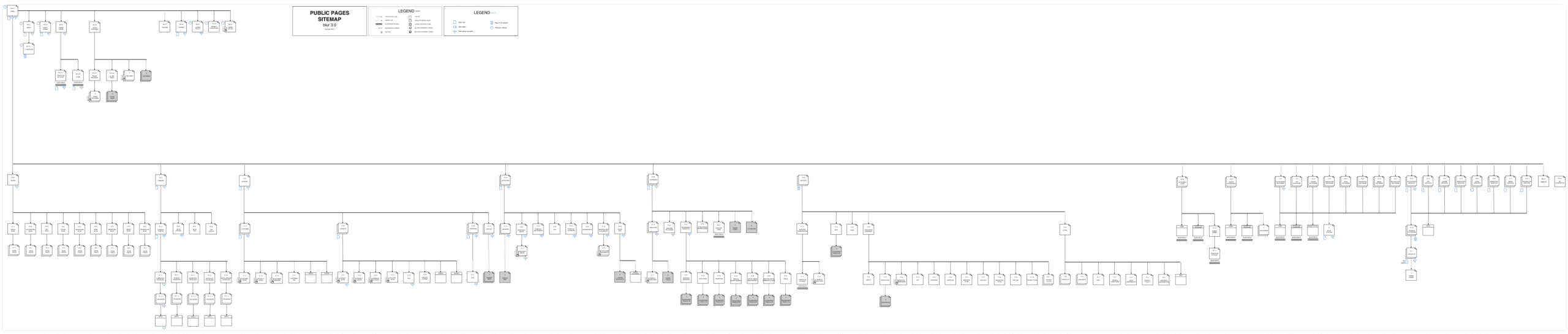
platform versions shipped during tenure — from a single-surface engineer-built product to a fully enterprise-grade platform meeting the security, automation, and UX requirements of multinational organisations
+183%
growth in total projects on the platform during the engagement period — driven in part by improved buyer activation and a Project Space redesign that reduced abandonment at the delivery stage
70%+
growth in vetted service providers, from tens of thousands to over 63,000 across 145 countries — supported by a redesigned expert onboarding and sign-up experience
75%
conversion rate from open project to completed delivery reached by the close of the engagement — versus a documented baseline where project abandonment was a structural, operationally expensive problem
84%
of enterprise projects in the final quarter came from repeat customers — evidence that the platform experience was compelling enough for large organisations to return independently, without sales intervention
10 weeks → 7–10 days
reduction in the enterprise services sourcing cycle — enabled by a platform UX that made brief submission, pitch review, and expert selection self-serve rather than manually facilitated at every stage
Results measured over the course of the engagement, versus the engineer-built baseline at project start, sourced from company annual reports and documented platform metrics.
The single most important outcome was structural: blur Group proved its s-commerce model worked at enterprise scale. The platform that arrived requiring manual support at every stage became a self-service enterprise procurement solution trusted by organisations including Shell, Momentive, GE, Danone, and Argos for hundreds of millions of dollars in services requirements. That transition was a design outcome first and a commercial outcome second — a platform legible enough for enterprise procurement teams to adopt without hand-holding is a UX achievement before it is anything else. The company later rebranded as Maistro, delisted from the London Stock Exchange to operate as a private company, and continued building on the tail spend management positioning established during this period. The mission Maistro operates on today — making previously manual procurement processes dramatically faster and more efficient through intelligent technology — is a direct continuation of the design vision and product infrastructure built during this engagement.
My Contribution
I was the Global Head of User Experience — the company’s first design leader, reporting directly to the Chief Product Officer — and I owned every user-facing surface the company shipped: the public marketing site, buyer onboarding, expert sign-up and pitching, Project Space, all proprietary platform tools, and enterprise client-facing proposal and presentation design. I grew the design and front-end function from a single designer to over 20 practitioners: three within the first six months, eight within the first year, and a team of more than 20 by the end of my tenure — including a front-end engineering team I took direct leadership of as the practice matured. I personally designed enterprise-class application interfaces across desktop, tablet, and mobile, and owned the design system, content guidelines, and front-end architecture standards that governed how every surface was built. My responsibilities extended beyond pure design: I owned the research practice, co-authored product requirements for major platform features, and represented the company’s platform capability directly in enterprise client engagements. The team owned production design, front-end implementation, and illustration execution; I owned strategy, research direction, product vision, hiring criteria, team structure, and the translation of user insight into commercial decisions. The design function’s shift from “makes it look good” to “co-owns product strategy” was a structural change I initiated and sustained — not an inherited position I maintained.
What I’d Do Differently Today
The biggest time cost on this project was the gap between research insight and validated design decisions — synthesis was slow, and the time between a pain-point workshop and a shipped design solution was measured in weeks rather than days. Today I’d compress that cycle dramatically using AI-native workflows: Claude for rapid synthesis of interview transcripts and survey data into structured insight reports, Figma AI for accelerating flow and concept generation directly from user journey sketches, and synthetic user testing tools to validate interaction models before committing engineering capacity. The six-persona system we built manually over months could now be kept continuously live and evidence-based — updated as new usage data arrives, rather than hardening into static artefacts that age out of accuracy between research cycles. The MCP integrations now available between design tools, analytics platforms, and product management systems would have closed the loop between research, design, and delivery in a way that genuinely wasn’t possible at the time. The methodology was right; the tooling available today would have made it three to four times faster — and let the team spend its creative energy on the genuinely hard problems, which was always the enterprise workflow complexity, not the research synthesis overhead.
Trusted by AI startup founders from pre-seed to Series B
The brands and organizations we’re privileged to work with.