Enterprise buyers often churn not due to product failure but because the user experience becomes cumbersome. A strong product can lead to complicated renewal discussions if it is not designed for the specific roles of its users, causing frustration and a perception of ineffectiveness.
Effective dashboard design prioritizes task completion for different user roles, yet many B2B products fail by creating a one-size-fits-all interface. This oversight can lead to increased support tickets and dissatisfaction. Identifying specific navigation issues in high-usage accounts can help mitigate churn risk, and structured design sprints can address these challenges efficiently.
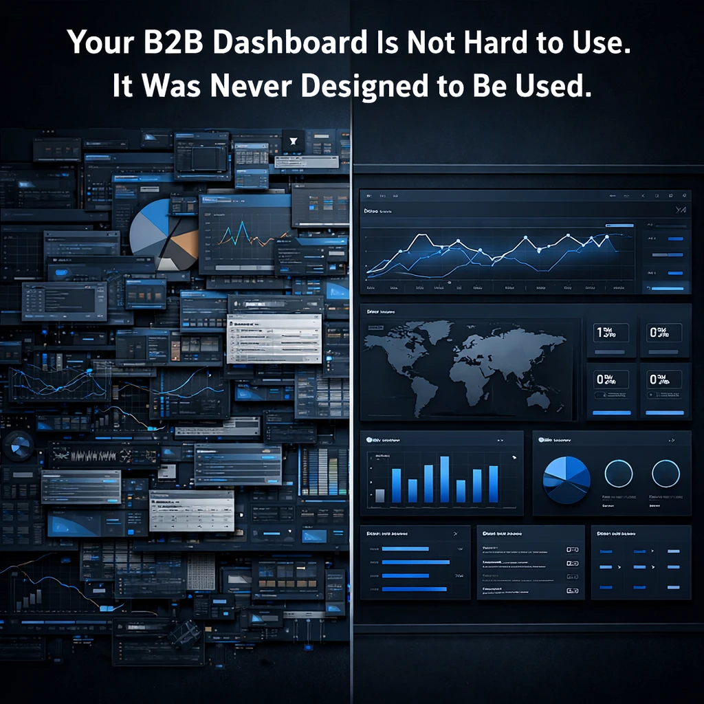
Enterprise buyers do not churn because your product stops working. They churn because it starts feeling like work.
There is a specific failure pattern in B2B SaaS that plays out the same way across categories: a founding team builds a genuinely capable product, closes early enterprise deals on the strength of a demo and a promise, and then watches renewal conversations get complicated six months later. The product did not break. The value is real. But the day-to-day experience of using it — the dashboard that IT admins, analysts, or operations leads live in for hours at a stretch — was never designed for the people who actually use it. It was designed for the people who built it.
That is not a UX problem. That is a revenue problem.
What Enterprise Users Actually Need From a Dashboard
Enterprise users are not casual. They are role-specific, time-pressured, and operating under accountability that consumer users never face. An IT admin managing security policy needs to know the status of a hundred rules at a glance — not after navigating three levels of nested menus. An operations lead tracking cross-team performance needs to surface anomalies without running a manual report. A finance director approving spend needs to reach the right number in under thirty seconds or they will call someone instead.
These are not edge cases. These are the workflows that determine whether your product becomes embedded in how an enterprise team operates — or becomes a line item that gets cut at renewal.
Good enterprise dashboard design means one thing practically: the right person can complete the right task in the minimum number of steps, with zero ambiguity about what they are looking at and what they should do next. Everything else — color, layout, component style — is in service of that single requirement.
The Role Mapping Problem Most Teams Skip
The most common mistake in B2B dashboard design is building a single interface for multiple user roles and hoping the information architecture holds together. It does not. An administrator, a manager, and an executive have fundamentally different jobs inside the same product, and a dashboard that tries to serve all three equally will serve none of them well.
Role mapping is not optional work. It is the foundation on which every layout decision, every data hierarchy, and every navigation pattern depends. Skip it, and you end up with a dashboard that surfaces everything to everyone — which is the functional equivalent of surfacing nothing to anyone.
This is also the mistake that generates the most support tickets. When users cannot find what they need, they do not conclude the product is complex. They conclude it does not work. And that perception, once formed, is very difficult to reverse in a renewal conversation.
One Thing You Can Do Before Your Next Customer Call
Pick your highest-usage enterprise account and ask your customer success lead one specific question: what is the one thing users in this account complain about finding or understanding in the product?
Not the most requested feature. Not the biggest integration ask. The navigation or comprehension friction that comes up most often in day-to-day use.
Whatever that answer is, open the dashboard and find the exact moment where that friction occurs. Count the steps between where a user lands and where they need to be. If that number is more than three, you have a dashboard design problem that is actively inflating churn risk.
Poplab’s B2B SaaS Dashboard Design sprint resolves this in four weeks: role mapping, an AI-powered information architecture audit, three to five core screens built to enterprise standard, and a component library your team can extend. Dev-ready Figma handoff included.
Book a free strategy call and get a scoped proposal within 24 hours.
Leave a Reply